
 OBJECT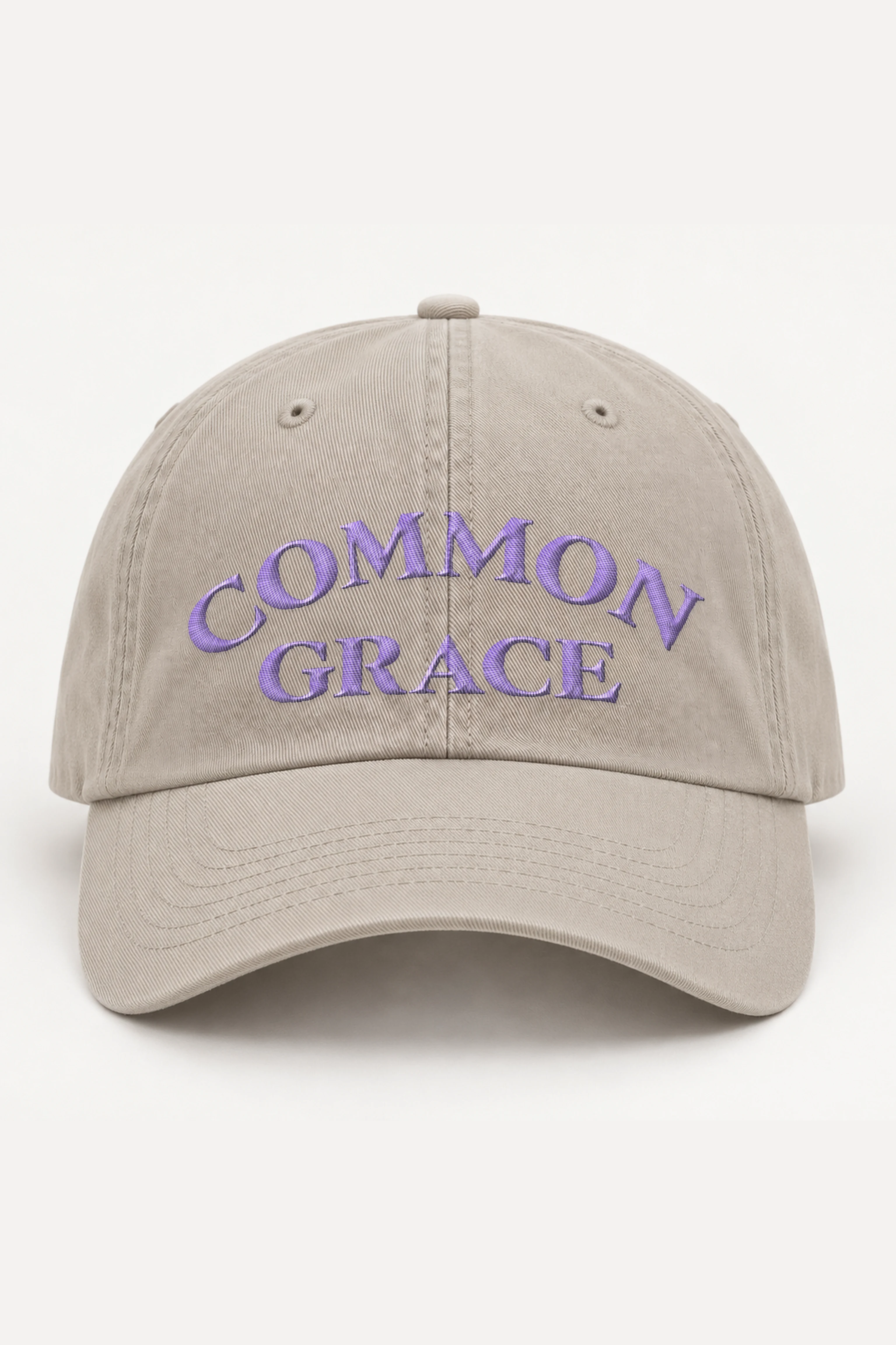
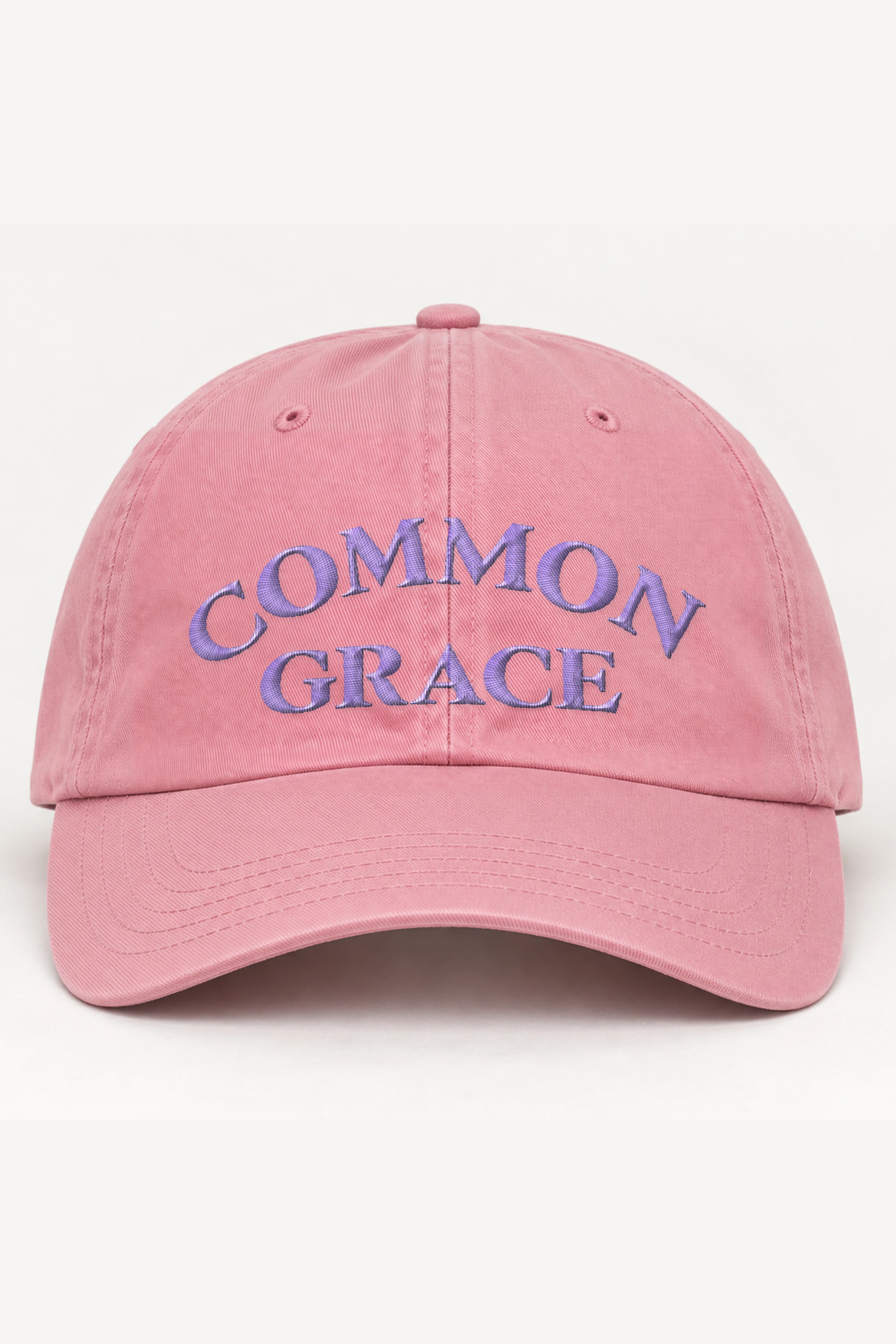
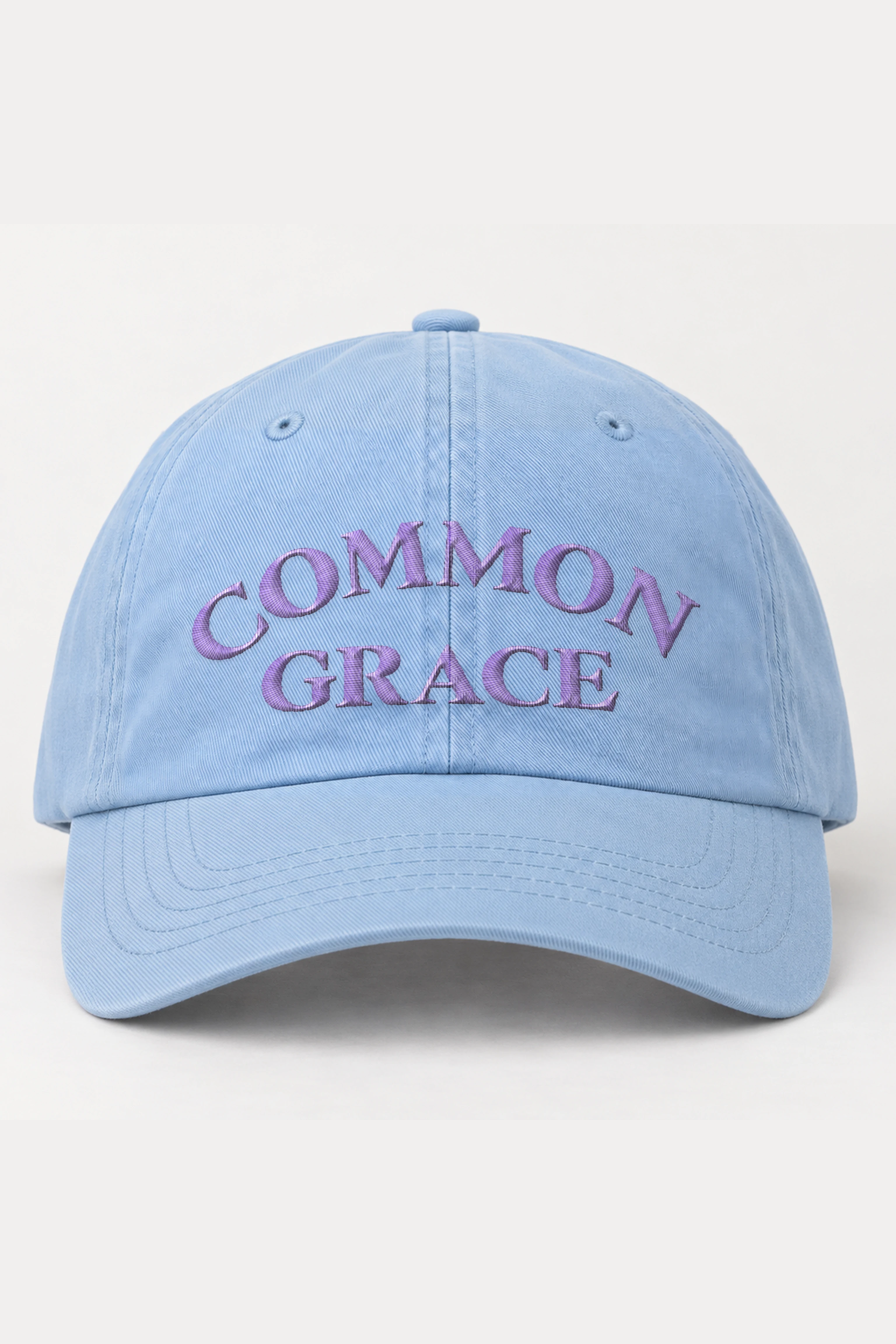
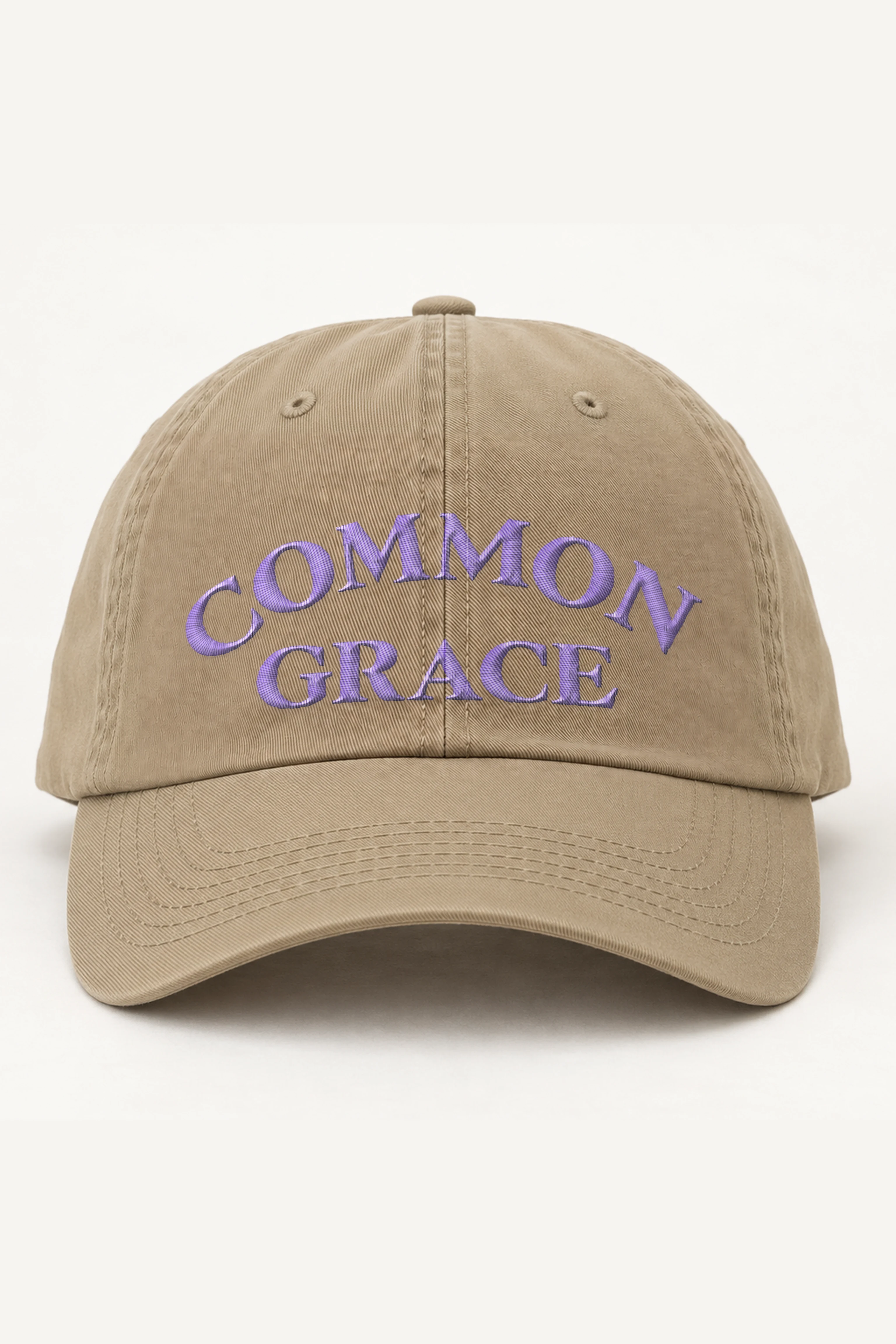
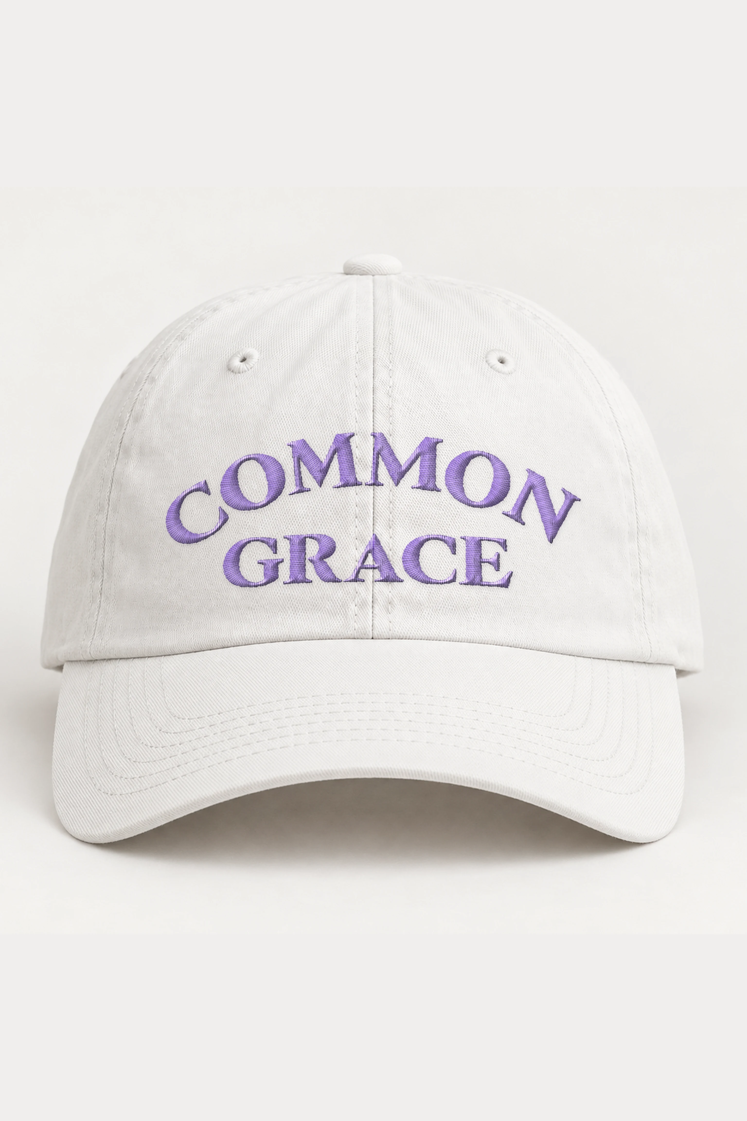
“Common Grace” — Classic Dad Hat · Embroidered
Unstructured low-profile six-panel fit with a curved visor and adjustable antique-brass buckle. 100% cotton chino twill; Green Camo uses a cotton-polyester blend.
Design story & product details
Purple lettering meets the white openings cut through its letterforms, forming a spare two-line reading of “Common Grace.” On the Coastal Washed Cap, the word Common rises in a pronounced arch, with the pair of M letters carrying the crest and the C and N dropping toward the outer edges.
Size & dimensions
Classic Dad Cap · Yupoong 6245CM · unstructured, low profile, one size with adjustable strap
| Measurement | in | cm |
|---|---|---|
| Head circumference | 20.5 – 21.6 (adjustable) | 52 – 55 (adjustable) |
| Sizing | One size fits most | One size fits most |
Six-panel cotton twill cap with a fabric strap and metal buckle.
Product details
Materials & fit
100% cotton chino twill; Green Camo uses a cotton-polyester blend.
Unstructured low-profile six-panel fit with a curved visor and adjustable antique-brass buckle.
Embroidery
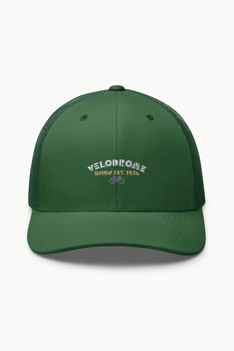
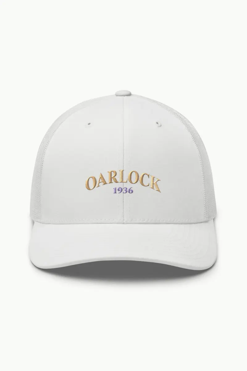
Front embroidery, as shown in the gallery.
Care
- Spot clean with cool water and mild detergent.
- Air dry only; do not machine wash or tumble dry.
- Do not iron the printed or embroidered design.
Delivery & returns
Ships with tracking; the delivery estimate for your country is shown on this page. If it arrives damaged or misprinted, tell us within 7 days and we reprint or refund it.










Reviews
There are no reviews yet.