
 OBJECT
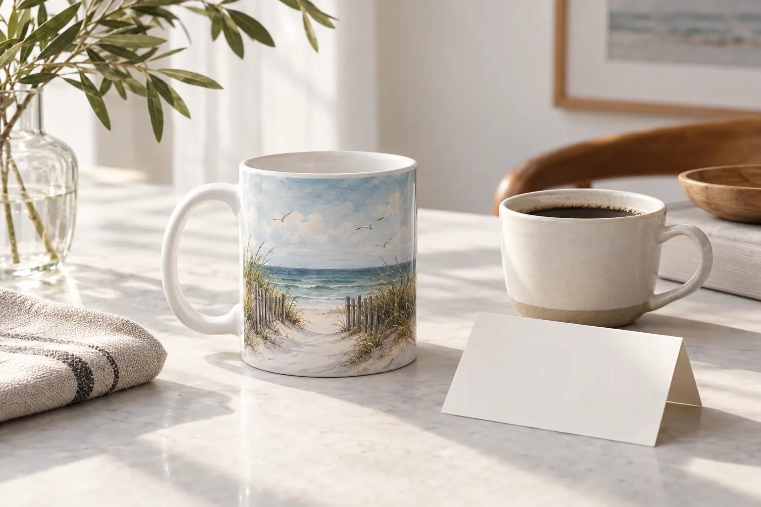
A Korean design mug gift for coffee lovers can get the artwork right and the daily routine wrong. A dramatic naval scene may suit someone’s wall better than their breakfast table; an appealing coastal illustration still needs to work with the amount of coffee they actually pour.
The useful rule is simple: choose the graphic for the person, then check the mug for the routine. Start with the coastal option for a recipient who likes illustrated scenery and bilingual type. Move toward floral symbolism or naval drama only when you know those interests are welcome. Here, the meaningful differences are in the artwork—not documented differences in drinking performance.
Choosing a Korean Design Mug Gift for Coffee Lovers
These featured mugs share an 11oz size designation, ceramic construction and a Black catalog color attribute. Their artwork is much less interchangeable. A seaside invitation, a message about mercy and a storm-driven warship each makes a different statement before any coffee is poured.
That makes recipient fit the strongest starting point. Do not choose the most elaborate image simply because it appears to contain more work. Choose the one whose subject, lettering and palette belong in the recipient’s daily surroundings. Complexity is a visual preference, not a quality grade.
Compare the message before the motif
The three directions below are editorial matches, not a performance ranking. None has documented advantages over the others in heat retention, handle comfort or dishwasher durability. The shared size also means that switching designs will not solve a capacity mismatch.
| Featured mug | Documented graphic direction | Choose it for | Main trade-off |
|---|---|---|---|
| Let’s Go See the Sea | Blue-and-orange coastal scene, bilingual lettering and an illustrated ribbon | Someone who likes travel imagery and an outward-looking message | The artwork includes 2026, which may matter for an undated gift |
| Rooted in Mercy | Camellia-style blooms, blackletter-inspired type and lavender roots | Someone who appreciates botanical graphics and meaningful wording | The phrase carries more emotional weight than a neutral pattern |
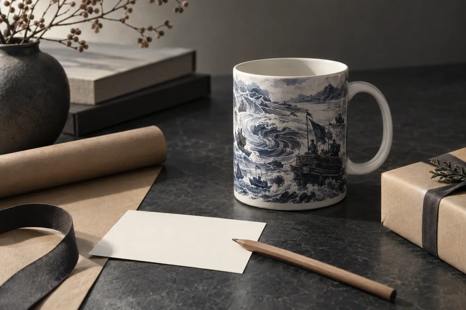
| Myeongnyang · Admiral Yi Sun-sin | Metal-style Roman lettering, a dragon-headed warship and a vortex | Someone drawn to Korean naval subjects or album-cover-style graphics | The turbulent composition is deliberately intense |
Consider three hypothetical recipients. For a friend whose preferred images are coastlines and illustrated travel scenes, the sea design is the logical first look. For someone who chooses flowers and expressive typography, the botanical option is more specific. For a recipient who actively enjoys naval history and heavy graphic art, the battle-inspired wrap has a stronger reason to be there.
If you know only that the recipient drinks coffee, you do not yet have enough information to choose confidently. Look for one additional clue: the images they display, the colors they repeat or the wording they willingly wear. A mug is a small object, but its message is unusually visible during ordinary routines.
The Coastal Mug: An Invitation Rather Than a Slogan
The “Let’s Go See the Sea” 11oz Ceramic Mug is the most natural starting point for a recipient who prefers scenery to symbolic statements. Its artwork combines English and Korean lettering with angular steps, railings, a lighthouse and layered blue waves. Orange accents organize the composition rather than leaving the coastal scene entirely blue.
The design has a useful visual hierarchy: large lettering establishes the invitation, while the steps lead attention toward the water. A bent pine tree and its directional blue needles continue that movement. Birds, a setting sun and the lighthouse give you smaller details to notice after the main phrase has registered.
Why this suits a particular kind of coffee lover
Choose it when the recipient likes an illustrated object that can suggest somewhere beyond the desk or kitchen. That is a design judgment, not a promise that the mug changes anyone’s mood. The combination works especially well as a gift when the invitation itself means something between you, without requiring a lengthy explanation of historical references or symbolic flowers.
Its bilingual lettering is a concrete reason to choose it over a generic coastal print. The catalog identifies the Korean phrase as an invitation to go and see the sea. You can explain that meaning in English on a gift note without presenting the lettering as mysterious decoration or claiming a wider cultural significance that the product description does not establish.
- Choose it for: a recipient who likes blue-and-orange graphics, seaside imagery and prominent lettering.
- Think twice for: someone who prefers plain ceramics, very sparse layouts or objects without visible words.
- Notice before ordering: the English ribbon includes the year 2026 as part of the artwork.
That date is neither a defect nor an automatic selling point. It can make sense for a gift tied to that year, but it weakens the fit if you specifically want an undated object. The cream area and deliberate texture variation belong to the described illustration; they do not establish a cream-colored ceramic body, a rough finish or a handmade glaze.
The appeal here is the relationship between text and scene. Buy it because that combination suits the person, not because coastal imagery makes it a universal choice.
The Floral Mug: Choose the Words as Carefully as the Flowers
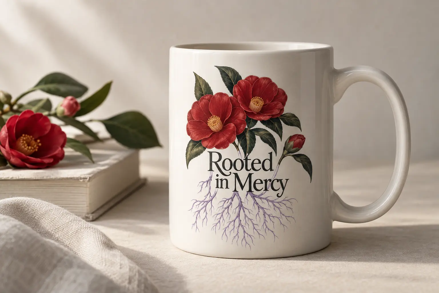
The “Rooted in Mercy” 11oz Ceramic Mug is not simply the floral alternative. Its composition joins dense camellia-style blossoms to blackletter-influenced typography, with a pale lavender ribbon and branching roots beneath. The flowers provide the canopy; the large word above the ribbon supplies the visual anchor.
Deep red petals, lavender stems and a dark purple-to-black letter fill create a markedly different direction from the coastal design. A thin red offset gives the main lettering a drawn dimensional effect. That is an effect within the graphic, not evidence of raised printing or an embossed surface.
Read the whole message
The phrase is the deciding detail. Mercy may suggest compassion, faith, forgiveness or patience to different recipients; none of those readings should be assigned to them without thought. If you know they welcome reflective wording, the phrase can make the gift feel considered. If your relationship is formal or uncertain, the same wording may feel more intimate than you intended.
The roots also change the floral language. Rather than presenting blossoms as an isolated decorative spray, the artwork shows a dense system extending downward. Read editorially, it connects visible growth with what supports it. The composition suits someone who enjoys that kind of visual metaphor, but it need not become an inspirational speech in your gift note.
- Prioritize the lettering if the recipient collects expressive, text-led objects.
- Prioritize the palette if their existing graphics already favor dark reds, purples and botanical detail.
- Pass on this message if you would need to explain why they should appreciate its sentiment.
For a closer look at text as the central design choice, the Words & Quotes collection is a useful browsing context. Keep the distinction clear: meaningful wording is a category preference, while this mug’s particular flowers, roots and blackletter treatment are what justify this individual selection.
The trade-off is density. Intricate petals, ornamental letter terminals and fine root lines offer several points of interest, but they are not the same as a restrained botanical outline. Give this mug to someone who enjoys looking closely at an image. Do not mistake a limited color family for a minimalist composition.
Naval Graphics: Match the Visual Language, Not Just the History
The Admiral Yi Sun-sin-related mugs share a broad subject area, but their compositions ask for different tastes. One emphasizes severe gothic lettering and a warship; another centers an armored figure; another layers ships and waves beneath stacked type. The fourth uses a vortex and metal-inspired lettering. These are meaningful distinctions when the object will sit in view every day.
The strongest choice for metal-inspired graphics
The “Myeongnyang · Admiral Yi Sun-sin” 11oz Ceramic Mug makes the clearest case for a recipient who likes album-cover-style intensity. Its cream-and-gold lettering has sharpened ends and a fractured appearance, while a dragon-headed warship is drawn into a navy-blue-and-white vortex. A cracked compass motif and scattered debris reinforce the turbulent composition.
Here, the catalog explicitly identifies the printed word as Roman lettering. Choose it for the historical reference and graphic treatment, not on the assumption that every Korean-themed object includes Korean script. The documented print arrangement also keeps the ship and lettering visible at the join opposite the handle.
When another naval composition fits better
The “Noryang 1598 · Admiral Yi Sun-sin” 11oz Ceramic Mug shifts the emphasis toward severe gothic type, densely shaded sails and dark cloudwork. Thorn-like corner flourishes direct attention inward. If the recipient prefers a ship-centered image and weathered-looking lettering to the vortex’s rotational drama, that is a defensible reason to choose it instead.
The “I Still Have Twelve Ships · Admiral Yi Sun-sin” 11oz Ceramic Mug is more figure-led. An armored person faces away beneath arched lettering, with a red cape moving across the scene and dark ships farther out. Choose that composition when the human silhouette and red accent matter more to the recipient than an intricate vessel portrait.
The “Thirteen Ships Myeongnyang 1597 · Admiral Yi Sun-sin” 11oz Ceramic Mug emphasizes stacked lettering, dragon-headed warships and navy-and-cream waves. Three prominent ships appear within a larger grouping, so the title should not be treated as a literal inventory of the most visible vessels. It suits someone who prefers a fleet composition over a single figure or a central whirlpool.
Keep historical claims modest. The descriptions establish references to Korean naval subjects, not documentary accuracy for every ship, flag, skyline or costume. Nor do the different titles establish an authenticated quotation or a complete account of a battle. A thoughtful gift note can name the reference without turning stylized illustration into historical evidence.
Will an 11oz Wraparound Mug Fit Their Coffee Routine?
An 11oz designation answers one question about size, not every question about use. It does not give you the mug’s external height, base width, weight, handle opening or comfortable fill level. Those details matter if the recipient expects it to fit beneath a particular brewer or wants to replace a much-loved existing cup.
Start with the drink they actually make
Suppose the recipient usually makes a modest black coffee and adds little or nothing afterward. The stated size may be a sensible starting point. If they routinely build a much larger milk-based drink, choosing a different graphic from this selection will not address the capacity issue: these featured options all carry the same 11oz designation.
Use the familiar mug they already own as a reference rather than relying on a styled photograph. Ask how much they normally pour, and leave room in that comparison for whatever they add. Do not treat the nominal capacity as a promise about a particular beverage recipe or assume the mug is insulated because it is ceramic.
- For brewer clearance: compare actual external dimensions with the space available beneath the outlet.
- For grip preferences: seek a view that shows the handle opening rather than only its outer silhouette.
- For portion size: compare the stated 11oz format with the recipient’s usual drink, including additions.
Look at the wrap as an object, not a flat poster
A mug wrap translates a flat composition onto a curved surface, and print templates use safe zones to protect essential details from trimming, distortion or obstruction near the handle [8]. That explains why a single front image cannot answer every placement question.
When alternative views are available, follow the design around the object. Locate the largest word, the main image and the area nearest the handle. For the coastal design, that means understanding how the invitation relates to the steps and lighthouse; for the floral design, it means seeing the relationship between the dominant lettering and the lower roots.
Handle orientation also matters to how the recipient encounters the image. Rather than assuming a universal front for left- or right-handed use, consider the view they will see while holding it and the view facing outward on a desk. The goal is not perfect symmetry. It is a composition that remains intentional as the mug turns, with details you want to see rather than an image chosen only for one flattering angle.
What the Print Process Can—and Cannot—Tell You
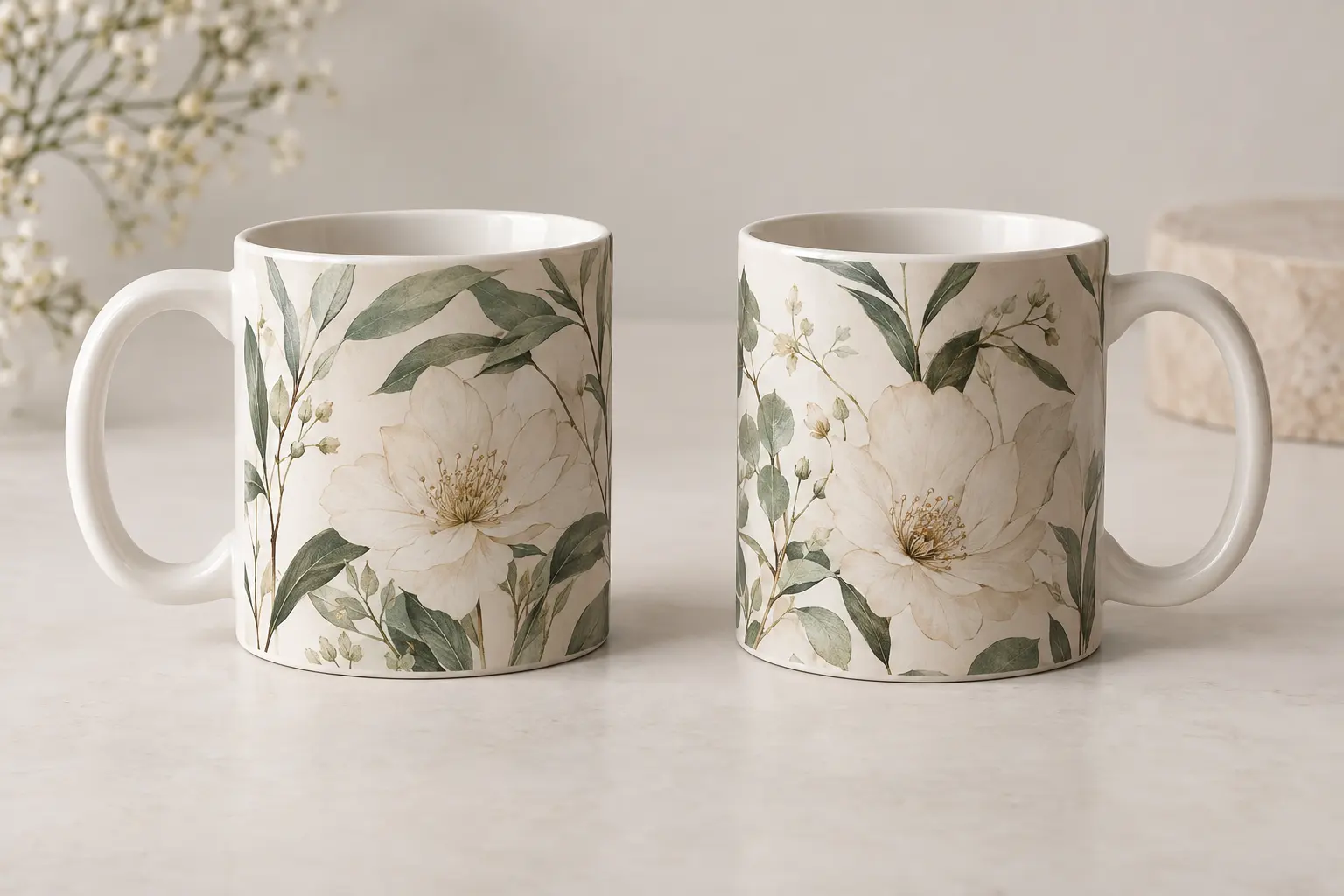
A wraparound graphic identifies an artwork format, not a manufacturing method. The featured descriptions do not specify whether these mugs use sublimation, kiln-fired ceramic decals or another process. That missing distinction matters because two visually similar printed mugs can place their color in different surface systems.
Sublimation: the coating is part of the construction
In a conventional ceramic mug sublimation workflow, a polymer coating allows the dye to bond during heat pressing [1]. The ceramic body and the printable coating therefore have different jobs. Calling the finished object ceramic does not, by itself, describe how its illustration is held at the surface.
The retrieved production guidance identifies coating quality, transfer paper, heat, time and handling as factors affecting color, detail and consistency [1]. A vivid product image cannot tell you how well those production variables were controlled. Equally, a subdued palette is not evidence of weak printing when muted colors belong to the original artwork.
Kiln-fired decals: a different route to decoration
In the documented kiln-fired decal process, an image is applied to a ceramic piece and fired so that it fuses into the glaze [3]. This differs from a dye-receptive polymer surface. It does not establish that any featured mug uses that method, and it is not a reason to transfer another maker’s durability promises to these products.
The practical question is therefore not simply which process sounds more premium. It is which process the exact mug uses, how its finished appearance is controlled and what care is supported for that finished object. Manufacturing terminology is useful only when it resolves those questions.
Printed texture is not surface texture
The catalog’s textured cream artwork, stippled clouds and fractured-looking lettering describe drawn effects. They do not prove that the mug feels grainy, has a matte glaze or carries physically raised detail. Keeping those categories separate prevents an attractive image from creating the wrong tactile expectation.
Screen color and printed color also rely on different reproduction systems; a mug-design technical reference describes the transition from RGB display color to print inks or sublimation dyes [8]. If an exact orange, lavender or blue is central to your choice, favor an available photograph of a finished mug over assumptions drawn from a screen rendering. For a larger gift order, requesting a physical sample is a sensible buying step—not evidence that a sample service is automatically offered.
Food Contact, Dishwasher Care and the Questions Worth Asking
For a daily coffee gift, the practical standard is straightforward: you need information about the finished mug’s intended use, not reassurance borrowed from ceramic mugs in general. The featured descriptions establish the format and artwork, but they do not provide food-contact test reports, dishwasher instructions or microwave-use confirmation.
That gap is a reason to ask, not a reason to declare the products unsafe. It also prevents a responsible recommendation from promising dishwasher resistance, microwave compatibility or a particular number of years without fading. Those are separate claims from liking the illustration.
Ask for evidence that matches the object
ISO 6486-1:2019 specifies a test method for lead and cadmium release from ceramic and related dinnerware intended to contact food and beverages [6]. Its scope includes serving and storing food and beverages, making it relevant to questions about a ceramic coffee mug [6].
The useful question is whether applicable documentation covers the supplied finished ware. Merely mentioning a standard is not the same as showing a result. A report should identify what was tested, while the product’s care instructions should explain what the recipient can actually do with the mug.
- Food-contact use: request the applicable compliance information for the finished mug intended for hot beverages.
- Cleaning: ask whether dishwasher use is supported and whether any rack or cycle restrictions apply.
- Reheating: seek explicit microwave guidance rather than inferring permission from the word ceramic.
- Decoration: ask which printing process and surface system are used if print longevity is a deciding concern.
Keep appearance care distinct from food-contact compliance. An instruction about washing the outside is not a substitute for documentation about the vessel’s intended food use. Likewise, confirmation of food-contact suitability would not automatically answer whether the artwork tolerates a dishwasher.
Once supplied, the exact product instructions should govern care; there is no need to invent a universal washing recipe. If the recipient depends on dishwasher cleaning or frequent reheating, unresolved guidance should pause the purchase. A gift that silently adds an unwanted maintenance task is not a good match, however relevant its graphic may be. Resolve that once, then pass the confirmed instructions along with the gift.
Finish the Gift Without Making It More Complicated
Once the image and practical requirements align, the best finishing touch is usually context rather than another product. A short note can explain why you chose the invitation, the roots or the naval composition. Keep it about the recipient’s taste instead of repeating an entire product description.
Make the reason specific
For the coastal design, refer to the appeal of the sea or the shared meaning of an invitation. For the floral design, explain what you appreciate about the wording only if that sentiment belongs in your relationship. For a naval graphic, name the recipient’s interest in illustration, history or metal-inspired art without claiming the image is an accurate reconstruction.
Do not promise gift boxing, personalized printing or special packaging unless those services are explicitly available for the order. An original graphic is already a distinct choice; it does not need to be described as custom-made for one recipient. Similarly, a made-to-order model should not be mistaken for an automatically editable design.
Check the order, not an imagined delivery schedule
Where an item is produced after ordering, use its stated production and delivery estimates for the destination. Do not build a birthday plan around a generic print-on-demand turnaround. Confirm the selected design and 11oz variant, the shipping address and the applicable policy for damage or an incorrect item before paying.
- Choose one visual reason: scenery, meaningful wording or naval drama.
- Resolve one practical fit: the recipient’s usual drink and required care routine.
- Confirm the occasion: artwork date, order timing and how you will present the gift.
If your uncertainty is actually about choosing a mug instead of apparel, the Korean graphic tee gift guide offers a separate route through recipient interests. The unisex crewneck tee fit guide addresses the silhouette questions that come with that alternative. Neither is a reason to add clothing automatically; the mug may be the more appropriate single gift.
Your next decision should be small and concrete: identify the graphic you can explain in one sincere sentence, then settle the remaining use and delivery questions. If you cannot explain why the image suits this person, keep looking rather than treating their coffee habit as the whole brief.
Shop the collection: Korean graphic tees, Korean long sleeve shirts, Korean sweatshirts, Korean hoodies and Korean tank tops – original graphics designed in Korea, made to order.
Frequently Asked Questions
Which Korean-design mug is the best gift for someone who likes coastal art?
The "Let's Go See the Sea" 11oz Ceramic Mug is the clearest match in this selection. Its bilingual lettering sits above an angular coastal scene with steps, a lighthouse and blue-and-orange details. Choose it for that combination of invitation and scenery, rather than assuming every coffee lover prefers a coastal theme.
Is an 11oz mug large enough for a coffee lover?
It depends on their usual portion, not how seriously they take coffee. Compare the stated capacity with the drink they normally prepare, including milk or other additions. Every featured mug here is designated 11oz, so changing the artwork does not provide a larger option. External dimensions and handle space need separate consideration.
Does Korean design mean the mug is manufactured in Korea?
No—do not infer manufacturing origin from the design description. These entries describe artwork, capacity and a color attribute, but they do not establish the country of manufacture. If origin matters to the gift, request an explicit origin statement rather than treating bilingual lettering or a Korean historical subject as proof.
Is the texture in the mug artwork raised or embossed?
The descriptions establish illustrated texture, not raised decoration. Examples include the coastal design's cream background variation and the naval graphics' stippled or fractured-looking effects. Those details should not be interpreted as embossing, a rough ceramic surface or a particular glaze finish.
Is the coastal mug suitable for an undated gift?
Only if you are comfortable with a year appearing in the illustration. The English ribbon on the "Let's Go See the Sea" design includes 2026. That can suit a gift associated with that year, but it is a reason to reconsider if an undated message is essential. The date belongs to the artwork, not a stated expiration or use limit.