 OBJECT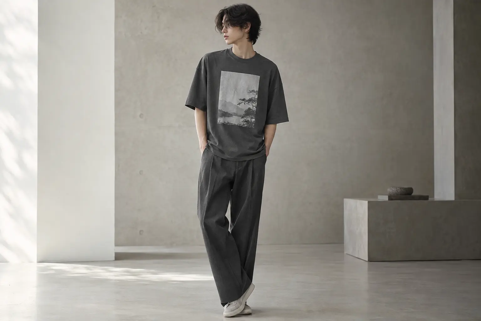
Korean unisex crewneck tee fit guide questions usually begin with one tempting shortcut: should you buy your normal size or go up for that relaxed streetwear shape? The useful answer is more precise. Start with the blank and a favorite tee’s measurements, then decide how much ease you actually want.
The StyleMZ selection here is built around two different blanks. Five designs use the 3001 blank, while BIG & BOLD uses the 5000 blank. That difference matters more than the word “premium” in a product title. A clean Korean-inspired outfit can look considered in a regular size, while an unnecessary size-up can make the body too long and push a front graphic out of balance.
Korean unisex crewneck tee fit guide: the decision in one sentence
If your priority is a neat, contemporary outline that works under an open shirt or with a restrained lower half, begin with a 3001-based design in the size that matches your favorite tee. If your priority is a looser, more substantial silhouette with an easy casual presence, compare the measurements of BIG & BOLD before choosing the same size or moving up.
The point is not that one blank is universally better. It is a decision about proportion. The 3001 blank used for most of these designs is a crew-neck, side-seamed unisex jersey tee made from 4.2 oz, 32-singles Airlume combed and ring-spun cotton in the standard solid construction. [1] The 5000 blank used for BIG & BOLD is listed as a 5.3 oz per square yard classic-fit tee with loose comfort, taped neck and shoulders, and a rib collar. [2]
Those differences create a useful starting point:
- Choose a 3001-based design in your measured size for a cleaner, lighter visual frame.
- Consider one size up on a 3001-based design only when you want deliberate extra ease and accept additional length.
- Choose BIG & BOLD when the heavier blank and roomier classic character are part of the appeal.
Imagine two hypothetical wardrobes. If you own slim, straight, or softly structured pieces and want the graphic to carry the interest, a 3001-based design gives you a more controlled starting point. If your wardrobe already leans relaxed and you want the tee to read as a broad, casual block, BIG & BOLD is the more coherent direction. Neither choice automatically produces a large Korean streetwear fit; the catalog does not document a Korean-market grading system or an oversized cut.
The practical rule is simple: let your preferred silhouette determine the size, then let the artwork determine the product. Do not reverse that order because a mock-up happens to look oversized.
3001 versus 5000: blank construction changes the silhouette
Fit is not just a letter on a size chart. The blank changes how the same graphic occupies the body, how the shoulder seam relates to the arm, and how much visual authority the tee has before you add any styling. This is why the product title alone is an unreliable shortcut.
What the 3001-based designs bring
The 3001 blank is described as a crew-neck, side-seamed unisex tee with a smooth surface intended for printing. Its standard solid construction is 100% Airlume combed and ring-spun cotton, 32 singles, and 4.2 oz. [1] In editorial terms, that makes it a strong starting point for an edited graphic-tee outfit: the side seams help establish a clearer body outline, while the lighter documented weight avoids making the garment’s bulk the whole story.
Do not transfer the standard solid composition to every color. The manufacturer lists a separate heather CVC construction with a cotton-polyester blend, so a heather color should be checked against the exact listing and garment label. A color name is not a substitute for a fiber specification.
What the 5000-based blank brings
The 5000 blank is the more substantial option in this comparison. Its product page lists a 5.3 oz per square yard fabric, classic fit for loose comfort, taped neck and shoulders, and a rib collar. [2] That makes it a plausible choice for a roomier, more visible casual shape, but it does not prove longer wear life against the 3001-based designs. Weight and construction are documented differences; comparative durability would require product-specific testing.
| Decision point | 3001-based designs | 5000-based BIG & BOLD |
|---|---|---|
| Best starting silhouette | Cleaner, lighter visual outline | Roomier classic shape with more visual volume |
| Documented blank weight | 4.2 oz, 32 singles | 5.3 oz per square yard |
| Construction details | Side-seamed, crew neck | Taped neck and shoulders, rib collar |
| Material caution | Solid and heather constructions can differ | Fiber content varies by color |
| Most useful styling role | Graphic-led, edited everyday outfit | Relaxed, broad, casual statement |
For a deeper explanation of why fabric weight and cut should be judged together, read StyleMZ’s comparison of heavyweight and standard tee silhouettes. The practical conclusion is simple: decide whether you want the garment to disappear around the graphic or become part of the graphic’s attitude.
That distinction also changes layering. A lighter, cleaner blank is easier to use beneath another casual layer without making the torso feel crowded. A heavier blank can stand alone more convincingly, but its visual volume should be balanced elsewhere in the outfit.
How to choose your unisex tee size without guessing
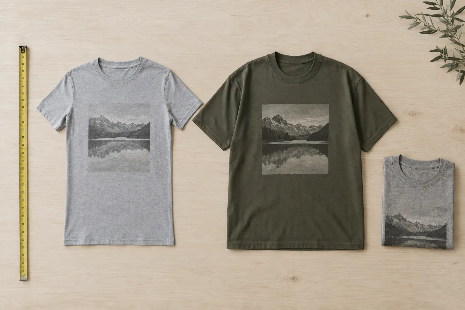
The most dependable sizing method is to compare a garment you already like, not to rely on the word unisex or on a body measurement alone. Pick a tee whose shoulder, chest, and length feel right. Lay it flat without stretching, measure the chest across the garment about one inch below the armpit, double that figure, and compare it with the current finished-garment chart for the exact product.
This method answers the real question: how much cloth do you want around your body? A body chart can tell you where you fall inside a manufacturer’s intended range, but a favorite tee tells you what your preferred silhouette looks like. Keep the reference garment in the same category. A relaxed tee is a poor benchmark for a close everyday fit, and a shrunken tee will distort the decision.
Use the following order
- Measure the reference tee. Record chest width and total length, and note whether the shoulder seam sits on or beyond your shoulder.
- Compare the product chart. Treat the listed number as a finished-garment measurement, not the measurement of your body.
- Check the available range. The catalog ranges differ by design. The Spirit of Korean and several other 3001-based designs are listed from S through 4XL or 5XL depending on the entry, while BIG & BOLD is listed from S through 5XL.
- Choose the intended ease. Match your reference tee for a controlled fit; add room only when a longer body and larger print field are acceptable.
One size up is a styling decision, not a guarantee of an oversized Korean silhouette. It can widen the torso, lower the shoulder line, and lengthen the body at the same time. Those changes may be welcome, but they happen together. If you want more room without a visibly longer hem, the answer cannot be assumed from the catalog; compare the exact measurements or choose the closer size.
Consider a hypothetical reader between two sizes who wants to wear a graphic tee under a cropped outer layer already in their wardrobe. The smaller option may preserve the intended visible area and avoid bunching. A reader who plans to wear the tee alone with a relaxed lower half may prefer the larger option, provided the hem does not overwhelm the outfit. In both cases, the measurement comparison decides; the label does not.
Another useful check is shoulder position. If your reference tee fits because the shoulder seam ends close to your shoulder edge, sizing up may change the character of the garment more than you expect. If the reference tee already has a relaxed shoulder, matching its chest measurement may be more useful than chasing a particular letter size.
Graphic tee fit: print scale, placement, and visual balance
A tee can fit correctly and still look wrong if the graphic scale does not suit the chosen ease. The body of the garment is the frame; the artwork is the focal object inside it. When you size up, you increase the available area around the print and change how far the design sits from the neckline, side seams, and hem. The result may look more spacious, or it may make a previously balanced graphic feel undersized.
Front-center artwork usually benefits from a deliberate torso proportion. Celadon Study, for example, is built around a detailed celadon vase illustration positioned at the front center chest, with medallions, floral motifs, geometric bands, and restrained grey-green, dark grey, and beige tones. Its design language is quieter than a full-bleed illustration. A close or true-to-reference fit keeps the vase legible as a composed object rather than letting it float inside excessive blank space.
Private signal takes a different route. Its front-only graphic uses a glitch-like abstract form, sound-wave patterns, distressed typography, and red accents against Heather Olive or Dark Grey Heather. That density can carry a looser silhouette more easily, because the design has enough visual information to remain assertive across a broader front panel. Still, a larger size should be chosen for the body shape you want, not as a substitute for graphic intensity.
Check three alignment points before sizing up
- Neck distance: does the top of the print remain visually connected to the crew neck, or does the extra body length create a large empty gap?
- Chest width: does the artwork stay central when the tee is worn, or do folds and excess width interrupt its shape?
- Hem relationship: will the print sit above the hem with enough breathing room, especially if you plan to tuck or half-tuck the tee?
Use print placement as a styling tool. A front-center illustration can anchor an otherwise minimal outfit. A dense, distressed graphic can set the mood without additional statement pieces. If you want six restrained ways to handle graphic proportion, StyleMZ’s minimalist Korean graphic tee outfit ideas are a useful companion.
The common mistake is to copy an image-based fit assumption from a model or product mock-up. A mock-up communicates artwork and general shape, not your final shoulder width, torso length, or preferred ease. Make the garment measurement the authority, then judge whether the print has enough room to breathe.
When the graphic is highly detailed, a little extra space can help individual elements remain readable. When the artwork is small or restrained, excessive ease may make it appear less intentional. This is why size and design should be considered together rather than in separate shopping decisions.
Which Korean-designed graphic suits your wardrobe?
Once the blank and size are settled, choose the artwork by the role you want it to play. StyleMZ’s designs do not all communicate the same level of visual volume. Some are cultural and illustrative, some are graphic and confrontational, and one is deliberately playful. The best choice is the one whose print language agrees with the rest of your wardrobe.
For a measured cultural statement
Celadon Study is the most restrained option in the group. Its front-print vase illustration uses a light grey-green, dark grey, and beige palette, with ornamental medallions and floral motifs. White, Baby Blue, and Silver color options give the design a quieter base than a high-contrast black tee. Choose your usual measured 3001-based size if you want the artwork to read like a considered art object rather than a large streetwear banner.
For a stronger cultural graphic
Traditional Korean mask dance drama is more visually expansive. The central masked creature, smaller red-masked figure, ribbon, and multicolor palette create a front graphic that can tolerate more casual ease. The catalog describes it as inspired by traditional Korean mask drama; that wording is the defensible description, so treat the artwork as cultural inspiration rather than generic fantasy imagery.
If you choose this tee, let the graphic remain the conversation. Keep the surrounding outfit calm, and avoid adding several unrelated motifs. Dark Olive, Vintage Black, and Black offer different levels of contrast, but the print itself remains the main event.
For playful confidence
BIG & BOLD uses a 5000-based blank and features a sunglassed gorilla in a floral Hawaiian shirt, sunset backdrop, and small crown accent. Its Sand, Sport Grey, and Military Green options reinforce an easy casual direction. Because the blank itself is roomier and more substantial, this is the better pick for a relaxed outfit when you want the tee to occupy space rather than disappear under another layer.
The Spirit of Korean sits between cultural symbolism and bold graphic dressing. Its stoic soldier, stylized Taegeukgi motif, distressed title, and vertical romanized phrases create a strong front statement. The catalog lists Heather Forest and Black Heather, with sizes S through 4XL. It suits a reader who wants a darker, more assertive base and is willing to style around the artwork. For practical outfit ideas specific to the flag motif, see how to wear a Taegeukgi graphic without a costume effect.
How to style a Korean graphic tee without forcing the look
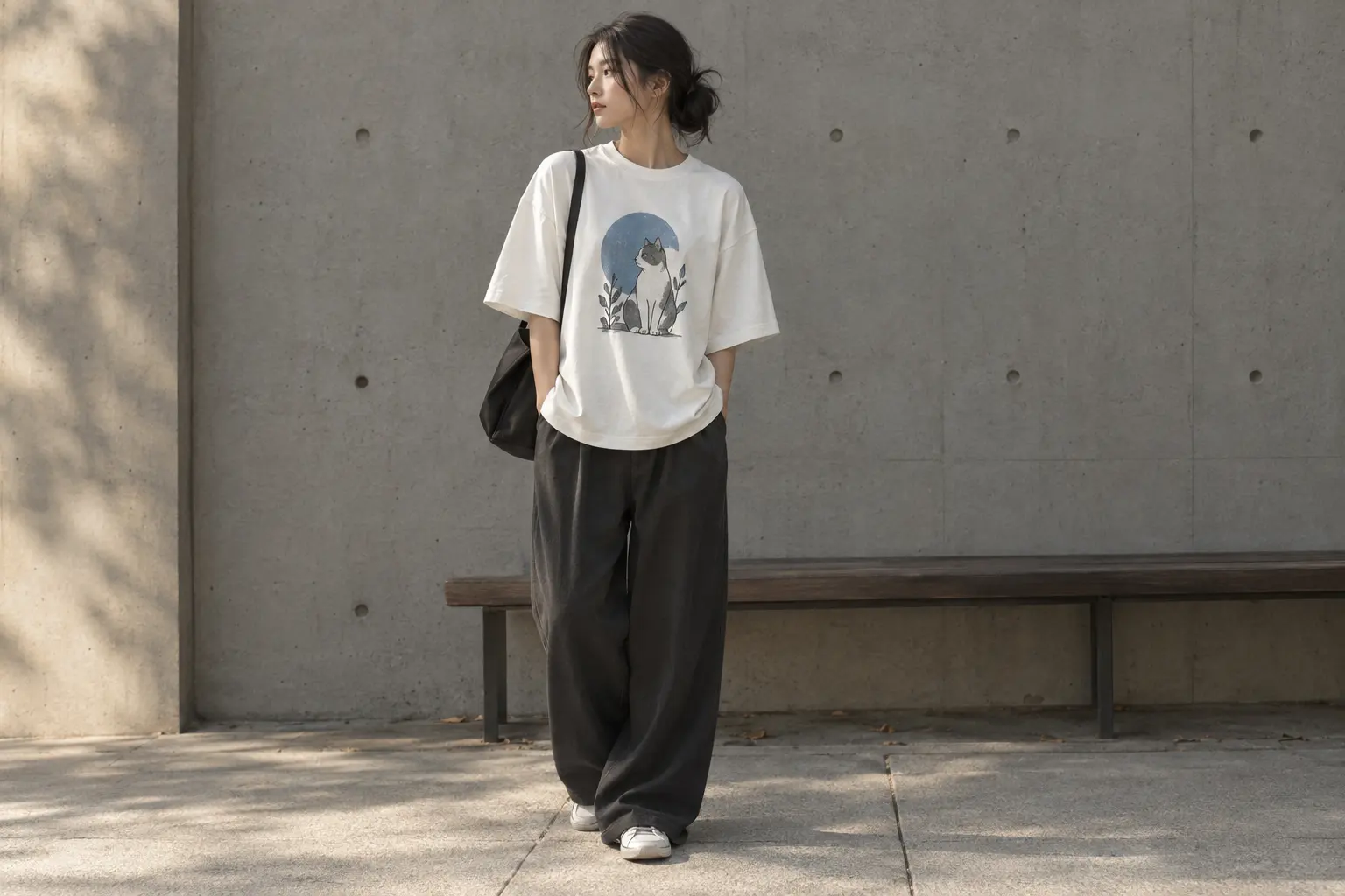
The strongest outfit usually gives the tee one clear job. If the graphic is dense, let the rest of the look provide line and restraint. If the graphic is quiet, use proportion, texture, or a deliberate color relationship to make the outfit feel finished. The aim is not to imitate a complete runway image; it is to make the printed object feel native to what you already wear.
Scenario one: the close, edited fit
Suppose you choose a 3001-based design in your regular measured size and want the outfit to work in a creative office or a low-key weekend setting. Keep the tee untucked or lightly tucked depending on the hem length, and use a simple lower-half silhouette from your existing wardrobe. The smaller scale of a close fit helps the graphic sit as a focal panel rather than turning the whole body into a single oversized block. Celadon Study is particularly suited to this treatment because its vase illustration and muted palette reward visual breathing room.
Scenario two: the relaxed streetwear fit
Suppose you size up on a 3001-based design or choose BIG & BOLD on the 5000-based blank because you want a broader, easier line. Let the shoulder and body volume be intentional. Avoid compensating with several additional oversized elements from your existing wardrobe, which can erase the graphic’s shape and make the outfit look accidental. A relaxed tee works best when at least one nearby proportion is controlled: a cleaner sleeve break, a defined tuck, or a lower half with less volume.
Scenario three: the statement graphic
For Traditional Korean mask dance drama or The Spirit of Korean, treat the artwork as the outfit’s visual headline. Start with one of the quieter colors already offered for the design, then repeat one minor tone from the print elsewhere in your existing wardrobe rather than matching every color. The approach keeps the cultural reference visible without turning the outfit into a themed costume.
Do not confuse styling polish with stiffness. A graphic tee can look intentional while remaining casual. The key is editing: one focal print, one clear silhouette, and no unnecessary competition around it. For a more specific bottom-half formula, StyleMZ’s graphic tee and denim outfit ideas cover ways to keep denim from making the look feel generic.
Color can also establish hierarchy. A pale or muted base lets a detailed illustration feel quieter, while a dark base can increase the force of a high-contrast design. The best color is not always the one that matches the most elements in the print; it is the one that gives the artwork enough separation without making the outfit feel overworked.
Print-on-demand care, color composition, and what to verify
Print-on-demand changes the buying conversation. The catalog states that these original designs are printed on demand near you and designed in Korea, but that wording does not establish that the garment was manufactured in Korea. Design origin, printing location, garment construction, and country of manufacture are separate details. Federal law requires that most textile and wool products have a label that lists the fiber content, the country of origin, and the identity of the manufacturer or another business responsible for marketing or handling the product; manufacturers and importers must also provide cleaning instructions under the Care Labeling Rule. [6]
That distinction is useful if you care about provenance. Read the product listing and final label for the exact information available, but do not turn “designed in Korea” into an unsupported “made in Korea” claim. The commercial strength of these pieces is the original graphic, the specified blank, and the made-to-order model, not an invented manufacturing story.
Color names are not fiber specifications
The standard solid 3001 construction is listed as 100% Airlume combed and ring-spun cotton, while the manufacturer’s separate 3001CVC construction is a cotton-polyester blend. [1] The 5000 blank page also lists different compositions for solids, Sport Grey, Ash Grey, and heathers or safety colors. [2] That means a Sand, Sport Grey, Military Green, Heather Olive, or Black Heather selection should be checked at color level rather than described automatically as 100% cotton.
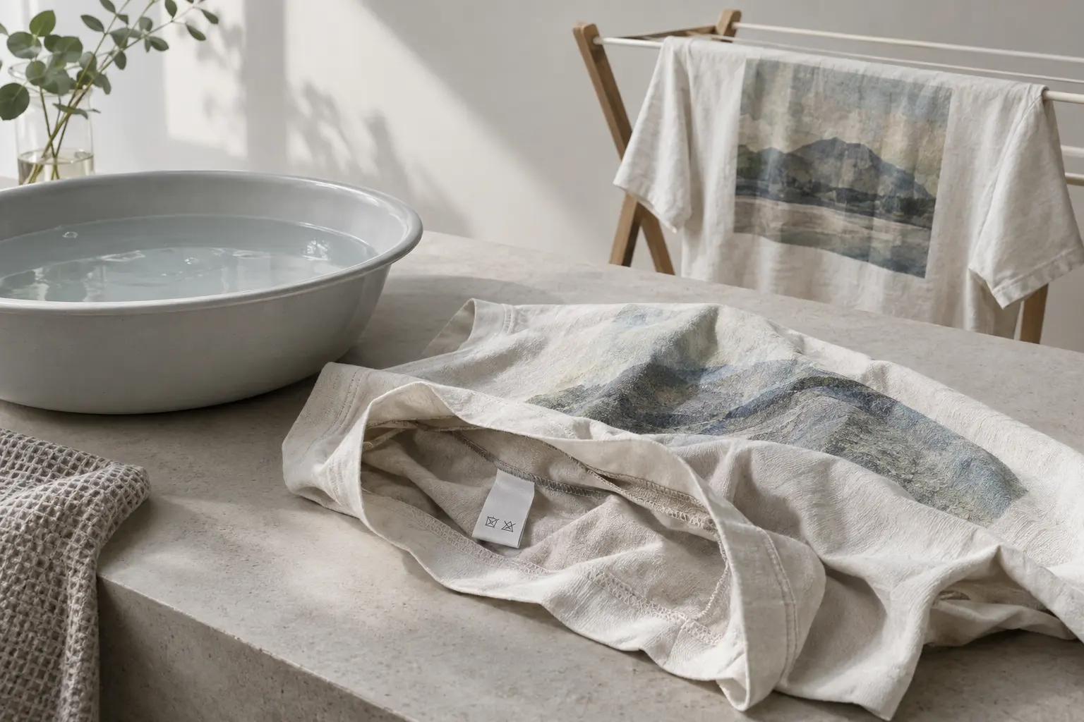
Care should follow the garment’s supplied instructions. As a cautious editorial rule, wash printed garments inside out in cool or cold water when the label permits, avoid direct high heat on the printed area, and use low-temperature drying or air-drying according to the supplied instructions. These steps may reduce unnecessary stress, but they cannot guarantee that a particular print will never crack, fade, or change hand-feel. No product-specific wash-test results are supplied here.
Finally, do not treat the word “premium” as a standardized textile grade. The defensible comparison is the exact blank, its documented weight and construction, the color-specific fiber content, the print placement, and the disclosed care information. If a listing does not disclose a print method, do not assume whether it is DTG, DTF, screen print, or another process.
The final buying rule for a cleaner or looser tee
At this point, the choice should be narrower than “Which Korean graphic tee looks coolest?” The better question is “Which blank and proportion will let this graphic work in my actual wardrobe?” That framing prevents a common error: choosing a larger size because an image suggests streetwear, then discovering that the added length changes the entire outfit.
Use this final rule:
- Choose a 3001-based design in your reference size when you want a controlled body line, lighter visual weight, and a graphic that stays central to the outfit.
- Size up on a 3001-based design when you have compared measurements and specifically want more ease, lower shoulder placement, and a longer body.
- Choose BIG & BOLD when its heavier blank and roomier classic character are more important than a cleaner outline.
- Choose the artwork last. Let print density, color, and cultural reference decide whether the tee is quiet, assertive, or playful.
For a hypothetical reader buying one versatile first piece, a measured 3001-based design is the safest starting point because it can be worn alone, lightly tucked, or under another layer without requiring an exaggerated silhouette. The Spirit of Korean makes sense if the wardrobe can support a darker, symbol-heavy focal point. Celadon Study is the more restrained route. BIG & BOLD is the better choice when you want the blank and gorilla illustration to project broad, relaxed energy.
A different reader may already own several close tees and want a deliberate shift. In that case, BIG & BOLD or a size-up 3001-based design can add useful volume, but only after checking the finished measurements. If the body becomes too long, the intended streetwear effect can turn into visual drag.
Another reader may care most about cultural illustration rather than silhouette. Traditional Korean mask dance drama offers the strongest multicolor front statement, while The Spirit of Korean uses a darker, more assertive composition. In either case, the graphic should lead and the rest of the outfit should support it.
The next sensible decision is practical: measure one tee you genuinely like, compare it against the exact listing, then choose the design whose graphic scale agrees with that proportion. Korean-inspired style is not a magic size. It is a relationship between line, blank, print, and restraint.
Shop the collection: Korean graphic tees, Korean long sleeve shirts, Korean sweatshirts, Korean hoodies and Korean tank tops – original graphics designed in Korea, made to order.
Frequently Asked Questions
Will a 3001-based tee look like a large oversized Korean streetwear tee?
Not by default. The 3001 blank is a standard unisex jersey blank used here for several designs, not a catalog-documented oversized Korean-market cut. Size up only after comparing finished measurements, because the change also adds body length and more space around the print.
Should I buy the same size in a 3001-based design and BIG & BOLD?
No, not automatically. BIG & BOLD uses a heavier, roomier classic-fit blank, while the other designs use a lighter documented construction. Compare both garment charts with a favorite tee; the same letter can produce a different amount of ease and visual volume.
Are all of these Korean graphic tees 100% cotton?
No. The standard solid construction used for the 3001-based designs is listed as 100% cotton, but heather constructions can use cotton-polyester blends. The 5000 blank also lists color-dependent blends, so check the exact color and final garment label rather than relying on the product category.
Is BIG & BOLD automatically more durable than the other tees?
Its documented 5.3 oz fabric, taped neck and shoulders, and rib collar make it the more substantial blank, but that does not prove longer wear life against the lighter designs. Durability also depends on the print process, washing, abrasion, and production conditions. Treat weight as a feel and construction difference, not a guaranteed lifespan claim.
Can I guarantee that a print-on-demand graphic will not crack or fade?
No product-specific guarantee can be made from the supplied information. Follow the garment's care directions, wash inside out when permitted, and avoid direct high heat on the printed area. Wash temperature, detergent, abrasion, ink system, and curing all affect the result.
Does designed in Korea mean made in Korea?
No. Design origin and garment manufacturing origin are separate claims. The catalog supports describing these designs as created by independent Korean fashion designers and printed on demand near you, but the country of manufacture should be taken from the exact label or product information.