
 OBJECT
If you’ve ever wondered what makes a graphic tee look vintage, three separate things are doing the work: the artwork, the ink, and the fabric under it. Most shirts sold as vintage-style control mainly the first. That’s not a trick. It just helps to know which part you’re paying for.
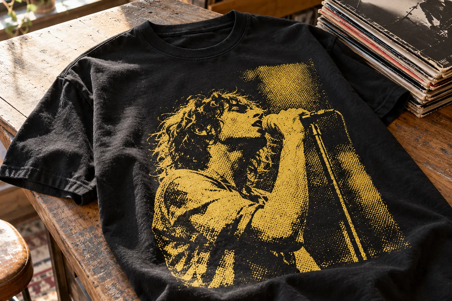
The difference matters at checkout. A halftone portrait with scraped edges can read as 1977 from across a room. Up close, it won’t feel like a shirt that has been through years of laundry unless the ink and finishing were chosen for that. This article covers each layer, what a product listing does and doesn’t tell you, and how to choose among a few of StyleMZ’s music and travel designs based on what you actually want the shirt to do.
What Makes a Graphic Tee Look Vintage: Three Layers, Three Questions
A vintage look isn’t a single effect. It’s a stack. The artwork sits on top and carries most of the visual signal. Under it is the ink system, which decides whether the print feels like a sticker or like part of the cloth. At the bottom is the garment itself: its fiber content, its weight, and whether it was washed or dyed after sewing.
One sourcing guide for washed graphic tees uses a similar split. It separates a garment wash that treats the whole shirt after sewing from a graphic treatment that distresses or softens the print itself [8]. The same guide says premium washed tees usually combine both, so the print doesn’t look stuck onto a crisp, untreated shirt [8].
That leads to a simple decision rule:
- You want the look. You’re buying the artwork. Judge the halftones, the distressing and the palette, and count any softness as a bonus.
- You want the feel. If you want a shirt that drapes and feels broken in from the first wear, you need confirmed process details: ink type, wash and dye method. Don’t infer them from a design description.
- You want the look to last. Here the blank’s fiber content and your laundry habits matter more than the art does.
For most gift buyers and everyday wearers, the first rule applies. A well-built distressed graphic on a sturdy cotton tee delivers most of the effect, and the rest comes with wear. The sections below take each layer in turn, so you can tell which one a given shirt relies on and whether that matches what you want.
The Artwork Signals That Read as Old
Designers have a fairly consistent toolkit for making new art look aged. Each tool imitates a real flaw of older, cheaper print jobs. That’s why they work: your eye has learned what tired ink looks like.
Halftones
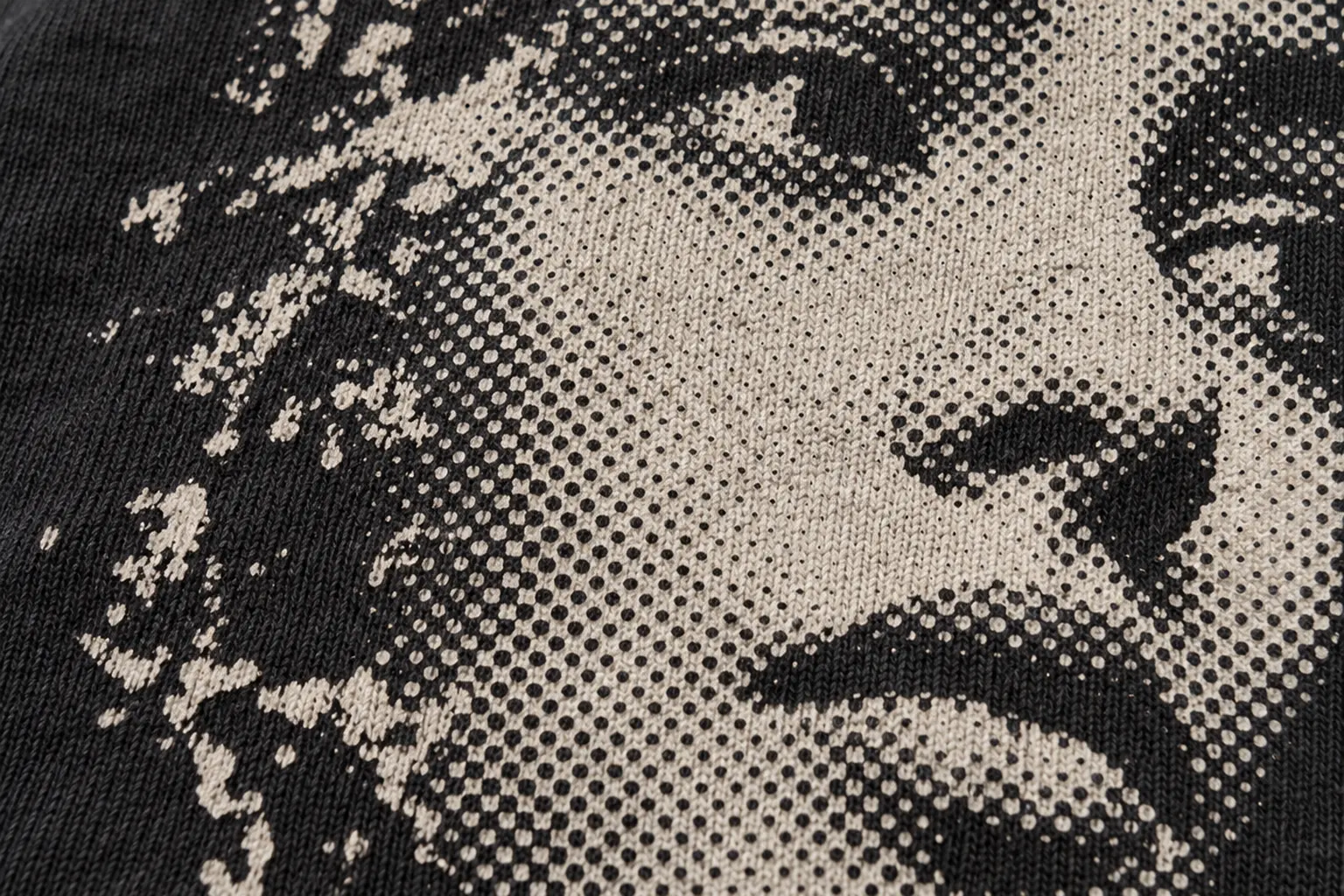
A screen-printed shape is either inked or it isn’t. To suggest shading, printers break tone into dots of different sizes, which is called a halftone. Fine dots blend into smooth gradients. Coarse dots stay visible and give an image the grain of an old newspaper photo or gig flyer. One print shop describes using higher mesh counts (230 and up) for fine detail and lower counts (110 to 160) to lay down heavier ink [6]. In practice, a deliberately chunky dot is one of the quickest ways to make a portrait look like it came from another decade.
Scrapes, flecks and knocked-out fills
Distressing removes small, irregular bits from solid areas so the ground color shows through. It imitates ink that has cracked and flaked over years of washing. Good distressing is uneven and doesn’t follow letter outlines. Bad distressing looks like a uniform filter laid over everything.
Limited, muted color
Older merch was often printed in a few spot colors, such as mustard yellow, black and off-white, rather than full photographic color. A small, slightly dusty palette reads as period. Bright neon gradients read as new, whatever else the art does.
Offsets and drop shadows
A second color nudged a few millimeters away from the first imitates the drift of a worn press. Cream or peach offsets behind lettering are a common example.
One distinction helps a lot here. Some designs are aged: they simulate wear, with halftone grit and scraped fills. Others are period: they borrow the style of an era, like sign-painted lettering or mid-century illustration, but are drawn cleanly. Both count as vintage, but they suit different people.
- Aged: “Vintage Night NYC” uses a halftone singer, distressed headline fills with no contour around them, and black stars and flecks crowding a rough yellow field.
- Period: “Vintage Train Interior” uses a circular badge with cream and tan lettering, an orange-red offset shadow and a hand-painted signboard edge. It’s nostalgic without pretending to be worn.
- Somewhere between: “risk make it flat” pairs comic-book red halftone shadows with a distressed painted swash under the phrase. It’s pop-art period styling with a little grit.
Ink Decides Whether a Vintage Print Feels Old
The artwork controls how a shirt looks. The ink controls how it feels in your hand and how it changes in the wash. That’s where many new vintage-style shirts and actual old shirts differ.
Discharge ink takes the most direct route. It doesn’t add a layer on top of the fabric. It chemically removes the garment’s existing dye and can replace it with pigment, so the print sits inside the fiber [4]. The trade-off is compatibility: discharge works only on reactive-dyed natural fibers, and polyester doesn’t discharge at all [4]. The same reference notes that slight variation between dye lots is treated as a deliberate feature in distressed vintage work [4].
Water-based inks also soak into the fibers instead of sitting on top, which gives a soft hand once cured [5]. Their weakness is opacity on dark garments, where they often need a discharge underbase or several passes [5]. Their advantage for this topic is that properly cured water-based prints tend to soften further with each wash [5].
Plastisol is the workhorse. It’s a PVC-based ink that cures with heat into a layer on the fabric surface [5]. It is bright, opaque and durable, but heavy deposits can feel thick and rubbery [5]. Printers can thin it and add softening bases, but it rarely feels as integrated as ink that has soaked in.
Direct-to-garment (DTG) printing, common in made-to-order production, deserves a mention too. One sourcing guide says DTG works best on fabric that was washed before printing, and on 100% ring-spun cotton [8]. The same guide warns that a DTG print can look pristine on a worn garment, which is a mismatch if you wanted both to age together [8].
| Ink system | Where the ink sits | Hand feel | Vintage character | Main catch |
|---|---|---|---|---|
| Discharge | Inside the fiber, replacing dye | Very soft, close to the bare fabric | Strongest; dye-lot variation reads as age | Natural reactive-dyed fibers only; not for poly blends |
| Water-based | Soaked into the fibers | Soft, matte | Good; tends to soften with washing | Weak opacity on dark shirts without help |
| Plastisol | Cured layer on the surface | Thin to rubbery, depending on deposit | Comes from the artwork more than the ink | Can feel applied rather than worn in |
| DTG | Pigment on pretreated cotton | Varies with pretreatment and color | Comes from the art; print may stay crisp | Print and fabric may not age in step |
The practical point: a design description tells you about shapes and colors, not chemistry. If the soft, faded hand is the reason you’re buying, you need the ink type confirmed. If the image is the reason, any of these systems can carry it.
Garment Dyes and Washes: The Vintage Feel You Can't See in a Photo
Beneath the ink is fabric treatment, and this is the hardest layer to judge from a product photo. Washes and dyes change how the whole shirt drapes, and they’re what make a true thrift-store find feel slack and soft.
The standard methods, as one sourcing guide describes them:
- Enzyme wash: cellulase enzymes break down cotton fiber surfaces for a soft, sueded hand and subtle, even fading [8].
- Stone wash: pumice tumbled with the garments gives more pronounced, random fading and can be harsher on fabric and seams [8].
- Acid wash: potassium permanganate creates high-contrast, splotchy bleaching, usually on dark garments [8].
- Garment dye: the tee is dyed after sewing, which produces the color variation at seams and hems associated with high-end vintage style [8].
Order of operations matters as much as the method. When a shirt is printed first and washed afterward, the print fades with the fabric, a sequence the same guide describes as standard for discharge inks [8]. When a blank is washed first and printed afterward, the graphic sits on the finished surface and keeps its edges [8]. A garment-dye specialist also notes batch variation as part of the character of dyeing finished garments [7].
These are batch processes. The sourcing guide puts typical minimums for basic washed tees at 500 to 1,000 pieces per style and color, with garment-dyed runs often higher [8]. That economics doesn’t suit printing one shirt at a time, which is how made-to-order graphic tees are usually produced.
So read the listing for exactly what it claims. The descriptions for the designs in this article cover artwork: halftones, distressed fills, palettes and lettering. They don’t state a discharge print, a garment dye or an enzyme wash, so don’t assume one. If you want that factory-softened feel before buying, ask for confirmation. Otherwise, expect a standard cotton tee whose vintage character lives in the print and builds with your own washing.
Not everyone wants a pre-faded shirt anyway. Washed and garment-dyed tees vary from batch to batch, so two gifts in the same color may not match. A clean blank under distressed art gives you a predictable color and lets the shirt age at your pace.
The Blank Under the Print: What the Gildan 5000 Brings
Most of the tees here are printed on the Gildan 5000 Heavy Cotton blank, so its construction sets the baseline for fit and wear. The manufacturer lists it at 5.3 oz per square yard with a classic fit [3]. It has taped neck and shoulders and a non-topstitched rib collar in a classic width [3]. The tear-away label is a small comfort point if neck tags bother you [3].
Pick the color by fiber, not just shade
The blank’s fiber content varies by color, and this is the most useful thing to check before buying. Per the manufacturer, solid colors are 100% U.S. cotton [3]. Sport Grey is 90% cotton and 10% polyester, Ash Grey is 99% cotton, and heathers and safety colors are a 50/50 cotton-polyester blend [3].
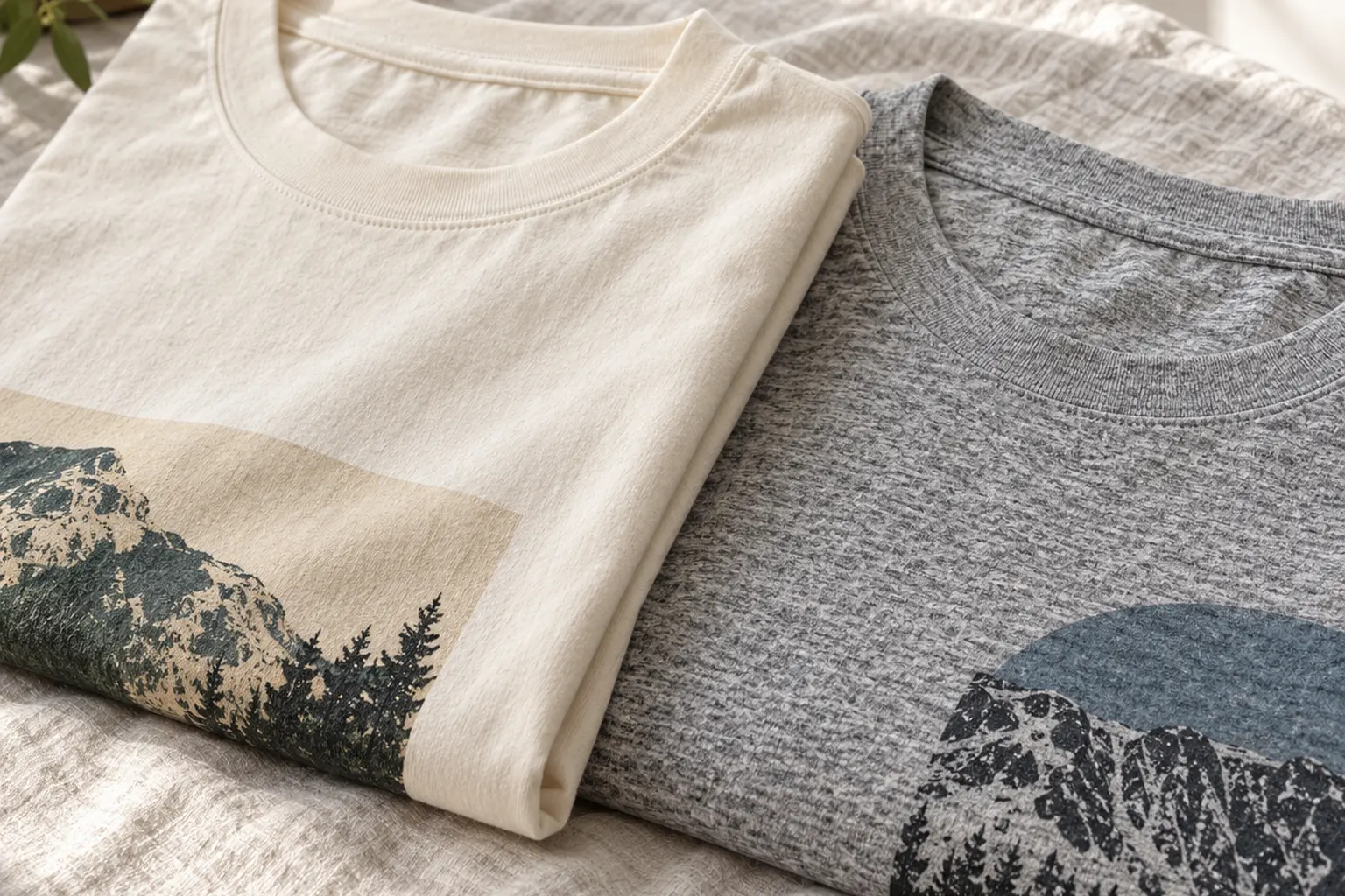
That affects the vintage question in two ways. First, any process that depends on cotton chemistry, such as discharge, behaves differently on a blend. Second, heather fabric has a built-in mottled texture that already reads as worn in, so a heather shirt can look slightly aged before the print does anything. Solids give the print a cleaner, flatter ground that shows halftone grain more crisply.
- Want the art to carry everything? Choose a solid, where the fabric stays out of the way.
- Want a softly weathered overall look? A heather adds texture, as long as the design has enough contrast to stay legible.
- Want a faded-paper feel? Natural or cream-type solids make bright fields look slightly aged next to the off-white ground.
Fit and size range
A classic fit is a straight, regular cut, not a boxy oversized one. If you’re after the slouchy shape of a well-worn concert tee, size up deliberately rather than hoping the cut does it for you. Our explainer on choosing between oversized and regular fit covers that trade-off. The 5000-based designs here run from S to 5XL, which makes them easier gifts across body types. Measure a favorite shirt against the chart using our unisex graphic tee sizing guide.
“Vintage Night NYC” shows how color choice changes the read. It comes in Light Pink, Natural, Navy, Military Green and Black. On Natural, the rough yellow field and halftone singer look like an old flyer on aged paper. On Black, the yellow block pops harder and the scraped patches show the dark shirt through them, which suits someone who wants the print to read as worn concert merch.
Matching the Design to the Kind of Vintage They Like
Once you know the layers, choosing a design gets easier. The question isn’t which shirt is most vintage. It’s which kind of vintage fits the person wearing it. Here are three hypothetical shoppers.
The record-collector dad
Say you’re buying for someone who owns more jazz on vinyl than anyone needs and still talks about a club that closed years ago. Simulated wear may matter less to him than a period look that feels like a real poster. “Downtown Vintage Jazz House” fits that brief. A brick-red diagonal banner cuts across a gold-and-black saxophone. The body is built from black stippling, with individually outlined keys. “Downtown” is packed into very tall, condensed navy capitals, each letter with a narrow peach offset, and an orange “Jazz” script runs over the lower horn.
It reads more as mid-century bill poster than as a faded relic, which keeps it looking sharp at a dinner. It comes only in darker grounds (Maroon, Black, Navy and Forest Green), so the gold horn and orange script have something to stand against. The design is dense, so the person should like a busy chest print. If he prefers one small logo, this isn’t his shirt.
The flea-market regular
If the recipient hunts thrift racks for cracked old band shirts, choose the aged style over the period style. “Vintage Night NYC” is the most heavily distressed design here. It has halftone grain on the face and hand, scraped interruptions in the headline, a February 3rd, 1977 date line with a lifted “rd,” and flecks across the ground. It’s a costume of age, done with care, and it works best on someone who likes that conversation-starter quality.
The traveler or photographer
For someone who collects train tickets or always has a camera, the travel designs offer nostalgia without grit. “Vintage Train Interior” places a muted teal, blue and rust-red carriage inside a circular badge that reads “Life is long strange trip,” with a far-end sign reading “NEXT STOP A BRIGHTER DAY.” Its colors include Natural and Ash Heather, and the heather adds the soft texture covered earlier. “Vintage Voyage” is a full-color shore scene: a kneeling photographer, cream-sailed boats and red connected script reading “Capture the Moment,” offered on Black, Navy, Maroon and Forest Green.
Then there’s “risk make it flat,” for the house painter, the DIY weekend warrior or anyone who enjoys a dry pun. The comic halftone shadows behind the cream “risk” give it a retro pop-art flavor rather than a worn one. Its range includes Dark Heather and Sport Grey Heather, so check the fiber content of the color you pick against the guidance above.
Tee or Long Sleeve: Same Artwork, Different Job
The singer portrait appears twice in this lineup, which makes it a clean test of format. “Vintage Night 1977” carries the same closed-eye singer, angled microphone, worn halftones and curling cable as the NYC tee, arranged as a compact music-poster mark on a long-sleeve shirt.
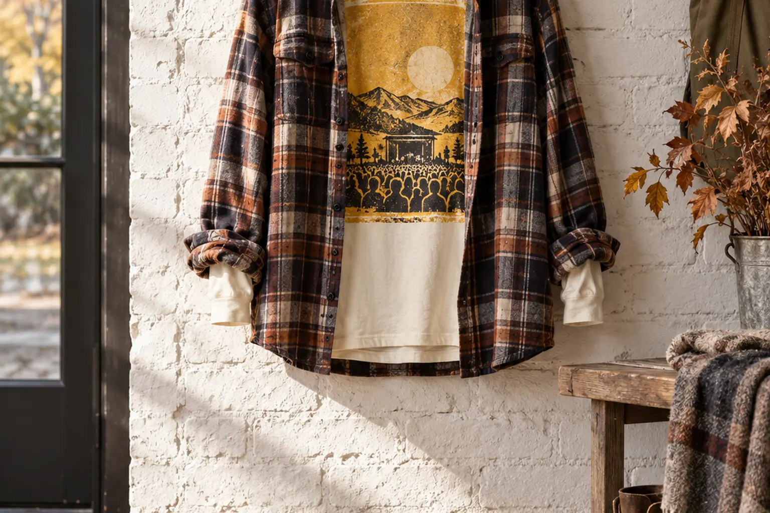
Choose the long sleeve when the shirt has to work as a layer. Vintage-style graphics often look most natural half-covered under an open overshirt or a jacket you already own, the way old tees end up being worn. Long sleeves suit fall evenings and air-conditioned offices, and the sleeve itself adds to the casual, lived-in silhouette. Our article on layering a graphic tee for fall covers how to keep the print visible when you add layers.
Check two differences before you choose:
- Size range: the long sleeve runs S to 2XL, while the matching tee goes to 5XL. For larger recipients, the tee is the safer pick.
- Colors: the long sleeve comes in White, Light Pink, Black and Military Green. White gives the yellow field a crisp, high-contrast frame, and Black gives the scraped patches more bite.
It’s printed on the Gildan 2400 long-sleeve blank, a different garment from the 5000. Check its fabric details on the listing rather than assuming they match the tee. If you’re unsure about format, the rest of our long-sleeve shirts show how other designs sit on the longer body.
Caring for a Vintage-Style Tee So It Wears In, Not Out
A vintage-style shirt is meant to keep aging, but there’s good aging and there’s damage. Fabric softening and gradual color mellowing are the good kind. Cracked, peeling ink is a production or laundry failure, not character.
Curing is where most print failures start. One print shop calls improper curing the main reason screen prints fail, and notes that a print can look perfect off the press yet fall apart if the ink didn’t reach the right temperature through its whole layer [6]. Plastisol in particular can crack and wash off when undercured [5]. You can’t control the curing, but you can avoid adding heat and abrasion that stress any print.
A sensible routine
- Turn the shirt inside out so the print doesn’t rub against zippers and rough fabrics in the drum.
- Wash cold on a gentle cycle with similar colors.
- Tumble dry low or hang dry. High heat is hardest on prints and on cotton shrinkage.
- Skip bleach. The blank may be rated for bleaching as a decorating technique, but that doesn’t mean the printed design will survive it.
- Don’t iron directly on the print. If you must, iron inside out.
Where a garment care label or a decoration-specific care card exists, follow it over any general advice, including this list.
With that routine, the cotton relaxes, the dark grounds soften slightly, and a well-made distressed design starts to look as if it has always looked that way. That’s the realistic version of vintage for a new shirt: art that reads old from the first day, and fabric that catches up with it.
Your next step is the boring but decisive one. Pick the color by fiber content, then size by measuring a shirt you already like. If you’re still choosing between a tee and something heavier for cooler months, the T-shirt collection is the place to compare designs side by side.
Frequently Asked Questions
What makes a graphic tee look vintage instead of new?
Mostly the artwork. Visible halftone dots, irregular scraped or flecked fills, a small, slightly muted palette and offset shadows all imitate how old prints aged. Ink that soaks into the fabric and garment washes add the soft, broken-in feel. A new shirt can look vintage through its art alone, but it only feels vintage if the ink and finishing were chosen for that.
Is a distressed print the same as a discharge print?
No. A distressed print is a design choice: worn texture drawn into the artwork, which any ink system can print. Discharge is a printing chemistry that removes the shirt's dye and replaces it with pigment, so the print sits inside the fiber. A shirt can have one without the other, and a description of the artwork alone doesn't tell you which ink was used.
Will a vintage-style print crack over time?
It shouldn't if it was cured properly and you wash it gently. Cracking usually comes from ink that didn't reach its full cure temperature or from heavy surface deposits, not from the vintage design itself. Washing inside out in cold water and drying on low heat removes most of the stress you control. Real cracking isn't the intended look, even on a distressed design.
Does a heather color make a tee look more vintage?
Often, yes. Heather fabric has a mottled, slightly uneven tone that reads as worn before the print adds anything. On the Gildan 5000 blank, heathers are a 50/50 cotton-polyester blend, while solids are 100% cotton. Pick a solid if you want the artwork to carry the effect cleanly, and a heather if you want an overall weathered texture.
Can I make a new graphic tee look vintage at home?
The safest way is time: regular cold washes and low-heat drying gradually soften cotton and mellow colors without attacking the print. Aggressive home tricks like bleach, hot cycles or abrasion are more likely to damage the graphic than to age it gracefully. If you want factory-style softness immediately, look for a shirt that's explicitly described as washed or garment-dyed rather than trying to recreate it in a home washer.