
 OBJECT
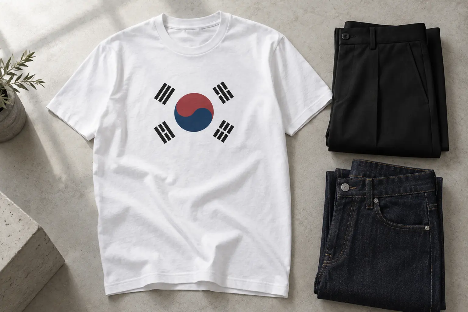
Korean flag Taegeukgi tee styling has one real problem: the graphic is already finished. A white field, a red and blue circle, four black trigrams. There is nothing for an outfit to add, and plenty for it to disturb.
So the useful answer comes early. Wear the flag as the single statement, keep it intact and flat, and build everything else from its four colours. If that sounds too ceremonial for an ordinary Tuesday, the better move is a different kind of Korean graphic. A lettering-led original such as the Stillness oversized tee carries Korean design without carrying a national symbol. The rest of this piece explains why, and where the rule bends.
Why the Taegeukgi Is Harder to Wear Than Other Graphics
Most graphic tees are illustrations. You can crop them with a jacket, half-tuck them, let a bag strap cross them, and the image survives because the eye fills in the rest. A flag does not work that way. It is a diagram with fixed parts, and it only reads correctly when all of them are present.
The official description is short. The Taegeukgi consists of a white background, a red and blue taegeuk circle in the centre, and four black trigrams, one in each corner [6]. Korea’s flag law fixes the arrangement further: the upper part of the circle is red, the lower part is blue, and the trigrams are black [7]. The flag itself is drawn to a three-to-two proportion [7].
What each part is doing
- The white field. The white background represents brightness, purity and peace [6]. In design terms it is also the breathing room, and it takes up most of the image.
- The taegeuk. The circle denotes the harmony between yin, shown in blue, and yang, shown in red [6]. It is the only saturated colour in the composition, so it becomes the focal point of anything you wear with it.
- The four trigrams. They symbolise sky, earth, water and fire [6]. Visually they are four small black anchors that define the corners, which is why hiding one unbalances the whole design.
There is a reason the layout feels so settled. Early versions of the flag took different forms for lack of specific guidelines, and a correction committee announced National Flag Construction Guidelines in October 1949 [6]. What you are wearing is a deliberately regulated piece of geometry, not a loose motif.
That has two styling consequences. First, the graphic is mostly empty space with a small, intense centre, so anything loud nearby wins the fight for attention and leaves the flag looking like an afterthought. Second, the image is symmetrical around a point. A tilt, a twist in the fabric or a covered corner is noticed immediately, in a way it never would be on a drawing of a bird or a bouquet.
The Korean Flag Taegeukgi Tee Styling Rule: One Statement, Kept Whole
Here is the rule in one line: a flag tee is the outfit’s only statement, and it is worn whole. Everything else is a supporting decision. It sounds restrictive. In practice it removes most of the guesswork.
Three checks before you leave the house
- Is the whole flag visible? An open jacket that covers two trigrams turns the flag into a red and blue dot between two lapels. Either wear the layer fully open and pushed back, or close it and accept that the tee is not the point today.
- Is it lying flat? A chest print pulled tight across the body bends the circle into an oval. A print that hangs in deep folds breaks the trigrams into fragments. This is a sizing question as much as a styling one, and it is the main reason a slightly relaxed cut tends to serve a geometric graphic better than a tight one.
- Is it alone? No second graphic, no large logo on an overshirt, no patterned scarf sitting on top of it. One symbol per outfit.
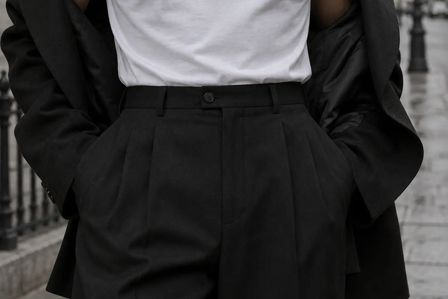
The tuck matters more than people expect. A full tuck into high-waisted trousers keeps the print flat and centred. A half-tuck drags the hem diagonally, and on a symmetrical design that diagonal reads as a mistake. If you prefer the shirt untucked, let it hang straight.
Where the rule relaxes
Not every Taegeukgi design is a full flag. Korean law states that the taegeuk circle and the trigrams may be used together or separately on goods [7]. A tee that carries only the circle, or a single trigram on the chest or sleeve, behaves like an ordinary graphic. It has no corners to protect and no proportion to distort, so it tolerates layering, half-tucks and a busier outfit far better.
That gives you a simple fork. Full flag: treat it formally and dress around it. Isolated element: treat it like any other print, with the general principles for styling Korean graphic T-shirts without overdoing it applying as normal. Knowing which one you own, or are about to buy, settles most of what follows.
Building an Outfit From the Flag's Four Colours
The flag hands you a palette: white, red, blue and black. The mistake is to use all four again in the rest of the outfit. Repeating every colour produces a costume, the look of someone dressed as a flag instead of wearing one.
Pick one colour to echo and let the others stay on the shirt.
- Echo the black. Black trousers or a black overshirt you already own pick up the trigrams and frame the print. This is the quietest option and the hardest to get wrong.
- Echo the blue. Indigo denim works because blue is already in the circle. Mid and dark washes sit comfortably. A very bright blue competes with the taegeuk instead of supporting it.
- Echo the white. White or off-white bottoms extend the field and make the whole outfit feel lighter. It suits warm weather and leaves the circle as the only colour on your body.
- Leave the red alone. Red is the most assertive colour in the design and among the smallest in area. A second red, in a cap, a sneaker or a bag, splits attention between two points. If you want red, keep it to something small and far from the chest.
Neutrals that sit outside the palette
Grey, stone, khaki and olive are useful precisely because they are not in the flag. They add nothing to the colour story, which is what you want from a supporting piece. Olive cargo trousers or stone chinos from your own wardrobe let the tee read as a considered graphic and not as fan kit.
Patterns to avoid
The trigrams are sets of short parallel bars. Put them next to stripes, checks or any other regular linear pattern and the two geometries interfere. Texture is the safer way to add interest: denim, corduroy, a heavy knit, a waxed jacket. They bring depth without bringing lines.
One last point concerns the garment colour itself. On a white tee the flag’s field and the shirt are the same colour, so the design becomes a floating circle with four marks around it. It looks cleaner, more graphic, less literal. On a coloured or dark tee the white field has to be printed as a rectangle, and the flag reads as a flag, edges included. Neither is wrong. They are different moods, and the second one is more declarative.
Respect, Intact Prints and What Korean Law Actually Says
A flag tee raises a question an ordinary graphic never does: is this appropriate? For the Taegeukgi there is a clear written reference point, and it is more permissive than many people assume.
The Act on the Flag of the Republic of Korea states that the national flag or the flag pattern may be used for various goods [7]. A printed T-shirt falls comfortably inside that idea. The same article sets two limits: the flag or pattern is not to be used by making a hole through it, cutting it or damaging it in any other way, and it is not to be used in a manner that causes a sense of repugnance [7].
This is Korean domestic law, summarised here for context and not as legal advice. Its value to you as a wearer is that it describes, in plain terms, what the flag’s home culture regards as careless treatment. The stated purpose of the Act includes defending the dignity of the national flag [7].
What that means in styling terms
- Do not customise through the print. Cropping a tee with scissors, slashing it or distressing it are common streetwear moves. On a flag tee, any cut that runs through the motif is the one treatment the law names directly. If you want a cropped shape, buy the shape.
- Check the orientation. Red belongs on the upper half of the circle and blue on the lower. A print with the colours reversed is an error, and it is worth a glance at the product image before ordering.
- Mind what sits next to it. Slogans, jokes or imagery that would embarrass the symbol are a judgment call, and the simplest answer is to keep the flag free of company.
- Retire a ruined print. A flag graphic that has cracked or faded badly looks neglected in a way a faded band tee does not. Move it to home wear.
If you are not Korean, none of this bars you from wearing the flag. Context does the work. A match, a national holiday, a cultural event or a trip are occasions where the tee has an obvious reason to exist. As an everyday default it can feel heavier than you intend, which is the honest argument for owning a second, lighter kind of Korean graphic too.
Print and Fabric: Why the White Field Changes Everything
How a flag graphic looks on fabric depends heavily on something most product pages mention only in passing: the colour of the blank and how the white is produced.
White ink is the hard part
Direct-to-garment printing jets ink straight onto the garment and is designed for short to medium runs [4]. That makes it a natural fit for made-to-order clothing. Colour inks alone are enough on a white shirt, because the shirt supplies the white. On a dark shirt the white field has to be laid down as ink.
That step needs preparation. Pretreatment creates a barrier on the garment so that white ink sits on top of the fibres and forms an underbase for the colour inks printed over it [4]. For a Taegeukgi, where white covers most of the design, the quality of that underbase decides whether the field looks crisp and opaque or thin and greyish.
Fibre matters as well. One printer manufacturer describes items with open, porous fibres such as 100% cotton as ideal for the process [4]. The same source says the washability of a properly cured print should be very similar to that of a properly cured water-based screen print [4]. The phrase to notice is “properly cured”: durability comes from the production process as much as from the ink.
What to check before ordering any flag tee
- Print method. Not every made-to-order shirt is printed the same way. Look for the method on the product page.
- Fibre content for your exact colour. Confirm the composition listed for the colourway you are choosing, not only the headline description.
- How the white is shown. On dark blanks, zoom in on the field. Flat, even white is the sign of a good file and a good print.
- Print size relative to garment size. A flag that fills a small may look modest on a 2XL. Product photos on a model near your size are more informative than a flat mock-up.
- Care instructions. Follow the label supplied with the garment. It overrides any general habit.
The practical summary: a white or natural tee gives you the most forgiving version of the flag, because the largest area of the design needs no ink at all. A black or navy tee gives you the most dramatic version and asks more of the printing. Choose with that trade-off in view.
When a Korean Lettering Graphic Does the Job Better
Some days the flag is too much. You want Korean design in the outfit, not a national symbol on your chest at the supermarket. That is where a lettering-led graphic earns its place.
To be clear about what follows: none of the StyleMZ pieces below is a flag print. They are original illustrations that use Korean lettering, and they solve a different problem, which is everyday wear with a Korean design signature and none of the ceremony.
Stillness: the closest in temperament
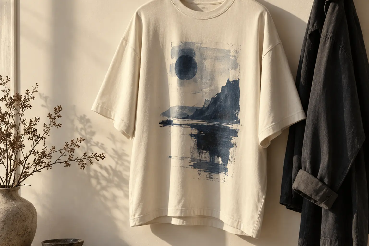
The Stillness Men’s Oversized Heavyweight Crewneck T-Shirt shares something structural with the flag. Its design is built on blue: a long-legged bird with a golden-yellow beak and navy crown stands above two large blue characters, navy reflections and concentric ripples, with the word STILLNESS in dimensional capitals below. The Korean lettering above the scene translates to the same word. A broad open area beside the bird’s neck balances the composition, the same use of empty space that makes the Taegeukgi feel calm.
It comes in Cream and Peach, in sizes S to 2XL. Cream is the choice if you like the pale-field logic of the flag. The same colour rule applies: echo the blue with denim, or frame it in black, and keep everything else quiet.
Breaktime Gathering: two colours, long sleeves
The Breaktime Gathering Unisex Longsleeve T-shirt is a two-colour illustration in navy and white. A deep navy silhouette with a scalloped edge holds two seated friends with mugs and a dog at their feet, and the Korean words for Break Time run across the top in broad, unoutlined white brush strokes. The restraint is the appeal. Two colours behave almost like a neutral.
It is offered in Black, Navy, Maroon, Forest Green and Cardinal Red, sizes S to 2XL. Dark blanks plus sleeves make it the cool-weather option here.
| Piece | Graphic and lettering | Garment colours | Sizes | Best for |
|---|---|---|---|---|
| Stillness Men’s Oversized Heavyweight Crewneck T-Shirt | Bird over blue characters and ripples; Korean and English word for stillness | Cream, Peach | S to 2XL | Quiet daily wear with a pale field |
| Breaktime Gathering Unisex Longsleeve T-shirt | Navy and white rest scene; Korean words for Break Time | Black, Navy, Maroon, Forest Green, Cardinal Red | S to 2XL | Cooler days, dark outfits |
| Daisy Shirt Gorilla Heavyweight Unisex Crewneck T-shirt (Gildan 5000) | Gorilla in orange lenses and teal daisy jacket; Korean line meaning “you worked hard today” | Sport Grey Heather, White, Sand, Natural | S to 5XL | Loud dressers, gifts with a message |
| Groove Night Heavyweight Unisex Crewneck T-shirt (Gildan 5000) | Black slanted lettering, orange flowers, olive leaves; English text only | Maroon, Black, Navy, Garnet, Forest Green, Cardinal Red | S to 5XL | Evenings out, dark blanks |
Read the table by mood. The first two are quiet and the last two are loud. If the flag appealed to you for its order and its space, start with the top half.
Three Situations, Three Different Answers
The rule only becomes useful when it meets a real day. Three hypothetical cases show where the recommendation changes.
If you are dressing for a match or a national occasion
This is the flag’s home ground. Wear the full Taegeukgi tee, on a white blank if you have the choice, with nothing over it or with a jacket worn fully open. Black or dark indigo below. Plain footwear. The crowd will supply all the red anyone needs, so there is no reason to add your own. Size the shirt so the print sits flat when you raise your arms, because that is how you will spend most of the afternoon.
If you need something for an ordinary working week
Here the flag loses. Under an overshirt or a cardigan it will be half-covered for most of the day, which breaks the first check, and a national symbol in a meeting carries more weight than you probably mean it to. A lettering graphic handles partial cover without complaint. Stillness in Cream under a dark overshirt you already own shows the bird and a slice of blue, and still makes sense. Breaktime Gathering works on its own as the top layer once the weather turns.
If you are buying for someone who loves Korean culture
A flag is a personal thing to give. You are guessing at the recipient’s relationship with a country, and at whether they would wear its symbol in public. A graphic with a translated phrase is the lower-risk present, because the meaning travels with it and can be explained in a sentence.
The Daisy Shirt Gorilla Heavyweight Unisex Crewneck T-shirt on the Gildan 5000 blank is the example. A gorilla in reflective orange sunglasses and a teal, daisy-covered jacket sits between block lettering reading BIG and BOLD, and beneath it an orange-to-yellow Korean line means “you worked hard today.” It is funny first and kind second. The tee runs from S to 5XL in Sport Grey Heather, White, Sand and Natural, a range matched here only by the other Gildan 5000 tees, which helps when you are estimating someone else’s fit. A long-sleeve version on the Gildan 2400 blank comes in Ash Heather, Carolina Blue, Light Pink and Sand, sizes S to 2XL.
One caution. This is a dense, high-contrast design, the opposite of the flag’s restraint. Give it to the person who dresses loudly, not the one who owns six grey sweaters.
Fit, Layering and the Next Decision
Fit decides whether a geometric print looks intentional. The flag and its quieter cousins both benefit from fabric that hangs instead of clinging, so the choice between a regular and an oversized cut is worth making deliberately, not by sizing up at random.
Regular or oversized
A regular cut keeps a centred chest graphic where the designer placed it and tucks cleanly. An oversized cut drops the shoulder seam and adds width, which gives the print more flat surface and suits wide or straight trousers. The Stillness tee is an oversized style by design. Its width is part of the pattern, so compare the size chart with a tee you already own before assuming you need to go up. The Gildan 5000 and 2400 pieces are described as unisex, and the size chart on each product page is the reference for chest width and length. The reasoning behind choosing shape, not size, in an oversized versus regular-fit graphic tee applies directly.
Layering without hiding the graphic
- Under the tee. A plain long sleeve you already own, worn beneath a short-sleeved graphic, adds warmth and leaves the print untouched. White under a white-field flag tee is nearly invisible. Black adds a second frame at the wrists.
- Over the tee. Choose outer layers that open wide. Anything with a broad lapel, or a zip worn half-closed, will cut across the chest.
- Instead of layering. A printed long sleeve removes the problem. The long-sleeve shirts in the catalogue put the graphic on the layer that stays visible.
The next decision
Start with the occasion, not the shirt. If the answer is an event about Korea, the flag is right, and your job is to keep it whole, flat and unaccompanied. If the answer is everyday wear, pick a lettering graphic whose mood matches how you already dress, quiet or loud, and apply the same four-colour discipline. Then choose the blank colour, and only then the size.
The current T-shirt range is the place to compare graphics side by side. Read each description for what the Korean lettering means before you buy. A phrase you can translate when someone asks is the difference between wearing a design and understanding it.
Shop the collection: Korean graphic tees, Korean long sleeve shirts, Korean sweatshirts, Korean hoodies and Korean tank tops – original graphics designed in Korea, made to order.
Frequently Asked Questions
What do the symbols on a Taegeukgi tee mean?
The flag has a white background, a red and blue taegeuk circle in the centre and four black trigrams in the corners. The white stands for brightness, purity and peace, and the circle shows the harmony of yin in blue and yang in red. The four trigrams symbolise sky, earth, water and fire. Knowing this helps with styling, because it explains why the design depends on balance and empty space.
Is it disrespectful to wear the Korean flag on a T-shirt?
Korean flag law expressly allows the flag or its pattern to be used on goods. It restricts using the pattern by cutting it, making holes in it or otherwise damaging it, and using it in a way that causes repugnance. In wearing terms, keep the print intact, correctly oriented and free of mocking imagery. Occasion still matters, so a flag tee sits most naturally at events connected to Korea.
What colours go best with a Korean flag tee?
Choose one colour from the flag to repeat and leave the rest on the shirt. Black trousers echo the trigrams and are the safest option, while indigo denim picks up the blue of the circle. Neutrals outside the palette, such as grey, stone or olive, also work well. Avoid adding a second strong red, because it competes with the centre of the design.
Should a Taegeukgi tee be white or black?
On a white tee the shirt itself becomes the flag's field, so the design reads as a clean circle with four marks around it and needs no white ink. On a black or dark tee the white field must be printed as a rectangle over an underbase, which makes the flag look more literal and depends more on print quality. White is the more forgiving choice. Dark is the more dramatic one.
Can I crop or distress a Korean flag T-shirt?
It is better not to if the cut would run through the graphic. Cutting or damaging the flag pattern is the specific treatment Korean flag law names as off limits, and a sliced flag looks careless regardless of intent. If you want a cropped or boxy silhouette, choose a garment made in that shape. Tucking the tee fully is a reversible way to shorten it visually.
Does StyleMZ sell a Taegeukgi flag tee?
The pieces discussed in this article are not flag prints. They are original graphics that use Korean lettering, such as the Stillness oversized tee, the Breaktime Gathering long sleeve and the Daisy Shirt Gorilla tee. They suit readers who want Korean design in everyday outfits without wearing a national symbol. Check each product page for the current graphic, colours and size chart.