 OBJECT
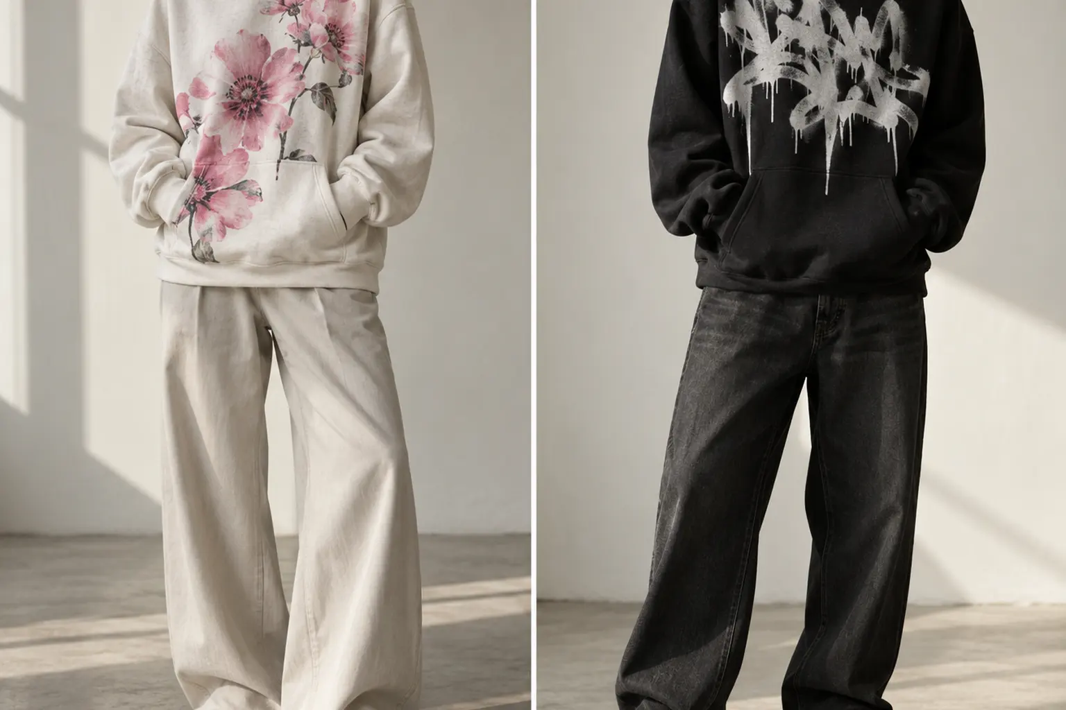
Korean typography hoodie styling gets difficult when a graphic you like becomes an outfit you cannot quite balance. The lettering has presence, the illustration adds another layer, and sizing up can introduce more volume than you intended. Adding extra streetwear references rarely solves that problem.
Start with a simpler rule: choose the message, give the artwork visual priority, then control the silhouette around it. The two hoodies here offer different compositions rather than a documented difference in quality. One builds a layered motivational message through flowers and cracked lettering; the other makes a direct bilingual statement through graffiti-inspired marks. Your best choice depends on which one belongs in your wardrobe—and which words you actually want to wear.
Korean Typography Hoodie Styling Starts With Visual Hierarchy
The first decision is not oversized versus regular. It is what you want someone to notice first: an illustrated arrangement or a blunt written statement. Both featured designs contain several colors and supporting details, so neither needs another prominent slogan elsewhere in the outfit. Let the hoodie do the talking before deciding how much volume to add.
Think of visual hierarchy as an order of attention. For this styling approach, the artwork comes first, the outline of the outfit comes second, and smaller accents come third. This is an editorial preference, not a universal rule. It is particularly useful when you want a busy graphic to feel considered without stripping all personality from the rest of your clothes.
Compare the artwork, not an imagined quality ranking
| Decision point | Floral Korean Typography | Graffiti City Korean Phrase |
|---|---|---|
| Message | Persistence, courage and preparing for tomorrow | Can’t speak Korean, with an English explanation |
| Dominant lettering | Cracked blue and red lettering with smaller supporting text | Two oversized black Korean lines with compact English capitals |
| Supporting elements | Pink cosmos, buds, foliage and a small orange shrimp-like detail | Skyline, crown, stars and orange and blue marks |
| Suggested outfit direction | Plain separates with one restrained color echo | A simple silhouette without competing slogans |
| Listed options | Six colors; S–3XL | Six colors; S–3XL |
Choose the floral composition if you enjoy discovering smaller details after the main lettering registers. Choose the graffiti composition if the bilingual joke is the reason you want the garment. The latter has a more direct message, but that does not make it visually minimal: its skyline, paint textures and scattered marks still ask for space.
Neither design earns a recommendation through an unsupported claim about superior printing or comfort. Their strongest documented distinction is the original artwork. That is useful: you can make the aesthetic decision without pretending that one illustration changes the underlying garment construction.
Before purchasing, name two existing bottoms you would wear with your preferred design. If both outfits require another purchase to feel right, pause. A graphic hoodie should have a clear role in your current wardrobe, not become the opening move in an expensive attempt to recreate a reference image.
Choose the Floral Hoodie for Layered Color, Not a Quiet Print
The “Floral Korean Typography” Heavy Blend Unisex Pullover Hoodie suits you if you want illustration and language to share attention. Its blue cracked bubble lettering weaves through pink cosmos blooms, green leaves, stems and unopened buds. Red lettering and a curved upper banner add another level of emphasis, while a small orange striped shrimp-like form rewards a closer look.
The wording is described as encouraging persistence, courage and preparation for tomorrow. Its fuller meaning includes remembering the road already travelled, overcoming fear, rising from the past and acknowledging today’s effort. That makes this the more appropriate choice if you want an encouraging message rather than a self-referential language joke.
Choose one color relationship
Resist treating every illustrated color as an instruction for the rest of the outfit. A blue detail, pink flower and orange accent do not require three corresponding accessories. Instead, choose either a tonal relationship with the hoodie body or a single restrained echo of the artwork in clothing you already own.
- For a graphic-first outfit: start with the listed White option and plain dark bottoms.
- For a softer overall palette: consider Light Pink or Light Blue with similarly restrained separates.
- For a neutral base: consider Sand, Ash Heather or Sport Grey Heather, then let the illustration supply the color.
These are styling directions, not promises about exact printed contrast. The artwork description includes an even gray field behind the illustration. Do not confuse that field with the hoodie body’s color, or assume that a gray area visible around the lettering is necessarily bare garment fabric.
That distinction matters when choosing a palette. A colored hoodie body and an illustrated background can read as separate planes. If you prefer the artwork to feel integrated rather than framed, study the complete garment image instead of choosing from the color name alone.
This design is less suitable if your definition of minimalism means very little visual information. Flowers do not automatically make a print delicate, and smaller lettering does not make it discreet. Here, density is part of the appeal. Style it as the main event rather than trying to disguise it beneath several other focal points.
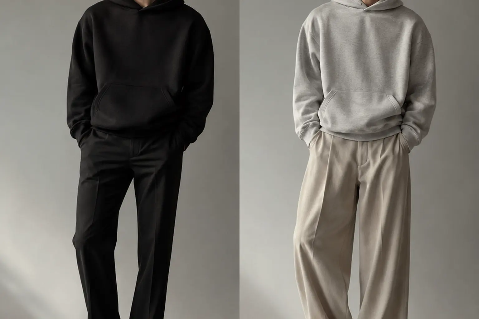
A useful starting outfit is the hoodie with plain straight-leg trousers you already own and understated footwear. Keep the lower half uninterrupted; add a color echo only after the basic composition works.
Choose the Graffiti Hoodie When the Phrase Is the Point
The “Graffiti City Korean Phrase” Heavy Blend Unisex Pullover Hoodie makes its meaning more immediately accessible through English. Two oversized Korean lines in black are followed by the phrase explaining that the wearer cannot speak Korean. That relationship between the languages is central to the design, not incidental decoration.
Its supporting marks are deliberately varied. Orange strokes form a loose perimeter, while blue contributes an eight-point star, a zigzag, a wavering stroke and heavier curved marks. The hand-drawn skyline, crown and paint textures establish an urban graphic vocabulary without requiring you to build an entire themed outfit around them.
Keep the supporting clothes less expressive
For a controlled result, pair this composition with plain bottoms rather than another piece carrying large lettering. A second slogan can make the outfit feel like two separate conversations. You do not need to eliminate all detail; the goal is to avoid another element that demands the same kind of reading.
The typography already contains irregularity. The Korean strokes have a blunt, brushy quality, and the narrower English lettering leans across an uneven baseline. My styling preference is to contrast that drawn energy with a straightforward garment outline: straight or gently wide trousers, a clearly resolved hem and footwear without another dominant graphic.
- Choose it for the message if the bilingual statement feels accurate or amusing to you.
- Choose it for contrast if your existing wardrobe is mostly plain and needs one expressive piece.
- Pass on it if you like the marks but would feel awkward explaining the wording.
Black trousers you already own offer an easy starting point because they repeat the dominant lettering color without introducing a new hue. That is a compositional choice, not a requirement. A lighter lower half can work too; keep its pattern and branding quiet so the phrase remains the principal point of attention.
Avoid assuming that the listed gray garment colors will produce a particular vintage effect. The catalog describes open gray space around the artwork, while the available body colors are a separate selection. Evaluate the complete combination rather than mentally substituting a different background.
This is the stronger choice when you want the words to be the conversational hook. It is not a substitute for the floral design if your real preference is an encouraging message; attractive lettering should not persuade you to wear a statement you do not mean.
Get the Hoodie Proportions Right Before Sizing Up
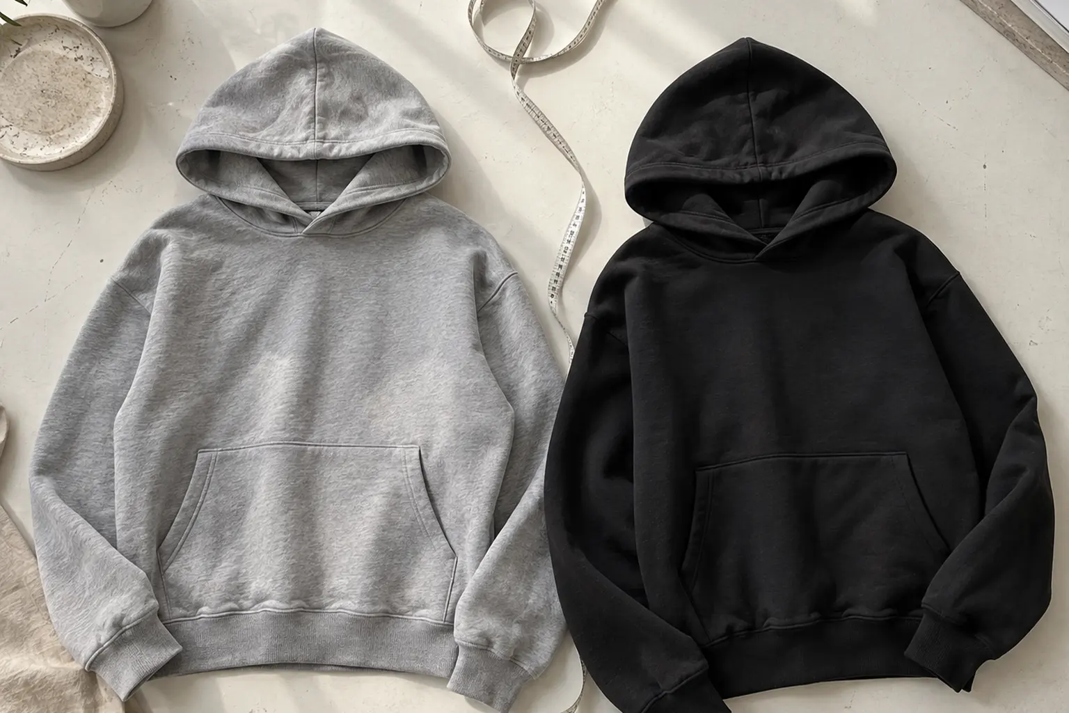
Both options use the Heavy Blend unisex pullover format. The G18500 manufacturer describes the blank as a classic fit intended for loose comfort, with an 8.0 oz/yd² fabric weight [1]. Start there rather than assuming you need a larger size to create a relaxed outfit.
The blank has a double-lined hood, a pouch pocket, and rib cuffs and a bottom band containing spandex for stretch and recovery [1]. For styling, treat these as separate parts of the silhouette: the hood frames the neck, the body establishes width, and the bottom band determines where the upper garment visually ends. A pleasing chest width does not automatically mean the length will suit your preferred trousers.
Measure the shape you want to repeat
Use a hoodie you already like as a reference, laid flat without stretching it. Compare its measurements with the product’s measurement diagram, following the same measurement points. A width measured across a flat garment is not the same number as a full chest circumference, so resolve the chart’s convention before comparing sizes.
- Compare body width. Decide how much space you want around your torso and any underlayer.
- Compare body length. Picture the bottom band against the rise and width of your usual trousers.
- Compare sleeve length. Consider where you want the cuff to sit, not just how roomy the body looks.
- Check the whole outline. Reject a size if solving one measurement makes the others unsuitable.
The listed range for both designs is S through 3XL. Those letters are selection labels, not enough information to predict your silhouette across international sizing systems. The Korean hoodie sizing and fit guide is a useful next step if you usually buy by habit rather than measurements.
There is also a difference between choosing a larger size and choosing a garment designed with oversized proportions. Do not assume a larger classic-fit hoodie will reproduce every dropped-shoulder or cropped-wide reference you save. The broader principle in choosing shape rather than simply a bigger size applies here, although tee measurements should not substitute for hoodie measurements.
For a fuller lower half, my default is a hoodie length that leaves the trouser shape understandable rather than obscuring most of it. With narrower bottoms, more upper-body volume may feel intentional. Neither approach depends on your height alone: the relationship between garment lengths matters more than a universal rule for short or tall shoppers.
Three Outfit Situations That Make the Decision Practical
You do not need a new wardrobe to make either graphic work. Start with the clothes you actually repeat, then decide what the hoodie should change: color, volume or attitude. These three hypothetical situations use existing wardrobe pieces rather than implying that StyleMZ supplies a complete head-to-toe look.
If you mostly wear black and want color without a reset
Choose the floral design if its message appeals to you, then keep your familiar plain black trousers. Let the blooms and lettering provide the departure from your usual palette. Begin without a matching accent elsewhere; you may find the artwork is already enough.
For this outfit, prioritize a clear boundary between the hoodie and trousers. If the body bunches excessively at the bottom band, reassess the chosen length rather than adding another layer to conceal it. The aim is a colorful upper half with a readable outline, not simply a neutral outfit underneath a large print.
If you like wide trousers but worry about looking swallowed
The graffiti design is a useful option when you want a direct statement above a plain, wider lower half. Keep your attention on the hoodie length and sleeves. Extra width can be deliberate; unwanted length at the body and cuffs is a separate issue and should not be accepted as the necessary price of looking relaxed.
Try the intended outfit with the footwear you would actually wear. Look at where the trouser hem ends and where the hoodie bottom band sits. If both areas gather heavily, simplify one of them. You are editing the distribution of volume, not trying to make every garment fitted.
If you need an outer layer but want the artwork visible
Use a coat or jacket you already own only if it has room for the hoodie and leaves the desired part of the design visible when worn open. An open outer layer creates a frame; whether that frame helps depends on which lettering or illustration it covers. Do not choose the layer solely because its color matches.
Also inspect the hood from the side and back. If the outer collar and hood compete for the same space, a less structured existing layer may make more sense. The principles in layering without losing the graphic offer a useful visual starting point, but a hooded garment requires its own space assessment.
- Check the outfit standing naturally, not only in a posed photograph.
- Remove one competing graphic before adding another accessory.
- Judge the front, side and back outlines separately.
- If an outfit works only while you constantly adjust it, change the proportions.
The condition that changes all three recommendations is practical wear. If your usual weather, workplace or daily routine means the hoodie stays covered, prioritize its message and fit for the moments when you will actually see it. A visually impressive outfit is not useful if it has no place in your week.
Understand the Blank Before Predicting the Print
The fabric specification needs more precision than a blanket claim that every color is identical. The G18500 manufacturer lists solids as 50% U.S. cotton and 50% polyester, and heathers as 40% U.S. cotton and 60% polyester [1]. Do not assume that every named catalog color maps neatly onto a fiber category without the selected variant’s specification.
That distinction matters if you are trying to predict a printed result from the garment name alone. Direct-to-garment printing, or DTG, applies water-based ink directly to fabric using inkjet technology [2]. One production provider identifies 100% cotton as its preferred substrate because of its ink absorption [2]. Neither fact proves how these exact finished hoodies will look.
Compatibility is not a finished-product guarantee
The blank manufacturer lists screen printing, embroidery, heat transfer, patches and DTG as compatible decorating techniques [1]. That list does not identify the process used for either featured artwork. It also does not establish that every technique produces the same edge definition, opacity or feel.
Technical printing guidance identifies garment material and color, pretreatment, printer settings and curing as factors that can affect the finished result [3]. For a shopper, the consequence is straightforward: judge photographs of the decorated garment rather than treating the blank specification as proof of print quality. A good substrate description cannot answer every question about a finished design.
Be especially careful with the word cracked. In the floral artwork, cracking is part of the described lettering design. It should not be confused with a prediction that the applied print will physically crack in wear. Similarly, the graffiti artwork’s paint textures are visual elements, not evidence of a particular printing method.
- Inspect lettering edges: can you distinguish the intended brushiness or distressing from unclear reproduction?
- Inspect small elements: do the buds, fine text and scattered marks remain understandable in a close view?
- Inspect the full garment: does the artwork’s scale suit the amount of surrounding fabric?
- Separate illustration from substrate: identify which gray areas belong to the artwork and which belong to the hoodie.
The manufacturer also specifies a brushed interior [1]. That describes the inside surface; it is not, by itself, evidence that the exterior printing face has the same raised surface. Avoid using an interior comfort feature to predict the artwork’s sharpness.
The sound buying position is neither suspicion nor blind confidence. Appreciate the original graphic, understand the blank, and ask for finished-product information when print fidelity is the deciding factor. Do not pay for a result you have supplied entirely through imagination.
Read the Korean Message as Carefully as the Composition
Typography is language arranged visually. For these hoodies, those two functions deserve equal attention: you should like the composition and be comfortable with what it communicates. The floral design and the graffiti design are not interchangeable simply because both use Korean lettering.
Korean typographic experimentation has a documented design history beyond apparel. A design archive describes Ahn Sang-Soo’s typefaces as departing from the conventional square frame and creating a radical visual impact [5]. That is useful context for taking letterform design seriously, but it does not establish an influence on these particular graphics.
Look at hierarchy before searching for a trend label
In the floral composition, lettering changes scale and treatment while interacting with flowers, stems and smaller text. The graffiti composition instead establishes two large Korean lines and follows them with compact English wording. You can assess those relationships without claiming that either represents a single current style worn across Korea.
Look for the order in which your eye reads the design. Does the dominant lettering register before the smaller details? Does the English explanation feel like a deliberate second beat? Is the gray space around the artwork helping the composition breathe? These are more useful questions than asking whether the garment looks sufficiently like a generalized idea of Korean streetwear.
- Meaning: would you still want the hoodie if someone explained the text before showing you the image?
- Composition: do you prefer intertwined illustration or a larger, more direct lettering hierarchy?
- Personal relevance: can you explain your choice without inventing a cultural connection?
The catalog provides a thematic explanation of the floral wording and a direct English meaning for the graffiti phrase. Those are different levels of description. If exact wording matters to you, request a complete translation rather than assuming a summary reproduces every line literally.
You do not need fluency to appreciate a type-based artwork. You do need enough information to choose it knowingly. For a gift, this becomes especially important: a recipient may enjoy the visual style yet dislike a motivational statement or a joke about language ability. Choose the message they would welcome, not merely the graphic you would wear.
Before Ordering, Resolve Fit, Finish and Care
Once you have selected the message and planned an outfit, make the remaining decision concrete. Both designs list White, Sand, Light Blue, Light Pink, Ash Heather and Sport Grey Heather, with sizes S through 3XL. Select the combination you can actually wear with your existing clothes, rather than collecting possibilities because several colors look attractive in isolation.
Use one final purchasing check
- Measurements: compare the selected size with your reference hoodie using the same measurement points.
- Variant: confirm the selected color’s fiber specification and availability.
- Artwork: establish the print location and dimensions from the product information or a complete garment image.
- Production: confirm the decoration method, whether the item is made to order, and the stated fulfillment window.
- Order terms: read the applicable return and exchange policy before committing to an uncertain size.
Made-to-order production should not be treated as shorthand for bespoke fit or an automatic environmental certification. For your purchase, the useful question is what happens after you order and whether that process suits your deadline. Do not turn an unconfirmed production assumption into a delivery promise, especially when buying a gift.
Care belongs in the same decision. Follow the finished hoodie’s instructions, including any print-specific guidance; the undecorated blank’s label may not answer every decoration question. General DTG guidance recommends washing inside out with gentle detergent and avoiding harsh bleach, with air drying preferred [7]. This is a general reference, not confirmation of the process used on these designs.
Printing guidance also links poor ink adhesion and premature fading to inadequate pretreatment or incorrect curing [3]. That means careful laundering cannot compensate for every production fault. Keep expectations balanced: neither the blank name nor a conservative wash routine establishes a guaranteed number of wears.
Your next step should be modest. Choose one message, one measured size and one outfit you can assemble now. If you can explain why the graphic belongs with those clothes—and you have resolved the product details that matter to you—you have a stronger reason to buy than a mood-board resemblance alone.
If the phrase feels wrong or the proportions remain uncertain, do not force the choice. The most convincing styling begins before the hoodie arrives.
Shop the collection: Korean graphic tees, Korean long sleeve shirts, Korean sweatshirts, Korean hoodies and Korean tank tops – original graphics designed in Korea, made to order.
Frequently Asked Questions
How do you style a Korean typography hoodie without making the outfit too busy?
Give the lettering priority and keep the surrounding clothes free of competing slogans. Start with plain bottoms you already own, then assess the overall silhouette before adding a color accent. You can retain interesting proportions without repeating every color in the artwork.
Should you size up for an oversized Korean hoodie look?
Not automatically: the G18500 blank is already described as a classic fit for loose comfort [1]. Compare body width, length and sleeves with a hoodie you like before selecting a larger size. More room at the chest is not useful if the body length and cuffs become unsuitable.
What does the wording on these Korean typography hoodies mean?
The floral design carries a message about persistence, courage, remembering past effort and preparing for tomorrow. The graffiti design says that the wearer cannot speak Korean and includes the meaning in English. Choose between them on that basis before deciding which illustration better matches your clothes.
Are the gray areas in the artwork the same as a gray hoodie color?
Do not assume so. The floral artwork is described with an even gray field, and the graffiti design includes open gray space around its lower edges. Use the complete image of your selected variant to distinguish the artwork's background from the garment body.
Does cracked lettering mean the hoodie print is damaged?
No: the floral design explicitly uses cracked lettering as part of its artwork. That visual treatment is different from physical cracking or peeling of an applied print. Compare the delivered design with the product imagery if you need to distinguish an intentional mark from a possible finish issue.