 OBJECT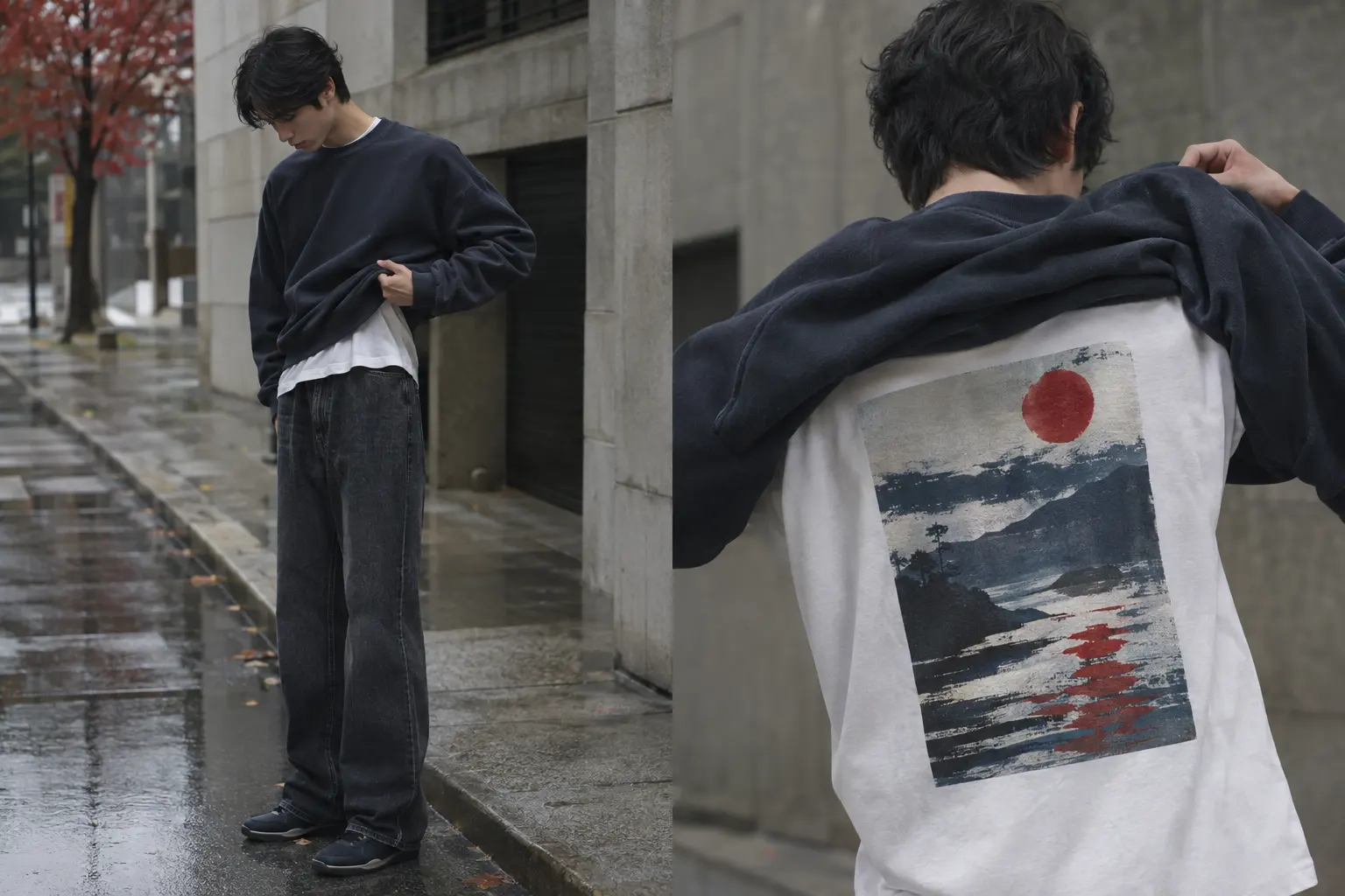
How to layer a graphic tee for fall is less about piling on clothes and more about protecting the hierarchy of the outfit. The tee supplies the image, the message, and often the strongest color; the next layer should add warmth without turning that focal point into visual noise.
The most reliable StyleMZ formula is a printed tee first and a crewneck sweatshirt second. Choose the tee according to the graphic and desired structure, then choose a sweatshirt with enough room for the shoulders, sleeves, and hem to sit cleanly. That approach suits transitional weather, when a layer needs to be removable rather than permanently built into the look.
How to Layer a Graphic Tee for Fall: Start With One Clear Base
The strongest fall outfit begins with one deliberate visual base, not two competing statements. A graphic tee should establish the mood before the sweatshirt enters the picture. If the artwork is bold, let the rest of the outfit you already own stay relatively quiet in color and shape. If the artwork is restrained, a more assertive sweatshirt can provide the second point of interest.
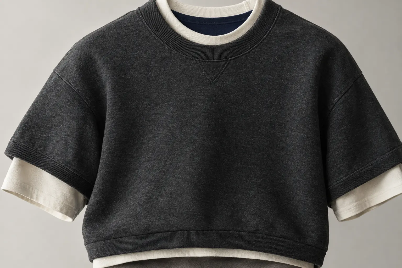
For most temperatures, wear the graphic tee directly against the body and pull the crewneck over it. This keeps the tee’s neckline and sleeves available as small visual signals while giving the sweatshirt control of the overall silhouette. When you are indoors, remove the sweatshirt and allow the tee to become the complete look; that change is one reason the formula works better than a single heavy top.
The decision becomes harder when the tee is oversized. A wide or long base can bunch beneath a classic-fit crewneck, especially around the sleeve openings and lower band. A relaxed tee can still work, but the top layer needs enough volume to accommodate it. The aim is not to force every edge to disappear. A controlled hem or sleeve reveal can look intentional; random folds usually read as a sizing problem.
The three-point check
- Shoulders: the sweatshirt should sit over the tee without pulling across the upper back.
- Sleeves: the short sleeves should not create a thick ridge beneath the crewneck armholes.
- Hem: decide whether you want a narrow tee reveal or a mostly covered base before choosing the sweatshirt size.
Think of this as a removable uniform for fall. The tee carries the identity, the crewneck handles the temperature, and the proportions make the combination look considered rather than improvised.
For more detail on silhouette before choosing a base, compare the principles in this Korean unisex crewneck tee fit guide. The useful question is not whether a tee is technically loose or fitted; it is how much space remains for the next layer.
Choose the Right Graphic Tee Weight Before Adding Warmth
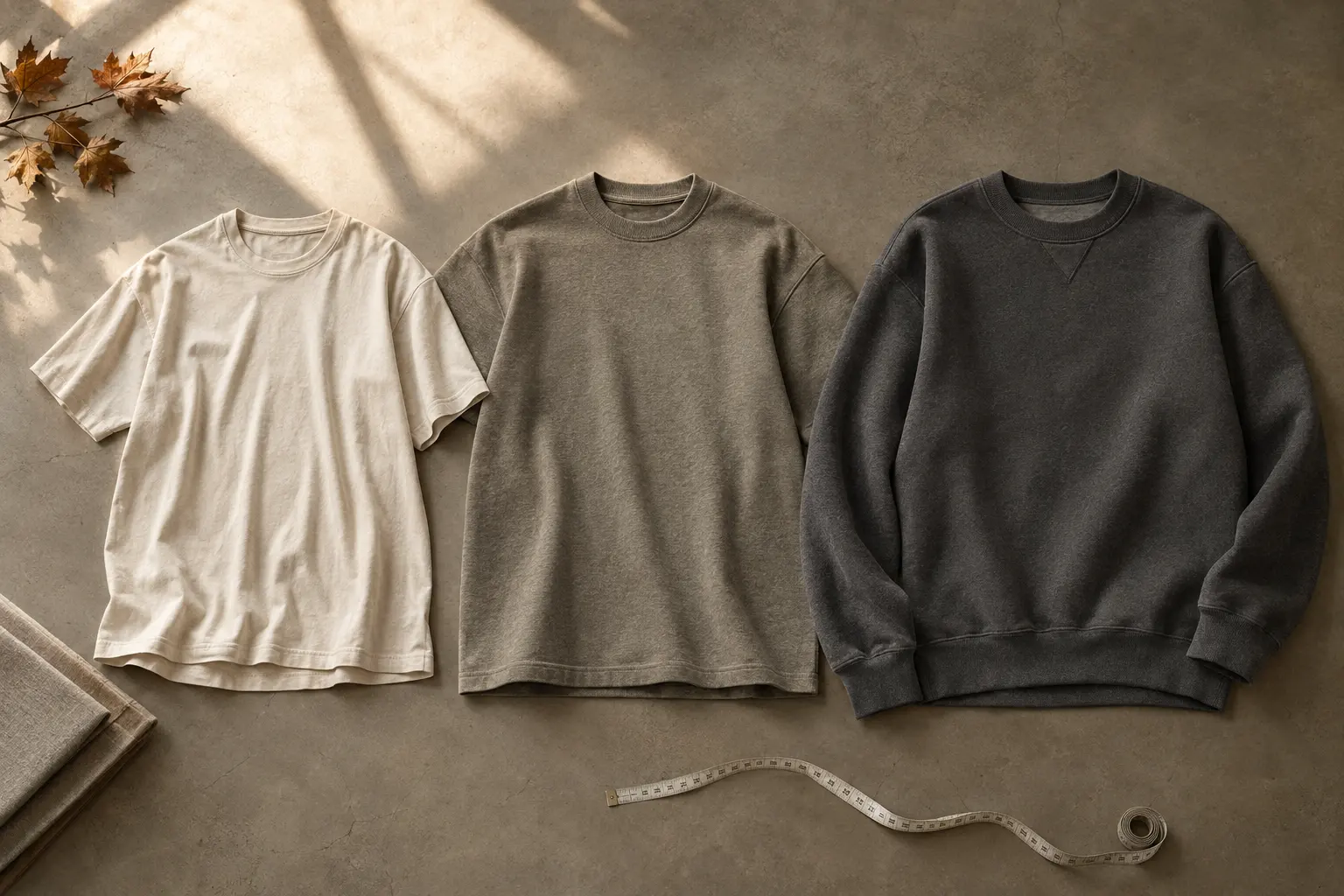
Fabric weight changes the behavior of a layered outfit. The BELLA+CANVAS 6400 is described as a women’s relaxed jersey tee in solid colors, made from 100% Airlume combed and ring-spun cotton at 4.2 ounces per square yard, with a contemporary looser fit. [1] That makes it the logical starting point when you want a lighter base beneath a sweatshirt and a relaxed line rather than a rigid box.
The heavyweight tee designs in this collection take a different position. They are listed as classic-fit heavyweight tees, so they bring more body and structure to the outfit before any second layer is added. That can be useful when you want the tee to hold its own indoors, but it also means you should pay closer attention to the sweatshirt’s room through the shoulders and sleeves.
The Rain Run crewneck is a substantially heavier layer: the manufacturer lists an 8.0-ounce-per-square-yard fabric in a 50% cotton and 50% polyester solid formulation, plus a brushed interior, rib cuffs, and a ribbed bottom band. [2] Those details support using it as the warming layer over a tee, although fabric weight alone does not prove identical warmth or comfort for every wearer.
| Layer | Documented construction | Best styling role | Main watchpoint |
|---|---|---|---|
| BELLA+CANVAS 6400 format | 4.2 oz, solid-color 100% Airlume combed and ring-spun cotton; relaxed fit | Light visual base beneath a sweatshirt | Loose proportions may bunch under a narrow top layer |
| Heavyweight graphic tee | Catalog-listed heavyweight classic-fit tee construction | Structured base with a stronger standalone presence | Needs enough sweatshirt volume above it |
| Rain Run crewneck | 8.0 oz, solid-color 50/50 cotton-polyester; brushed interior and rib details | Warm outer layer for cooler fall conditions | Can conceal a front tee graphic when worn closed |
Use the lighter relaxed tee when layering ease comes first. Choose a heavyweight design when you want a more substantial tee silhouette and expect to wear the sweatshirt as a removable option rather than the main styling requirement. Add Rain Run when the day has moved beyond a light transitional layer.
Color-specific fabric formulations can differ from the solid-color specifications, so treat the figures as useful product guidance rather than a universal claim about every available color. For a more detailed decision on body and drape, see this comparison of heavyweight and standard tee silhouettes.
Let the Print Placement Decide the Layering Order
Graphic placement determines what the outfit can communicate while the sweatshirt is on. A back print is often the easiest design to layer because it can become visible whenever the top layer is removed. A front print is more demanding: a closed crewneck will conceal most of the chest artwork, leaving the tee to communicate through its sleeves, neckline, and lower hem.
That distinction makes a back-print tee a particularly sensible fall base. The Korean Taegeukgi Flag Women’s Relaxed T-Shirt has its main artwork on the back, with a distressed interpretation of the flag, paint-splatter color, geometric elements, and bold English lettering. The catalog presents it as an artistic interpretation rather than a plain reproduction, so it reads as a designed graphic with cultural reference rather than a neutral logo.
The cultural reference deserves a measured reading. The artwork uses the taegeuk and four black trigrams as recognizable elements of the Korean flag, then adds its own splatters, text, and geometric treatment. Those additions belong to the independent graphic design and should not be mistaken for official flag specifications.
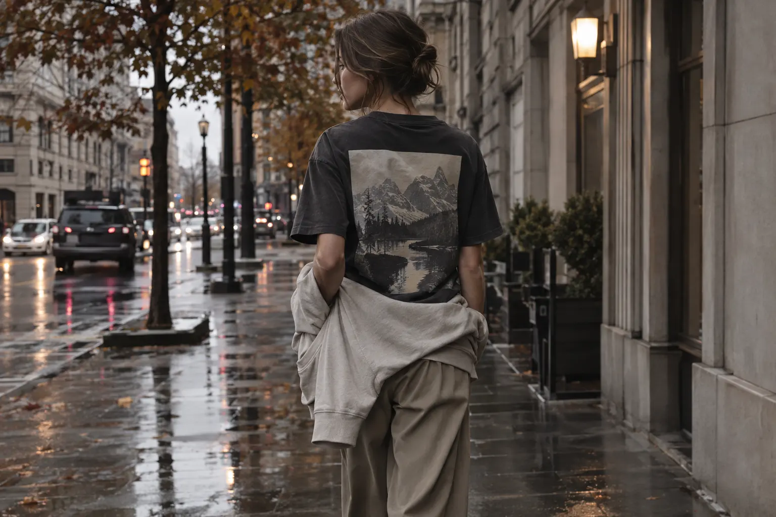
With this kind of back print, wear the tee beneath a crewneck when you want the outfit to move between outside and inside. Once the sweatshirt comes off, the graphic becomes the back view rather than an afterthought. The design works best when the layer above it does not force the tee into a cramped, wrinkled shape.
- Back graphic: prioritize a clean fit through the back and plan for the tee to be seen when the sweatshirt is removed.
- Front graphic: use the tee as the main layer, or accept that the chest image will be hidden beneath a closed crewneck.
- Small graphic: allow the neckline and hem to do more work, especially when the sweatshirt has its own front artwork.
For a large back illustration, avoid adding another loud printed object directly above it. The best contrast is usually a solid sweatshirt or a sweatshirt whose front graphic has a different scale and position. That gives the outfit a sequence: small edge, solid field, then full image when the layer comes off.
For readers drawn to the cultural reference and lighter base, the Korean Taegeukgi Flag tee is the clearest match.
Build a Korean Streetwear Palette Without Overworking It
Korean-inspired graphic styling does not require every item to announce the reference. The cleaner approach is to take one cue from the artwork and repeat it quietly through the rest of the outfit you already own. A navy tee can meet a charcoal or black sweatshirt; a graphic with red accents can be grounded by a neutral layer; a pale sweatshirt can make a dark printed tee feel less expected.
Start with the dominant field color, then identify one accent. The NIGHT WALKERS SEOUL tee uses a rich illustrated palette that includes cream, teal, orange, green, yellow, brown, black, and red. Its back-print city scene already contains enough information, so the most controlled pairing is a subdued crewneck whose color does not compete with every shade in the artwork.
For brighter front graphics, the reverse can work. The Daylight tee uses a vivid sun, striped beach towels, cocktail, and orange imagery. Rather than matching its colors literally, place it beneath a neutral sweatshirt and let only the lower hem or sleeve edge show. The color becomes a flash instead of a full second palette.
Use proportion before color matching
Color is only half of the edit. The sweatshirt should either echo the tee’s relaxed attitude or deliberately sharpen it. A classic-fit crewneck over a classic-fit heavyweight tee creates a straightforward streetwear block. A roomier crewneck over a relaxed tee creates more movement but also increases the risk of excess fabric at the hem.
- Choose the tee according to the artwork’s scale and placement.
- Choose a sweatshirt in a neutral or one-color family that supports the print.
- Check the visible hem from the side, not only from the front.
- Remove one competing graphic if the outfit starts to look like a stack of posters.
A useful edit is to keep the sweatshirt’s front quieter when the tee has a detailed back scene. If you want a more graphic-heavy look, reverse the priority: let the sweatshirt become the visible statement and allow the tee to function as a color and fit layer underneath.
For examples of keeping a printed outfit intentional rather than crowded, the principles in minimalist Korean graphic tee outfits apply here even when the artwork itself is expressive. Minimalism is about editing the total image, not restricting every garment to a blank surface.
Adjust the Formula as Fall Temperatures Move
Fall is not one temperature, so the outfit should have more than one useful state. In early fall, the tee may be enough outside, with the sweatshirt carried or tied only when the day changes. In the middle of the season, the crewneck can stay on for the commute and come off indoors. Later, the same combination becomes a base under any additional outer layer you already own, provided the total bulk remains comfortable.
Current South Korean retail coverage describes transitional clothing as pieces designed to be combined as temperatures shift, including lightweight long-sleeve tops, cardigans, vests, and other layering items. [6] That supports a practical reading of fall layering: flexibility matters more than treating one formula as a fixed seasonal uniform.
For the StyleMZ catalog, the tee-plus-crewneck pairing is strongest when you want a simple two-state outfit. The tee handles the visual identity and indoor temperature; the crewneck supplies the more substantial layer for cooler air. If the day is warm enough that you will never wear the sweatshirt, choose the tee on its own rather than buying extra bulk into the look.
Three hypothetical weather decisions
- Warm afternoon, cool evening: choose a relaxed tee such as Korean Taegeukgi Flag and carry a crewneck. The back graphic remains available during the day, while the sweatshirt solves the later temperature drop.
- Cool commute, heated interior: choose a heavyweight tee such as Stand Firm beneath a roomy crewneck. The tee still has enough structure to work when the sweatshirt comes off.
- Cold evening walk: choose Rain Run over a tee. The sweatshirt becomes the primary visible layer, so select the tee for neckline, hem, and sleeve balance rather than expecting its chest graphic to remain visible.
Do not confuse a heavier garment with a guaranteed solution for every climate. Humidity, wind, movement, and personal comfort change the experience. The dependable decision is modular: pick the layer you can remove, not just the one that appears warmest on a product page.
Which StyleMZ Graphic Tee and Sweatshirt Pairing Fits You?
The right pairing depends on what you want the outfit to do after you leave the house. If the graphic is the reason you are buying, select the tee first and keep the sweatshirt subordinate. If warmth or a sweatshirt-led silhouette matters more, choose the crewneck first and treat the tee as a supporting layer.
For a cultural reference with a relaxed base, Korean Taegeukgi Flag is the most considered choice when you want a back graphic that can emerge once the upper layer comes off. Its listed colors are navy, black, and dark gray, and its size range runs from S through 2XL. The relaxed shape gives it a softer starting point than the heavyweight classic-fit tees, but the sweatshirt still needs enough room to prevent bunching.
Rain Run takes the opposite approach. It is a heavyweight unisex crewneck with a front print showing a retro Seoul night-runner scene. Its listed colors include light blue, graphite heather, ash, navy, and cardinal red, with sizes S through 3XL. Choose it when the sweatshirt should remain the main visual layer and the tee underneath only needs to support the neckline and lower edge.
Stand Firm is useful when you want the base to feel more structured. Its front graphic centers on a red moon, mountains, and a winding road, and the listing describes it as a heavyweight crewneck tee. The color options include graphite heather, navy, and black, with sizes S through 5XL. Because the print is on the chest, it is most legible when the sweatshirt is removed or when the tee is worn as the primary top.
Make the choice by priority
- Graphic visibility: choose a back-print tee and plan for an easy sweatshirt-off moment.
- Defined tee structure: choose a heavyweight design such as Stand Firm.
- Warmth-first styling: choose a crewneck such as Rain Run and let the sweatshirt lead.
- Relaxed base layering: choose the BELLA+CANVAS 6400 format and verify the sweatshirt dimensions before ordering.
These are different solutions, not a universal ranking. The most adaptable product is the one that matches the actual role you need: visible artwork, a structured base, or a substantial top layer.
Rain Run suits shoppers who want the sweatshirt to carry the outfit’s visual weight while the tee remains a practical foundation.
Avoid the Fall Layering Mistakes That Flatten the Graphic
The first mistake is choosing both pieces by graphic alone. A striking tee and a striking sweatshirt can become a crowded rectangle once one is placed over the other. Decide which artwork deserves attention in the finished outfit, then let the second piece contribute through color, fit, or warmth.
The second mistake is ignoring the shoulder and sleeve relationship. A tee can feel comfortable alone yet become restrictive under a sweatshirt with a narrow armhole. Conversely, a very roomy sweatshirt can swallow a lighter relaxed tee and make the lower layer look accidental. Read the size information for both garments and compare the body shape before ordering.
The third mistake is assuming that every print should remain visible. A closed crewneck naturally hides much of a front graphic. That is not a product failure; it is a styling consequence. If front artwork is essential, wear the tee as the main top, use a removable layer that does not cover the chest, or accept that the tee’s colors and proportions—not its full image—will be doing the work.
Production and care deserve equal attention
StyleMZ’s featured products are made to order. In print-on-demand production, the garment is made after it is purchased rather than held as finished inventory. [4] That model supports original designs and one-off orders, but it also means you should review the current size chart, color availability, and estimated production information before placing the order.
Care should follow the label supplied with the specific garment. In the United States, covered apparel is required to provide regular care instructions, and the Federal Trade Commission requires those instructions to have a reasonable basis. [7] A provider-specific washing recommendation should not automatically replace the label attached to your order.
- Confirm the tee and sweatshirt measurements instead of relying only on S, M, or L.
- Check whether the selected color has a different material formulation from the listed solid version.
- Plan the outfit around the actual print position, not a product image viewed from one angle.
- Follow the supplied care label, especially where washing, drying, ironing, or decoration warnings differ.
One more error is treating “printed on demand near you” as a guarantee of a particular local facility or delivery route. The practical question is simpler: does the production and shipping information work for your timing? If you need the outfit for a fixed date, allow room for made-to-order production rather than assuming immediate dispatch.
The Final Decision: Build a Removable Fall Graphic Tee Outfit
The best fall layering decision is the one that preserves choice. Start with the graphic tee you would happily wear alone, then add a sweatshirt that can leave the outfit without disturbing its proportions. This keeps the purchase useful across changing temperatures and prevents the upper layer from becoming a disguise for a design you wanted to show.
Use the BELLA+CANVAS 6400 format when a relaxed, lighter base matters most. Choose a heavyweight design when you want the tee to have more body and a stronger standalone shape. Use a crewneck such as Rain Run when cooler conditions make the sweatshirt the practical center of the outfit. Those roles follow the documented construction and catalog fit descriptions, not a claim that one material will feel identical for every person.
Then make one final print-placement decision. A back graphic gives you a strong reveal when the sweatshirt comes off. A front graphic asks you to choose between visibility and warmth because a closed crewneck will cover the chest. A sweatshirt with its own front image can reverse the hierarchy, making the tee’s hem, neckline, and sleeves the quieter layer.
A fast shopping sequence
- Choose the message: cultural reference, illustrated city scene, landscape, or abstract color.
- Choose the base: relaxed lighter jersey or structured heavyweight tee.
- Choose the temperature layer: a classic-fit crewneck with enough space for the base.
- Choose the reveal: visible hem and sleeves, full tee after removal, or sweatshirt-led styling.
- Check the practical details: size range, selected color, made-to-order timing, and care label.
If you are still undecided, choose the tee whose graphic you would wear without the sweatshirt. That is the soundest test of relevance. A fall layer should extend the life of the design, not compensate for a design you do not actually want to see.
For the broadest selection of base layers, browse the StyleMZ T-shirts category; when warmth is the priority, compare the available crewneck sweatshirts against the tee’s width and print placement.
For a front-print sweatshirt with a more assertive graphic presence, No Rules Just Vibes is the alternative when the upper layer should lead rather than disappear.
Shop the collection: Korean graphic tees, Korean long sleeve shirts, Korean sweatshirts, Korean hoodies and Korean tank tops – original graphics designed in Korea, made to order.
Frequently Asked Questions
What should I wear over a graphic tee in fall?
A crewneck sweatshirt is the clearest option when you want warmth without introducing a complicated outfit structure. Choose one with enough room for the tee to sit smoothly through the shoulders, sleeves, and hem. If the tee has a large back print, a removable sweatshirt lets you show the artwork indoors or whenever the temperature rises.
Can I wear a heavyweight graphic tee under a sweatshirt?
Yes, but the sweatshirt must have enough volume to accommodate the tee. A heavyweight base creates more structure than a lighter relaxed jersey, so a narrow sweatshirt may produce bunching at the sleeves or hem. Choose this combination when you want the tee to remain useful as a standalone top after the sweatshirt comes off.
How do I show a front graphic under a crewneck?
You generally cannot keep most of a front chest graphic visible beneath a closed crewneck. Instead, let the tee contribute through its neckline, sleeves, hem, and color, then remove the sweatshirt when the full print matters. If constant graphic visibility is the priority, wear the tee as the main layer and use a removable top that leaves the chest open.
Is a relaxed tee better than a heavyweight tee for fall layering?
Neither is universally better. A relaxed 6400-style tee is the more logical choice when you want a lighter base beneath another top, while a heavyweight tee offers more body and structure. Your sweatshirt fit changes the answer: the roomier the upper layer, the more freedom you have to choose the heavier base.
How should I wash a printed graphic tee or sweatshirt?
Follow the care label supplied with the individual garment because instructions can vary by product, color, blank, and fulfillment route. Do not assume that a generic cold-wash or inside-out recommendation applies to every item. Pay particular attention to drying and ironing directions where the decoration is concerned.