 OBJECT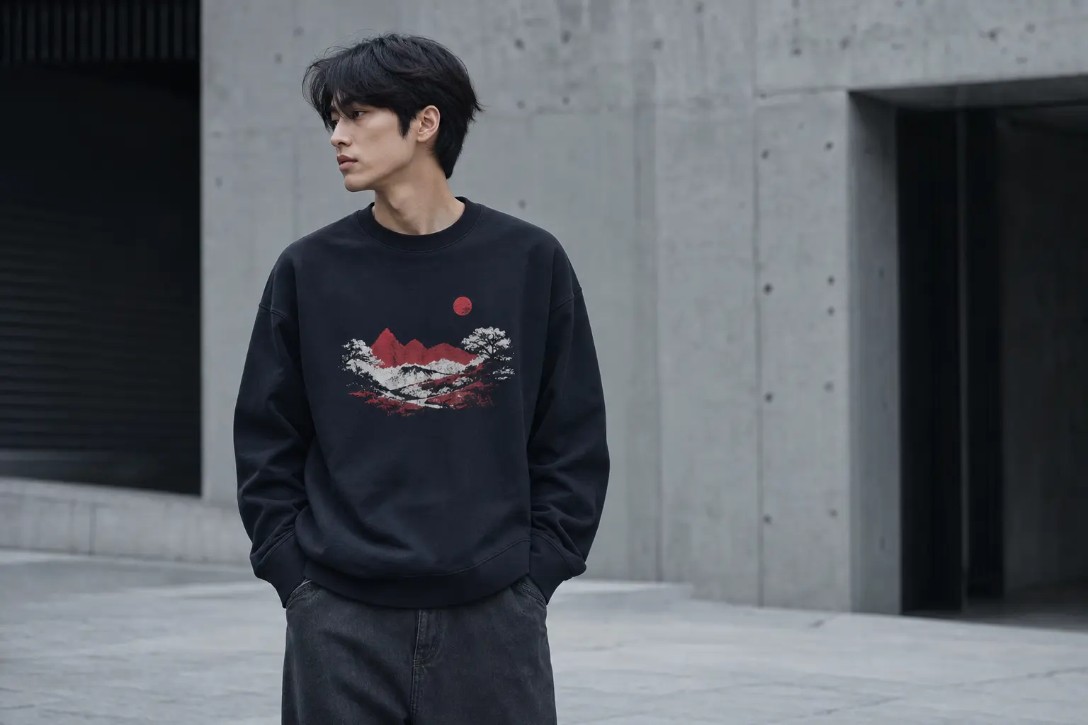
Minimalist Korean graphic tee outfits work when the graphic is edited by proportion, not erased by caution. The right shirt can bring Korean design language into an everyday wardrobe without turning the rest of the look into a costume.
The useful decision is simple: choose the tee whose blank, print placement, and color intensity match the amount of attention you want to carry. A restrained chest graphic such as Stand Firm is the safest starting point; a large back design such as Korean Taegeukgi Flag asks for more deliberate styling.
Minimalist Korean graphic tee outfits begin with proportion
The common mistake is to define minimalism as a tiny logo, a white shirt, or a completely empty outfit. That approach misses what makes Korean-inspired streetwear feel considered: the tension between a clear graphic and generous, uncomplicated space around it. A larger print can still look clean when the silhouette is controlled and the supporting colors do not compete.
Think of the tee as the visual anchor. Your existing wardrobe supplies the quiet frame: one simple lower half, a restrained layer when needed, and accessories that do not introduce a second message. The graphic should be allowed to read at a glance. If the shirt has several colors, do not answer it with several more.
The three-part edit
- Choose the focal zone. A chest print is read from the front; a back print changes the outfit as you move away. Decide which view matters for your day.
- Choose the silhouette. A relaxed, lighter tee supports a softer line, while a heavyweight classic-fit tee makes the shape more deliberate and boxy.
- Choose one supporting color. Pull a quiet neutral from the artwork, or repeat one accent sparingly. Avoid matching every color in the print.
For a first purchase, this rule favors an uncomplicated graphic over a complicated outfit. Stand Firm uses a limited red, white, grey, and black palette with a chest scene of a red moon, mountains, a winding road, and small birds. That makes it easier to wear with a low-contrast base than a multicolored city illustration.
Minimalism is also a question of repetition. If the same tee can work with several quiet combinations already in your wardrobe, it earns more space than a design that only works with one carefully coordinated look. This does not mean every shirt must be neutral. It means the print should have a clear job.
If you already own dependable denim, the same principle applies there: let the tee provide the point of difference and keep the denim, layer, and footwear you already own visually calm. For more ways to avoid accidental costume styling, see this graphic tee and denim outfit edit.
Korean streetwear tee fit: lighter drape or structured weight?
There are two materially different shirt foundations in this edit. The Korean Taegeukgi Flag tee uses the Bella+Canvas 6400, which the manufacturer describes as a sideseamed women’s jersey tee with a contemporary looser fit; its solid-color specification lists 100% Airlume combed and ring-spun cotton at 4.2 ounces per square yard [1]. The five other designs use the Gildan 5000 Heavy Cotton blank, listed at 5.3 ounces per square yard with a classic loose fit, taped neck and shoulders, and a rib collar [2].
That difference changes the outfit before the artwork enters the conversation. The Bella+Canvas option is the more fluid choice for an untucked line, a partial front tuck, or a softer proportion. The Gildan base has more visual structure, so it suits a boxier streetwear silhouette and looks most intentional when you do not force it into a close, tightly tucked shape.
| Option | Documented blank | Best styling direction | What to verify |
|---|---|---|---|
| Korean Taegeukgi Flag | Bella+Canvas 6400; relaxed, sideseamed jersey | Loose, fluid, untucked or partial tuck | Selected color composition |
| Stand Firm | Gildan 5000; 5.3 oz/yd², classic loose fit | Boxy, quiet, front-led outfit | Selected color composition |
| Bloom Study | Gildan 5000; front print, plain back | Clean front focal point | Graphite Heather or Sport Grey fiber mix |
| Golden Bloom | Gildan 5000; front print, plain back | Strong floral accent with neutral support | Military Green and heather specifications |
| Daylight or Night Walkers Seoul | Gildan 5000; heavyweight base | Graphic-first streetwear proportion | Color and size availability |
Do not generalize “100% cotton” across every displayed color. Gildan lists Solids as 100% U.S. cotton, Sport Grey as 90% U.S. cotton and 10% polyester, Heathers and Safety Colors as 50% U.S. cotton and 50% polyester, and Ash Grey as 99% U.S. cotton and 1% polyester [2]. Bella+Canvas lists the 6400 solid colors as 100% Airlume combed and ring-spun cotton [1]. If fiber content matters to your decision, treat the selected color specification as part of the purchase, not as a footnote.
Choose the lighter relaxed foundation when you want the shirt to move softly around the body. Choose the heavier classic foundation when you want the tee itself to establish a firm, graphic silhouette. The choice is less about which blank is superior and more about whether you want ease or structure to lead.
Size range is part of that decision. The Taegeukgi listing runs from S through 2XL, while the Gildan designs listed here extend from S through 5XL. Compare the current product measurements with the intended silhouette rather than assuming that the same size label creates the same visual proportion across blanks.
Best minimalist graphic tees by visual density
Graphic density determines how much editing the rest of the outfit requires. A plain back and a concentrated front print are forgiving because the eye has one clear destination. A detailed illustration, multiple colors, or a large back composition can still work, but the surrounding pieces need to step back.
The six designs, ranked for restraint
- Stand Firm: the easiest starting point. Its red moon, mountain, road, and bird silhouettes sit within a limited palette, making a graphite, navy, or black base especially straightforward.
- Bloom Study: a modern botanical composition with three abstract flowers in burnt orange, teal, and mustard yellow. Its front-only placement leaves the back plain, which helps the shirt feel designed rather than overloaded.
- Golden Bloom: five golden yellow poppies with green stems and a dark green title. It has more color presence than Stand Firm, but the centered front arrangement remains easy to frame.
- Korean Taegeukgi Flag: a large back graphic with a distressed interpretation, paint splatters, geometric forms, gold accents, and bold English text. The placement is expressive, not quiet.
- Daylight: a warm-weather composition featuring a radiant sun, beach towels, a cocktail, orange imagery, and a city detail. Its seasonal association comes from the artwork itself, not from evidence of a broader market trend.
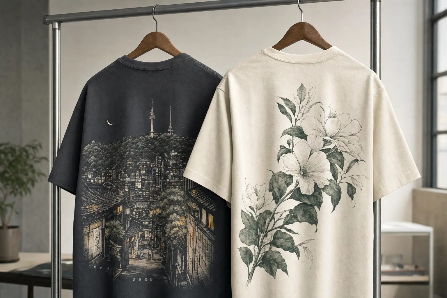
- Night Walkers Seoul: the densest option, with a detailed Seoul street scene, multiple colors, city signage, people, a taxi, and N Seoul Tower. It belongs in a minimalist outfit only when the rest of the look is especially controlled.
This ranking is a styling judgment, not a claim about quality. A dense print can be the right answer if your wardrobe is mostly neutral and you want the tee to carry the personality. A restrained print is better when you need repeat wear across different settings.
For a quiet first graphic, select Stand Firm or Bloom Study. For a statement purchase, select Night Walkers Seoul or Korean Taegeukgi Flag and accept that the shirt will lead every outfit. The most versatile choice is not automatically the smallest design; it is the one whose visual demand matches your existing clothes.
Bloom Study and Golden Bloom deserve attention because they solve a specific wardrobe problem: color without a competing back view. Their front-only compositions can sit beneath a simple open layer, provided the layer does not cut through the main artwork. This makes them more adaptable than their bright palettes might initially suggest.
Browse the wider StyleMZ T-shirt selection only after deciding which of those two roles you need: wardrobe anchor or graphic event.
How to build Korean graphic tee outfits around color
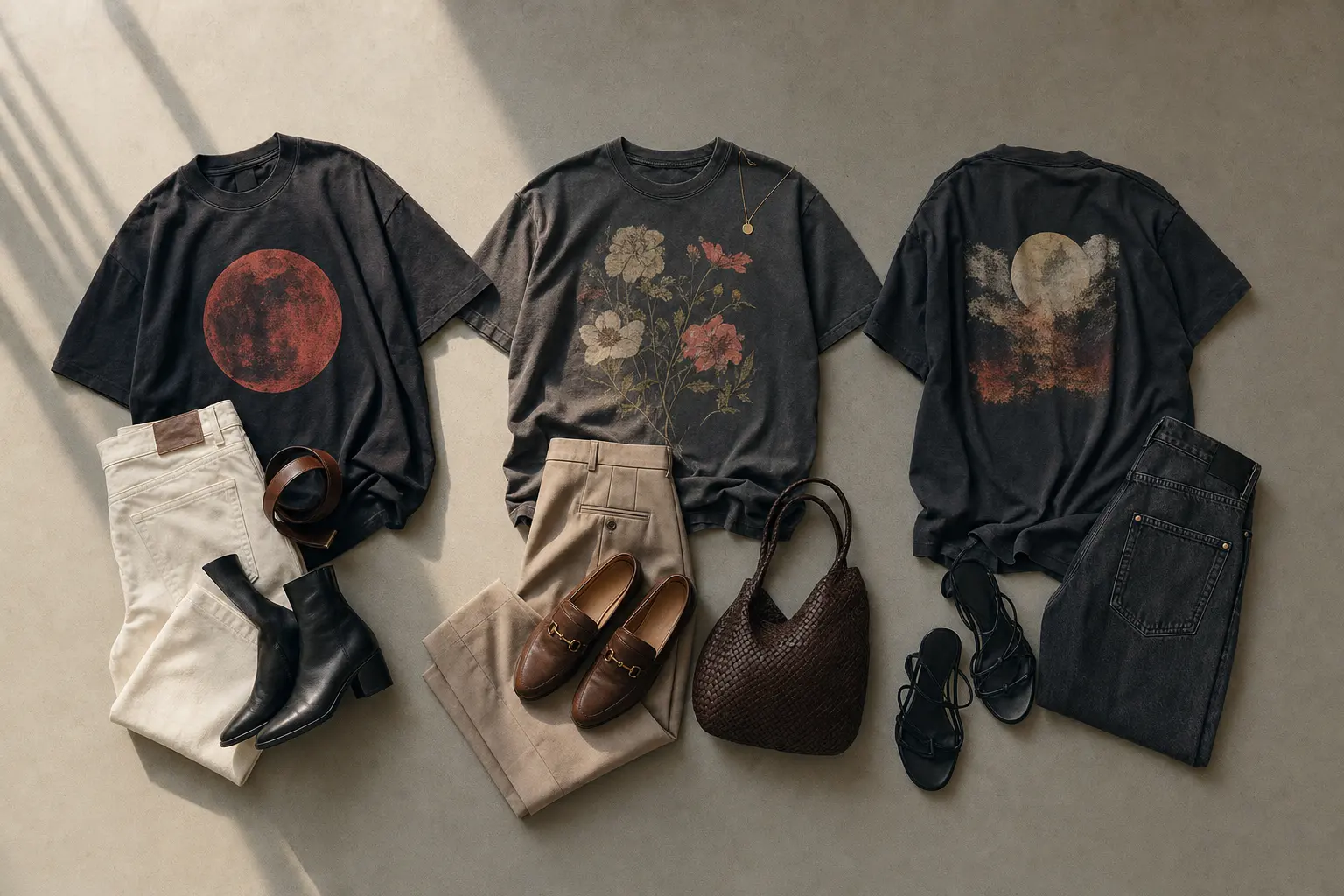
Color is where a clean graphic tee outfit can become crowded. The solution is not to remove every accent. It is to select one relationship between the artwork and the rest of what you wear: tonal, neutral, or single-accent.
Three reliable color formulas
Tonal: use a dark or muted base with a graphic that contains a related value. Stand Firm on graphite, navy, or black creates a controlled field for the red moon without requiring another red element. This is the strongest formula when you want the print to feel integrated rather than decorative.
Neutral frame: pair a colorful front print with the quietest pieces you own. Bloom Study on Sport Grey or Graphite Heather already supplies burnt orange, teal, mustard, and dark green; the surrounding outfit should not introduce a competing graphic, bright contrast, or elaborate pattern. Keep the shirt visible rather than hiding the composition under a busy layer.
Single accent: allow one small echo of the print’s strongest color, then stop. Golden Bloom can lead an outfit built around dark green, graphite, or another restrained neutral. Daylight can be treated as a warm-weather statement, but its yellow, teal, orange, and mint references mean the supporting pieces should be especially plain.
Color matching is less useful than color containment. Repeating every shade in a graphic makes the outfit look assembled around a product image. Repeating one shade, or none at all, makes the print feel like part of a wardrobe.
- Use a neutral lower half when the shirt contains three or more noticeable colors.
- Keep additional text and logos out of the immediate visual field.
- Choose a layer that leaves the key print visible rather than cutting it through the middle.
- For a front-only design, use the plain back as a reason to keep the silhouette simple from behind.
- When the shirt is already bright, let shape rather than more color create the outfit’s interest.
Suppose you want a bright summer shirt for occasional wear. Daylight is a reasonable choice because the sun, towels, cocktail, and orange imagery already establish that mood. If you need a tee for frequent rotation, Stand Firm or Bloom Study will place fewer demands on the rest of your wardrobe.
A second hypothetical shopper may own mostly dark pieces but dislike outfits that look severe. Golden Bloom can soften that wardrobe through its yellow flowers and green stems without requiring a bright supporting layer. Keep the rest of the outfit dark and let the botanical front remain the only warm note.
The principle also applies to accessories you already own: one quiet object can finish the outfit, while several attention-seeking additions dilute the graphic. The cleanest combination is often the one that leaves one visual question unanswered.
Styling a Korean flag graphic with cultural accuracy
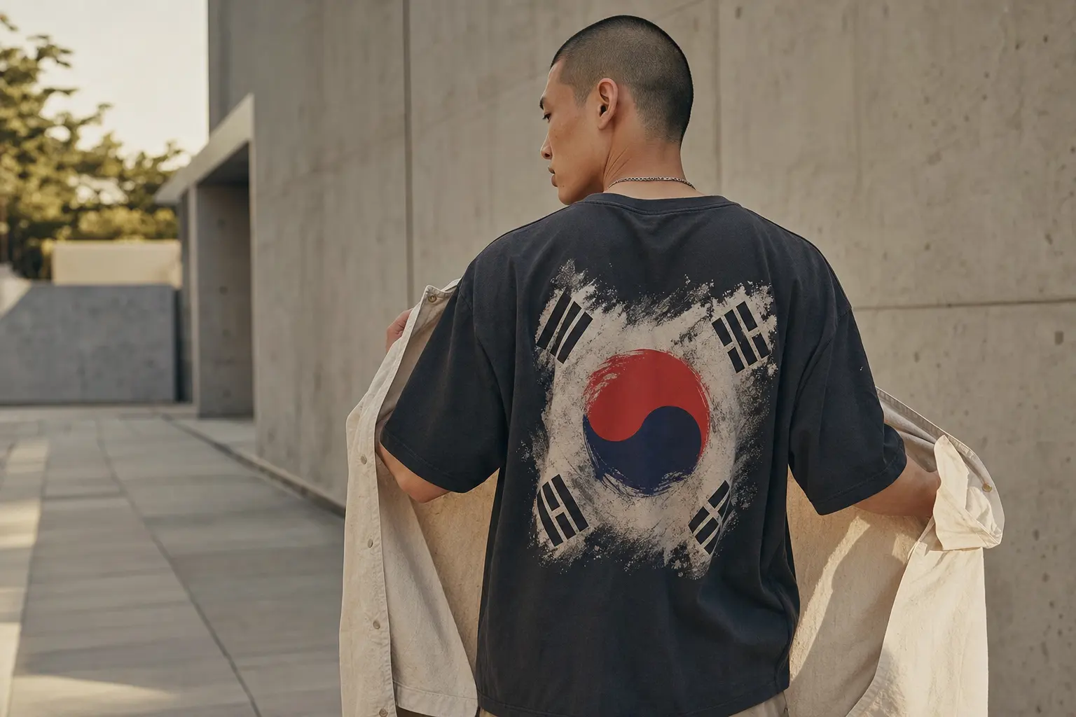
The Korean Taegeukgi Flag tee deserves a more careful description than “flag-inspired streetwear.” The official Taegeukgi consists of a white background, a red-and-blue taegeuk circle, and four black trigrams, with documented symbolic associations for the elements represented by those trigrams [3]. The StyleMZ design is an artistic reinterpretation: its distressed splatters, geometric forms, gold accents, and English text are additions to the standardized flag construction.
That distinction affects both styling and language. Present the shirt as a contemporary Taegeukgi-inspired artwork, not as an official flag reproduction. The graphic’s large back placement and paint-splatter treatment make it more expressive than a discreet emblem, so a quiet front and an uncomplicated silhouette give it room to read without turning the outfit into themed dressing.
Keep the rest of the outfit deliberately plain
- Use a dark or neutral base. The catalog lists Navy, Black, and Dark Gray, all of which allow the red, blue, black, white, brown, and gold artwork to lead.
- Preserve the back view. Avoid a layer that completely covers the graphic when the artwork is the reason for the purchase.
- Do not add a second national reference. The shirt already carries the cultural signal; extra symbolic graphics can make the styling feel performative.
- Keep the front relaxed. Because the Bella+Canvas blank is a looser jersey tee, an untucked line or partial tuck is more coherent than a tightly compressed full tuck.
The back print should also influence how you move through an outfit. A simple layer can be worn open or removed when you want the artwork visible, rather than chosen to compete with it. This makes the tee useful in a sequence of looks without pretending that the graphic is discreet.
This is the case for choosing meaning over maximum versatility. If you want the easiest everyday graphic, Stand Firm remains the simpler answer. If the Korean cultural reference is central to your decision, the Taegeukgi design offers a more specific point of view, provided you describe and wear it as an artistic reinterpretation.
For a more detailed discussion of proportion and context, continue with how to wear a Taegeukgi tee without a costume effect. The useful takeaway is restraint: let one culturally specific graphic speak clearly, then remove visual noise around it.
Best suited to: a shopper who wants the back graphic and cultural reference to be the central reason for buying, not someone looking for an anonymous neutral basic.
Front print or back print: choosing the right focal view
Print placement changes how an outfit communicates. A front print is immediately legible in conversation and photographs, while a back print becomes more visible in motion, in a queue, or when a jacket is removed. Neither is inherently more minimalist. The question is whether you want the graphic to organize the front of your silhouette or create a reveal from behind.
Bloom Study and Golden Bloom are front-print-only designs, so they work well when you want a complete outfit idea visible from the front. Their plain backs provide visual relief and make them easier to wear under an open layer. Keep that layer simple enough that the floral composition remains intact; a cropped interruption across the flowers can make the print feel accidental.
Korean Taegeukgi Flag makes the opposite choice. Its back graphic is the event, while the front can function as a quieter entrance to the outfit. This supports a relaxed, walking-oriented silhouette, but it asks you to think about how the shirt looks from behind rather than judging it only in a mirror.
Match placement to the day
- For a presentation-led outfit: choose Bloom Study, Golden Bloom, or Stand Firm, where the front graphic can carry the visual message.
- For movement and streetwear presence: choose Korean Taegeukgi Flag or Night Walkers Seoul, then preserve the back view with a simple layer.
- For a seasonal accent: choose Daylight when its sun-and-orange composition fits the occasion, rather than forcing a summer-coded graphic into every setting.
Night Walkers Seoul needs the strongest edit because the back illustration contains buildings, shops, cafes, people, a taxi, N Seoul Tower, and several colors. It is a compelling city graphic, but calling it minimal in the strict sense would be inaccurate. Its place in a minimalist wardrobe comes from the neutral support around it, not from low graphic density.
A hypothetical commuter who wants a graphic that reads immediately in a front-facing setting should choose Stand Firm or Bloom Study. A shopper who wants the artwork to appear as people pass behind them has a stronger case for Korean Taegeukgi Flag or Night Walkers Seoul. The right answer depends on the visual encounter you actually want.
If your wardrobe is built around layering, a front-only floral may offer more practical wear because the plain back tolerates an open overshirt or simple outer layer. If your priority is a single memorable graphic, a back print gives the outfit more movement and less visual insistence from the front.
Print-on-demand T-shirts: what to verify before buying
Made-to-order production changes the buying decision. In a print-on-demand model, a product is made after it is purchased rather than held as finished inventory; the provider describes the process as printing, packaging, and shipping the item after the order, without order minimums [4]. For a design-led shopper, that supports original graphics and smaller releases. It does not, by itself, prove faster delivery, lower environmental impact, or superior print durability.
The blank manufacturer’s decoration guidance should be read with similar precision. Bella+Canvas describes the 6400’s smooth surface as ready for direct-to-garment decoration [1]. Gildan lists the 5000 as suitable for screen printing, embroidery, iron-on transfers, bleaching, and tie dye [2]. Those statements establish compatibility with decoration processes, not the wash life, colorfastness, or exact print method of every finished StyleMZ item.
A sensible pre-order check
- Confirm the selected color and size are available, rather than assuming every catalog option shares the same fiber composition.
- Compare the listed size range with the silhouette you want. The Gildan designs extend through 5XL, while the Korean Taegeukgi Flag listing runs from S through 2XL.
- Read the finished garment’s care instructions when the shirt arrives. The print and blank are one finished product, so component information alone cannot replace its label.
- Allow for made-to-order fulfillment when planning a gift or time-sensitive outfit.
Care should be treated as a product-specific instruction, not a universal internet routine. The FTC says covered apparel needs care instructions and that those instructions must have a reasonable basis for the finished garment; when several components are combined, evidence for the whole garment matters [5]. That is why a blanket promise such as “wash cold and hang dry” should not be presented as the official care rule for every color, print, and fulfillment combination.
Fiber variation matters here as well. A shopper selecting Sport Grey, Graphite Heather, or another non-solid color should not assume that the composition matches a solid-color version of the same blank. This is a small detail with a practical consequence: if material content affects comfort, care, or purchasing standards, verify the exact color rather than relying on the product family name.
Choose the product because the artwork and silhouette solve your wardrobe problem first. Then use the label to protect that choice. The made-to-order format is a reason to value the originality of the design, not a reason to assume anything about durability or delivery until current product information confirms it.
Best suited to: a shopper who values original artwork and accepts that current fulfillment, color composition, and finished-garment care need to be checked at the point of purchase.
Which Korean graphic tee fits your actual wardrobe?
The best choice changes with the wardrobe you already have. A shopper with dark, quiet basics needs a different answer from someone whose closet already contains bright seasonal pieces. Use the following hypothetical situations as a decision test rather than as fixed style rules.
If you want one repeatable everyday tee
Choose Stand Firm. Its limited red, white, grey, and black palette gives you a clear focal point without requiring an elaborate color plan. The Gildan 5000 foundation is listed as a 5.3-ounce heavyweight, classic loose-fit shirt [2], so keep the rest of the silhouette straightforward and let the boxy structure remain visible. This is the most defensible first purchase when versatility matters more than cultural specificity or seasonal mood.
If you want Korean design language to be the point
Choose Korean Taegeukgi Flag, but accept the tradeoff. The relaxed Bella+Canvas blank and large back graphic create a looser, more expressive outfit, while the Taegeukgi reference gives the design cultural specificity. Keep the front quiet, avoid competing symbols, and describe the image as an artistic reinterpretation rather than an official flag. The recommendation changes if you need a low-profile shirt for conservative settings.
If your wardrobe needs color but not another complicated shape
Choose Bloom Study or Golden Bloom. Both place the artwork on the front and leave the back plain, making them easier to frame with simple layers. Bloom Study is more graphic and abstract, with three differently colored flowers; Golden Bloom is more concentrated, with five yellow poppies and green foliage. Choose the former for a modern art direction and the latter for a brighter botanical statement.
If you want the strongest street-scene narrative, Night Walkers Seoul is the honest choice, but it is not the easiest minimalist print. If you want a warm-weather mood, Daylight makes that intention visible through its sun, towels, cocktail, and orange imagery. Those designs become better choices when you want the shirt to carry atmosphere rather than serve as a neutral daily uniform.
Consider a third situation: you already own several restrained graphic tees and want one piece with a more distinctive point of view. In that case, choosing the least demanding option may be redundant. Night Walkers Seoul or Korean Taegeukgi Flag can fill a genuine gap, as long as the rest of the outfit is reduced to a quiet frame and the print’s placement is part of the plan.
The final rule is practical: buy the graphic that fills a genuine gap. If you need restraint, choose Stand Firm. If you need a lighter drape and a meaningful back print, choose Korean Taegeukgi Flag. If you need front-facing color with a plain back, choose one of the floral designs. That is a stronger decision than choosing by title, trend language, or the assumption that every Korean-inspired tee should be styled the same way.
Shop the collection: Korean graphic tees, Korean long sleeve shirts, Korean sweatshirts, Korean hoodies and Korean tank tops – original graphics designed in Korea, made to order.
Frequently Asked Questions
What makes a Korean graphic tee outfit look minimalist?
Keep one graphic as the focal point and make the surrounding colors, layers, and accessories quiet. A detailed print can still work when the silhouette is simple and the rest of the outfit does not introduce competing text or patterns. Stand Firm is the easiest StyleMZ example because its palette and chest placement are comparatively restrained.
Which StyleMZ tee is easiest to style minimally?
Stand Firm is the most straightforward starting point. Its red, white, grey, and black chest graphic can sit against a dark or muted base without demanding a second accent. Bloom Study and Golden Bloom are also practical because their designs are front-print only and leave the back plain.
Are all of these Korean graphic tees made in Korea?
The supplied catalog information establishes that the original artwork is designed in Korea and printed on demand near the buyer. It does not establish that the garments themselves are manufactured in Korea. Check the current product information if country of manufacture is part of your purchase decision.
Is the Gildan tee heavier than the Bella+Canvas tee?
The Gildan 5000 is listed at 5.3 ounces per square yard [2]. The Bella+Canvas 6400 solid-color specification is listed at 4.2 ounces per square yard [1]. In styling terms, the Gildan foundation supports a more structured, boxy appearance, while the Bella+Canvas blank supports a lighter relaxed line. Exact fiber content can vary by selected color.
How should a printed StyleMZ T-shirt be washed?
Follow the care instructions on the finished garment rather than applying one universal routine. The FTC requires covered apparel to carry care instructions and says those instructions need a reasonable basis for the finished garment [5]. The blank manufacturer’s decoration-readiness information does not establish the exact wash life of a finished StyleMZ print.
Which design works best for a strong back-print outfit?
Korean Taegeukgi Flag is the clearest back-led option, with a large artistic Taegeukgi reinterpretation and bold English text. Night Walkers Seoul is another back-focused choice, but its detailed city scene and broad color range require quieter supporting pieces. Preserve the back view with a simple layer and let the shirt carry the visual story.