 OBJECT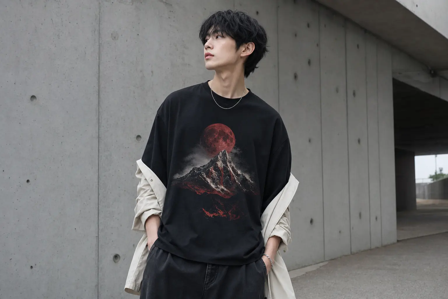
Faith message graphic tee styling works best when the message has room to speak. The common mistake is treating a meaningful print as an invitation to add more symbolism, more lettering and more accessories. That approach can make a considered graphic look like a costume.
A better method is editorial: choose one dominant idea, set its proportions against the rest of the outfit, and let the blank garment shape the mood. For most shoppers, that means starting with the centered Stand Firm design when direct resilience is the point, then moving toward a back-print or cultural graphic when you want more distance.
Faith Message Graphic Tee Styling Starts With One Clear Statement
Make the graphic the decision, not an afterthought
A message tee already contains a visual hierarchy. Words establish tone, imagery establishes mood, and the garment color controls how loudly both are read. If every other visible element tries to contribute a second message, the outfit loses its center.
The strongest starting point is therefore simple: decide what you want the shirt to communicate before deciding what to wear with it. A direct resilience statement, a personal spiritual reference, a cultural symbol or an uplifting botanical image each asks for a different amount of visual support. They should not all be styled as if they carry the same meaning.
The Stand Firm tee is the clearest example of a direct statement. Its chest graphic combines a red moon, mountains, a winding road, birds and the words “STAND FIRM IF YOUR FEET IS IN THE RIGHT PLACE.” The catalog presents it as a resilience design rather than identifying it with a particular faith tradition. That distinction matters: you can wear it as an expression of conviction without assigning it a doctrinal origin the product description does not establish.
Use this three-part check before building the outfit:
- Read: Can the wording be understood without another slogan competing nearby?
- Scale: Is the print large enough to remain intentional, but balanced by the garment’s shape?
- Silence: Are the remaining visible pieces quiet enough to let the message remain primary?
This is why a restrained outfit often looks more fashion-aware than a heavily coordinated one. The point is not to hide the message. It is to stop the styling from explaining it twice.
Think of the tee as a graphic poster that happens to move with the body. The eye should know where to land first, then where to travel. A centered print asks for a relatively calm frame around it; a busy layer, competing logo or strongly patterned accessory interrupts that reading.
For a useful visual contrast, compare the principles in these graphic tee and denim outfit ideas. The same logic applies here: proportion and repetition make a graphic look deliberate.
That rule also protects the personal meaning of the garment. If the message matters to you, it does not need theatrical reinforcement. A clean silhouette can communicate confidence more convincingly than a collection of literal references.
Choose Between a Direct Faith Message and a Cultural Graphic
Meaning changes the styling distance
Not every meaningful graphic is a faith message, and not every expressive statement should be described as religious. The catalog does not identify the Stand Firm wording as scripture or as belonging to a specific faith tradition. It is more accurate to call it a resilience statement unless the artwork or designer provides a clearer attribution.
That leaves you with a useful choice. If you want the outfit to communicate personal resolve at first glance, choose a centered statement. If you prefer an indirect expression, choose imagery that carries meaning through symbolism, color or cultural reference rather than explicit wording.
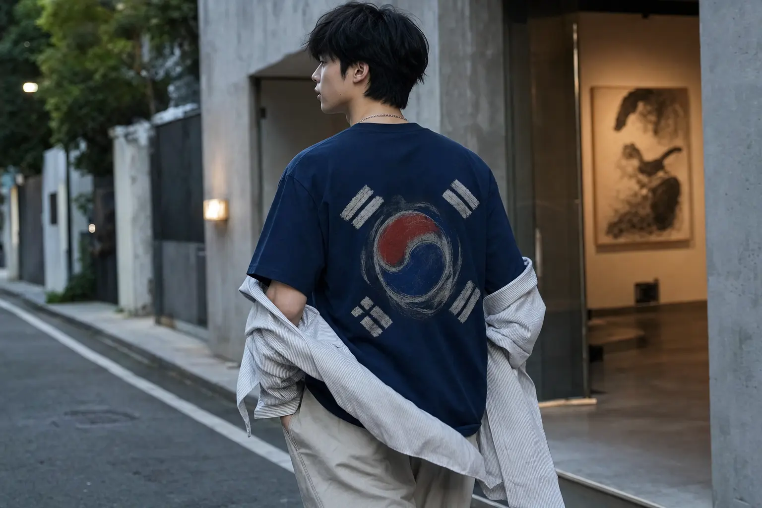
The Korean Taegeukgi Flag tee belongs to the second category. Its back graphic is described with the Taegeuk symbol, four black trigrams, bold “TAEGUKKI” and “KOREA” text, plus paint-splatter and geometric elements. It should be styled as Korean cultural graphic art, not as a generic red-and-blue abstract print or proof of official affiliation.
Its back-led placement changes the outfit equation. The front can remain quiet, which makes the shirt easier to wear with a simple outer layer or a clean accessory. The visual interest appears when you turn, so the rest of the outfit can support the silhouette rather than compete with a chest slogan.
Choose a direct statement when:
- You want the wording to be immediately legible.
- Your existing wardrobe is mostly quiet and can carry one strong focal point.
- You are comfortable with the message being read before the outfit is read.
Choose a cultural or symbolic graphic when:
- You want meaning to unfold through artwork rather than a sentence.
- You prefer a back print and a calmer front view.
- You understand the symbol well enough to present it accurately.
The distinction is especially useful when shopping internationally. This Taegeukgi styling reference offers a focused way to think about cultural context without turning a national symbol into a costume prop.
In practical terms, the direct message is the stronger choice for a reader searching specifically for a faith-adjacent or conviction-based tee. The Taegeukgi design is better when the intended expression is cultural identity, Korean graphic language or art-led streetwear.
There is no need to force those categories together. A shopper may like both designs, but they serve different communicative purposes. The first says something through language; the second builds atmosphere through image, color and a recognizable national reference.
If your answer changes depending on the setting, layering can keep the decision flexible. Wear the direct statement when you want clarity, and choose the back-print option when you want the outfit to reveal its strongest detail through movement.
Compare Graphic Tee Fits Before You Size Up
The blank determines whether the message looks crisp or swallowed
Graphic styling depends on the garment underneath the artwork. A relaxed women’s tee and a classic unisex tee can carry the same styling idea while producing very different proportions. Do not assume that “oversized” means the same thing across both blocks.
The Bella+Canvas 6400 is described by its manufacturer as a women’s relaxed-fit, side-seamed crewneck with short sleeves and a looser contemporary shape. Solid colors are listed as 100% Airlume combed and ring-spun cotton at 4.2 oz, although the exact product color and supplier specification still matter before making a fiber assumption [1]. The shape supports a body-skimming approach: wear it close enough that the print stays readable, then create volume elsewhere with an open layer you already own.
The Gildan 5000 family takes a different position. Its published product information describes a classic fit, taped neck and shoulders, rib collar and tear-away label, with a listed weight of 5.3 oz and color-dependent fiber formulas [3]. That makes the blank a more natural starting point for a loose streetwear silhouette, but it does not automatically make every size an intentionally oversized Korean fit.
| Option | Documented blank direction | Graphic effect | Best styling decision |
|---|---|---|---|
| Korean Taegeukgi Flag | Women’s relaxed, side-seamed Bella+Canvas 6400 | Back-led cultural statement | Keep the front and accessories quiet |
| Stand Firm | Classic-fit Gildan 5000 | Centered chest message | Use balanced proportions rather than extra slogans |
| Daylight | Classic-fit Gildan 5000 | Bright, detailed front artwork | Repeat one print color and reduce accessory noise |
| Bloom Study | Classic-fit Gildan 5000 | Front floral composition with plain back | Let the chest artwork lead against a simple layer |
| Golden Bloom | Classic-fit Gildan 5000 | Central floral statement | Build around green, yellow or a neutral base |
For a hypothetical reader who normally wears a neat medium, the first move should be comparing garment measurements with a favorite tee, not automatically buying a larger size. A larger Gildan may create useful shoulder volume, but it can also add length that overwhelms the message. A relaxed Bella+Canvas fit may already provide enough ease without that problem.
Consider the relationship between print position and hem length. A centered chest design can look visually low when the shirt is much longer than expected, especially if the lettering sits below the strongest image. A back graphic has more room to tolerate a relaxed proportion because the artwork is read across a larger moving surface.
Weight matters as a styling variable, too. At 5.3 oz, the Gildan blank is more substantial than a very light jersey tee, but the specification alone does not prove the dense drape of a specialist heavyweight streetwear garment. The likely tradeoff is a more structured appearance against potentially warmer wear when conditions are hot.
The decision is straightforward: choose the 6400 when you want a softer, less oversized proportion; choose the Gildan 5000 options when a classic loose shape is part of the look. In both cases, measurement comparison beats a size label.
If you already own a tee with the right shoulder line but the wrong length, compare both measurements rather than copying its size. A deliberate oversized silhouette depends on balance: enough width for ease, enough length to fall cleanly, and no accidental excess that hides the composition.
Build a Color Hierarchy Around the Graphic
Repeat one color, then stop
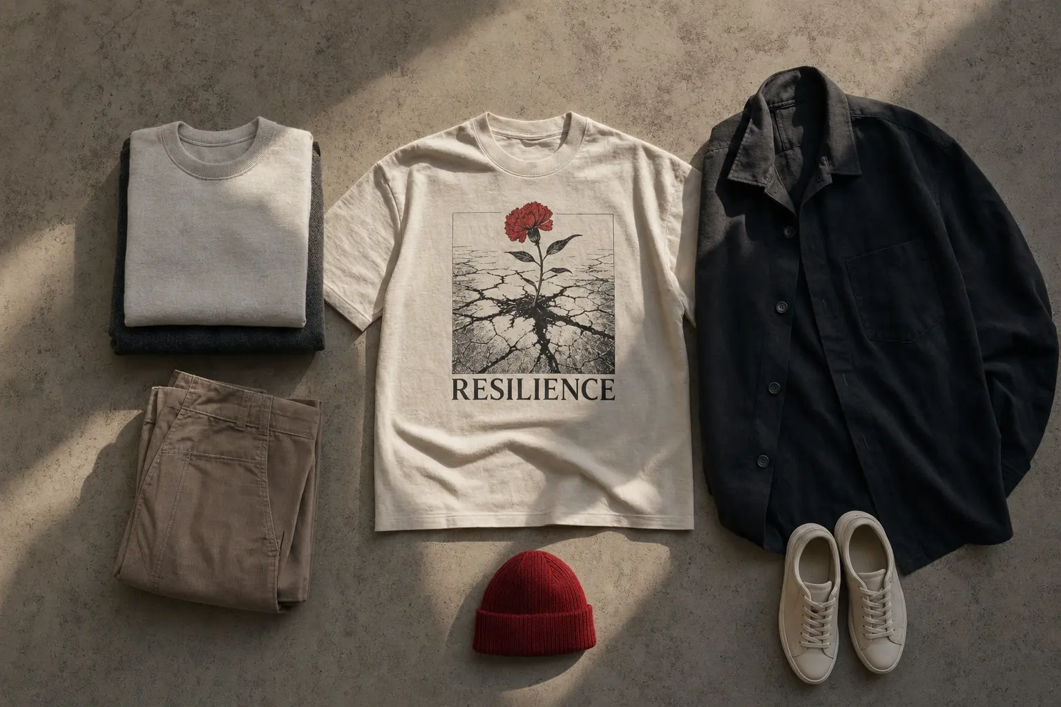
The fastest way to make a message tee look considered is to repeat one color from the print in a small, quiet part of the outfit. This can be a layer, a visible cuff or a neutral-toned accessory you already own. Repeating every color from the artwork is less effective because it turns the outfit into a literal palette exercise.
For Stand Firm, the red moon is the obvious accent, but it should not automatically dictate a red-heavy outfit. A black, navy or charcoal base lets the red appear as a controlled signal. If the tee is worn in Graphite Heather, Navy or Black, the message remains the focal point while the mountain scene retains its contrast.
Bright designs need a different restraint. Daylight contains a yellow sun, teal and orange beach elements, a cocktail glass and a city reference. Its energy is intentionally social and summery, so styling it with another bright graphic would create competition. One repeated tone is enough; the rest can sit in black, cream, grey or denim already in your wardrobe.
Botanical designs reward the same approach. Bloom Study uses burnt orange, teal, mustard yellow, dark green and grey in a centered floral composition. Golden Bloom places five yellow poppies with green stems beneath dark green wording. Neither needs a second nature motif to explain the idea.
Use this editing sequence:
- Identify the strongest color in the print.
- Choose one supporting neutral for the visible layer.
- Remove any accessory that introduces a competing logo, slogan or high-contrast pattern.
- Check the outfit from a distance, where overall blocks matter more than tiny details.
Imagine a reader dressing for a gallery visit in early autumn. The right move is not to match every flower in Bloom Study; it is to pair the tee with one calm layer and let the burnt orange or teal appear once elsewhere. For a weekend walk, Stand Firm can take a similar route with a dark base and one red detail.
Print scale should guide the amount of color you repeat. A large, multicolor image already occupies substantial visual space, so a small color echo is enough. A compact chest mark can tolerate a little more surrounding contrast, but it still benefits from one clear hierarchy.
This restraint also keeps the styling adaptable. You can change the surrounding pieces without changing the message, which is the point of buying an original graphic rather than a novelty costume.
When in doubt, remove one item before adding another. Most graphic outfits become sharper when the visual field is edited, not expanded.
Use Layers to Control How Public the Message Feels
Visibility is a styling dial
A faith-adjacent or resilience graphic does not have to be fully exposed at every moment. Layering lets you control how directly the wording is read while preserving the tee as the outfit’s anchor. The key is to use existing garments as framing devices, not as a second styling performance.
For a centered chest message, an open overshirt can divide the graphic into a deliberate central panel. Keep the layer plain or minimally textured so the wording remains legible. If the overshirt closes across the print, the message becomes partial and can look accidental, especially when the most important words disappear beneath a button line.
A back-print design works well under a layer that can be removed or pushed aside. The Korean Taegeukgi Flag tee has its major artwork on the back, so a quiet front-facing outfit can become more expressive when the layer moves. This is also why the design does not need additional patriotic colors in every other piece; the graphic already carries its own red, blue, black and gold vocabulary.
For cooler weather, the principle is proportion before warmth. A longer outer layer over a shorter tee can create a clean vertical line, while a cropped layer can expose the full message and make the graphic feel more assertive. Avoid combining an oversized tee, an oversized layer and several long accessories unless that volume is intentional across the whole silhouette.
Three useful layering situations:
- Warm indoor setting: Wear the message tee alone with the print fully visible and keep accessories minimal.
- Transitional weather: Add an open, plain layer that frames the chest or allows the back print to appear when you move.
- Cooler streetwear proportion: Choose one longer or roomier layer, then keep the lower half of the silhouette visually calm.
If the outfit begins to feel too themed, remove the layer with the strongest texture or wording first. The tee should remain the most specific item. For more seasonal proportion ideas, see these fall graphic-shirt styling principles, adapting the layering logic to clothes you already own.
Layering also changes social emphasis. A fully visible slogan is direct and declarative. A partially covered print is quieter, but it should still look intentional. Place the opening of the layer beside the graphic rather than across the most important line of text.
The result is more flexible than a permanently exposed slogan. You decide when the message leads and when the silhouette leads.
Keep Korean Visual References Accurate and Personal
Meaning should not be invented for atmosphere
Korean design influence is visible in the catalog through original artwork described as designed in Korea, but that does not mean every graphic has the same cultural meaning. A clean editorial approach separates Korean visual language, Korean cultural symbolism and your own interpretation.
The NIGHT WALKERS SEOUL tee, for example, is an urban illustration with buildings, shops, cafes, pedestrians, a white taxi and N Seoul Tower. Its catalog description presents the work as a Seoul night scene and includes text within the artwork. That makes it a city graphic, not a faith graphic, even if you wear it as a personal reminder of movement, community or evening reflection.
Likewise, flowers can suggest renewal or hope to an individual wearer without becoming documented religious symbols. Bloom Study and Golden Bloom are described as botanical or nature-inspired designs. It is reasonable to style them as reflective, optimistic or art-led pieces. It is not reasonable to claim that the catalog assigns them a specific spiritual doctrine.
This distinction affects accessories. If a tee already carries a national symbol or a strong textual statement, adding unrelated symbolic jewelry, slogans or costume-like elements can blur the reference. Clean personal items are usually more effective because they let the artwork retain its identity.
Ask yourself three questions:
- Am I wearing this image because I understand what it represents, or because it creates a vague “Asian streetwear” mood?
- Does my styling clarify the artwork’s tone, or does it turn the symbol into decoration?
- Would the outfit still work if the graphic were viewed as art rather than as a claim about me?
For a shopper drawn to Korean streetwear’s adaptable proportions, the useful lesson is not to copy a fixed uniform. It is to treat clothing as a way to balance identity, shape and context. A tee can be expressive without demanding that every surrounding item repeat its story.
This is also where a broader look at Seoul streetwear graphics can help: use it for visual reference, not as proof that one silhouette represents every Korean wearer.
Personal interpretation still has a place. You may connect a floral graphic with renewal or a night-city image with reflection. Present that as your reading of the artwork, not as an official meaning supplied by the designer.
That distinction produces more thoughtful styling. It respects the reference while leaving room for the garment to become part of your own wardrobe rather than a borrowed costume.
Make-to-Order Graphics Need Practical Care Expectations
Separate documented facts from assumptions
Print-on-demand is part of the commercial story for these designs, but it does not answer every question about a finished garment. The catalog identifies the products as printed on demand near the buyer; it does not document the exact printing method, country of manufacture, wash label or guaranteed print longevity.
That matters because print method can affect surface feel and color behavior, yet a general category explanation cannot be transferred to a specific listing without fulfillment documentation. Do not buy a tee on the assumption that it uses direct-to-garment printing, has a particular soft print surface or will age in a certain way.
Care should be equally evidence-led. The Federal Trade Commission’s apparel rule requires covered manufacturers and importers to provide regular care instructions and maintain a reasonable basis for those instructions [7]. The practical decision is simple: use the care information attached to the garment you receive rather than treating generic graphic-tee advice as a universal rule.
Fiber content also varies by color within the Gildan 5000 family. The published information lists solid colors as 100% U.S. cotton, Sport Grey as 90% cotton and 10% polyester, heathers and safety colors as 50% cotton and 50% polyester, and Ash Grey as 99% cotton and 1% polyester [3]. Catalog color names such as Graphite Heather, Sport Grey or Dark Heather should therefore not be treated as interchangeable with solid black or navy.
Before ordering, make four checks:
- Confirm the selected color rather than relying on the product family’s headline fiber claim.
- Compare the listed size information with a garment you already own.
- Read the supplied care instructions when the product arrives.
- Keep the print’s placement in mind when choosing how the tee will be layered and stored.
Made-to-order production can be a sensible match for original artwork because the product is created after purchase, but that mechanism alone does not prove a lower total environmental impact. Shipping, blanks, packaging, returns, energy and print waste still matter. Shop for the exact design and use case first; treat production claims with the same precision you apply to fit.
The same discipline applies to words such as “heavyweight,” “soft” and “durable.” A catalog description may use those terms, while a manufacturer’s blank specification supplies a different kind of evidence. The safest comparison is to state what the blank and listing document, then leave unsupported performance promises aside.
For a buyer ordering across borders, this clarity is especially useful. The artwork may be described as designed in Korea and printed near the buyer, but those statements do not establish that the blank garment was manufactured in Korea. Design origin, blank origin and fulfillment location are separate questions.
A precise product description is not less exciting. It gives the graphic, fit and design language room to stand on their own.
Apply the Rule to Three Realistic Shopping Situations
Let the intended use decide the level of statement
Three different shoppers can search for the same kind of message tee and need three different answers. The right choice depends on how directly the graphic should speak, how much volume the silhouette can carry and whether the intended meaning is verbal, cultural or personal.
Situation one: you want a visible statement for everyday wear. Choose Stand Firm if the wording is the reason you are shopping. Its chest-centered red-moon and mountain composition gives the outfit a clear point of focus, while the available Black, Navy and Graphite Heather colors allow a controlled base. Start with your usual measured size, then size up only if the extra width and length create the loose proportion you want. Do not add another slogan or a symbolic layer.
For this first situation, the best supporting pieces are quiet rather than literal. A plain open layer can frame the chest, while one dark neutral below the waist keeps the eye near the artwork. If the shirt is already relaxed through the body, adding another oversized element may make the message feel lost inside the silhouette.
Situation two: you want expressive meaning without a front-facing slogan. Choose the Korean Taegeukgi Flag tee when the cultural artwork is more important than direct verbal messaging. Its relaxed Bella+Canvas 6400 shape supports a less oversized outfit, and its back graphic gives the front a quieter read. A plain layer, restrained accessories and one color echo from the artwork are enough. If you need help judging the cultural reference, read the product description carefully rather than describing the symbol as generic abstraction.
For this second situation, movement becomes part of the styling. The back graphic appears as you walk away or remove an open layer, so the front does not need a second focal point. Choose the size for the relaxed block first, then use color to support the red, blue, black or gold already present in the artwork.
Situation three: you want the styling method but not a documented faith message. Choose Bloom Study or Golden Bloom when botanical art expresses your mood more accurately than text. Both use front-centered floral compositions, so the same rules apply: keep the surrounding outfit quiet, choose one supporting tone and let the blank back or neutral layer provide breathing room. These are not documented religious designs, but they can support a personal interpretation of renewal or optimism.
For this third situation, the choice is about emotional directness rather than doctrine. Bloom Study brings a more varied abstract floral palette, while Golden Bloom offers a concentrated yellow-and-green statement. Neither requires an added symbolic accessory; the composition already supplies the visual language.
The defensible recommendation is therefore conditional, not universal. Stand Firm is the strongest direct answer to a faith-adjacent message-tee search because its wording is explicit and its graphic is centered. The Taegeukgi option is better for cultural expression and a quieter front. Botanical designs are the better choice when you want symbolic feeling without claiming a specific belief system.
Before checkout, make one final edit: remove any surrounding item that tries to tell a second story. The best version of this outfit is rarely the most decorated one. It is the one in which the print, proportion and personal meaning agree.
If none of the three situations matches your wardrobe, use the same rule in reverse. Start with the amount of attention you want, identify the print placement that creates it, and then select the blank whose width and length support that decision. The garment should make the styling easier, not force you to compensate for it.
Shop the collection: Korean graphic tees, Korean long sleeve shirts, Korean sweatshirts, Korean hoodies and Korean tank tops – original graphics designed in Korea, made to order.
Frequently Asked Questions
What is the best tee for faith message graphic tee styling?
The Stand Firm Heavyweight Unisex Crewneck T-shirt is the clearest choice when you want a direct resilience message. Its centered chest artwork and wording create one obvious focal point, so the rest of the outfit can stay quiet. It should be understood as a resilience statement rather than assigned to a specific faith tradition without additional information.
Should a graphic tee be oversized for Korean streetwear styling?
Not automatically. The Gildan 5000 options already use a classic loose fit, while the Bella+Canvas 6400 is described as a relaxed women’s fit. Compare garment measurements with a tee you own before sizing up, because extra length can overwhelm the graphic even when the shoulder width looks appealing. A considered loose silhouette is better than accidental excess.
How do you style a message tee without looking like a costume?
Use one dominant graphic and keep the remaining visible pieces simple. Repeat one color from the print instead of matching every color, avoid nearby slogans and choose layers that frame rather than cover the message. With a cultural graphic, make sure the symbol is described accurately rather than treated as generic decoration. The outfit should support the artwork instead of performing the same idea twice.
Can a floral graphic tee represent faith or spirituality?
It can carry personal meaning for the wearer, but that does not make it a documented religious design. Bloom Study and Golden Bloom are presented as botanical or nature-inspired graphics. Style them as reflective or optimistic pieces if that is your interpretation, without claiming that the catalog assigns a particular doctrine to the artwork. Personal symbolism and documented product meaning are different things.
What should I check before washing a print-on-demand graphic tee?
Check the actual care label or supplied care instructions for the garment you receive. The available product information does not establish one universal wash method or exact printing process for every listing. Fiber content can also vary by color in the Gildan 5000 family, so confirm the selected color rather than assuming every shade has the same composition. Generic graphic-tee care advice should not override the garment’s own instructions.