 OBJECT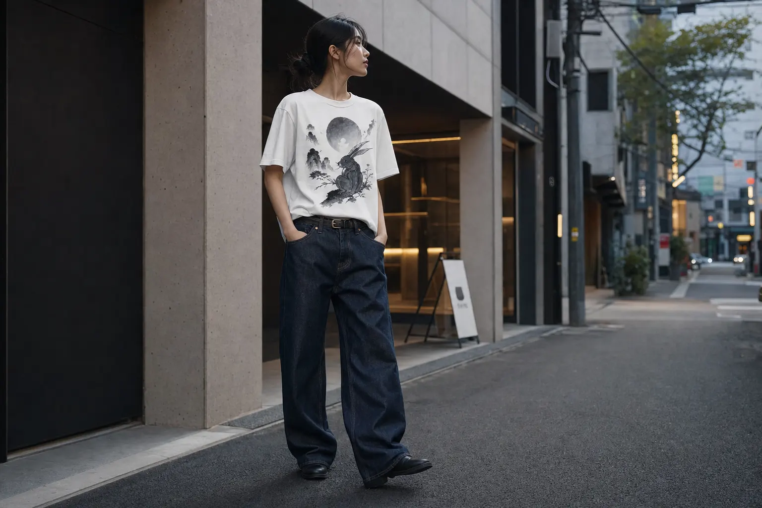
Graphic tee and denim outfit ideas become useful when they solve a real styling problem: how to make a printed top feel directional instead of thrown on. The answer is rarely more accessories or louder color. It is proportion, fabric weight, and a graphic with enough visual authority to carry the look.
Seoul streetwear offers a clear reference point. Current Korean design favors urban imagery, restrained styling, and silhouettes that allow the artwork to remain visible. Use the same logic with denim you already own: let one element lead, keep the rest clean, and make the fit look deliberate.
The proportion rules behind strong graphic tee and denim outfits
Start with the silhouette, not the slogan
A graphic tee and denim outfit works when the two pieces occupy different but compatible visual roles. The tee supplies artwork and attitude; denim supplies the long, quiet line underneath. If both pieces are tight, the result can feel dated and overly literal. If both are extremely oversized, the graphic may disappear inside excess fabric.
A relaxed or boxy tee generally benefits from denim with a straight or gently relaxed leg. That pairing gives the shoulder and chest room while keeping the lower half legible. A more compact tee can handle wider denim because the contrast creates shape. You do not need a dramatic tuck to create definition; a clean hem ending near the upper hip can be enough.
Pay attention to the position of the print. A centered front graphic reads differently from a large back illustration. Front artwork becomes the focal point, so keep the rest of the outfit quiet. A back print needs movement and space around it, which makes an unbuttoned overshirt or a simple open layer useful when the weather allows. Avoid covering the artwork with a crowded front layer.
- Relaxed tee: pair with straight or roomy denim and a clean visible hem.
- Heavyweight tee: use its structure to balance denim with a firm waistband and clear leg shape.
- Large back print: keep the front simple so the graphic can appear as you move.
- Bright graphic: repeat one small color elsewhere, rather than matching every shade.
The fabric relationship matters as much as the cut. Official blank specifications commonly sit around 150 to 180 GSM, while some streetwear blanks reach 220 GSM for a denser drape.[1][2] With rigid denim, a midweight or heavyweight tee usually looks more coherent than a thin top that collapses at the waistband. With stretch denim, either weight can work, but a structured tee prevents the outfit from becoming too soft overall.
How to match tee weight with rigid and stretch denim
Use fabric contrast with intention
Denim is not one universal material. A rigid cotton pair holds a firm line and often looks better with a tee that has enough body to meet it. Stretch denim adds mobility and a closer fit, so the shirt can either sharpen the outfit with a heavier blank or create an easy contrast with a softer relaxed silhouette.
For a rigid pair, avoid a flimsy top that twists or bunches immediately at the waistband. A heavyweight cotton crewneck with a clean boxy drape gives the look a stronger upper frame. For stretch denim, a roomy tee can prevent the lower half from feeling too polished, especially when the jeans are narrow through the leg. The goal is balance, not identical thickness.
| Denim type | Best tee direction | Why it works | Common mistake |
|---|---|---|---|
| Rigid, straight denim | Midweight or heavyweight relaxed tee | Matches the firm structure and keeps the silhouette clean | Choosing a very thin tee that collapses at the waist |
| Rigid, wide denim | Compact tee or controlled boxy fit | Creates contrast and keeps the body from looking shapeless | Adding oversized volume everywhere |
| Stretch, slim denim | Roomy heavyweight tee | Offsets the close lower fit with an easier upper line | Pulling the shirt too tightly into the waistband |
| Stretch, straight denim | Relaxed tee with a visible hem | Maintains comfort while preserving proportion | Using excessive tucking that interrupts the graphic |
Material also affects print clarity. Cotton is commonly favored for vivid direct-to-garment results because its absorbency supports crisp, opaque graphics, while blends can create a softer or more intentionally faded appearance.[3] That does not make one fabric universally superior. Choose cotton when the artwork is the main event; choose a blend only when its hand and visual softness are part of the desired mood.
When shopping, inspect the product details for the actual blank, fabric composition, and fit rather than relying on the word heavyweight alone. The same label can mean different things across makers. This is where a focused collection of printed T-shirts is more useful than scrolling through unrelated basics: you can compare the artwork and garment information together.
Seoul-inspired graphic tee styling without costume details
Keep the reference contemporary
Korean-inspired dressing works best when it borrows a visual principle rather than assembling obvious symbols. Current Korean design combines global influences with local traditions, and traditional construction ideas such as straight lines, diagonal movement, pleats, slits, and patchwork can inform modern graphics without reproducing a traditional garment.[6] Translate that approach into styling through proportion, controlled color, and a clear graphic.
Seoul streetwear often feels observational rather than decorative. A city scene, restrained typography, abstract cultural symbol, or botanical composition can say more than a stack of obvious references. The denim should act as the neutral city surface beneath the image. Dark denim creates a sharper frame around cream, teal, orange, or red artwork; washed denim makes a bright graphic feel more casual and open.
For a genuinely current look, avoid combining every signifier at once. You do not need a head-to-toe thematic outfit, exaggerated logos, and multiple statement accessories. One strong tee, straightforward denim, and a clean silhouette communicate the idea more convincingly.
- Choose one dominant visual reference: city, landscape, floral, flag, or typography.
- Let denim repeat the graphic’s darkest neutral instead of competing with its accent colors.
- Keep the front of the outfit quieter when the back of the tee carries the artwork.
- Use a relaxed, genderless proportion if you want the look to feel closer to Seoul streetwear.
That restraint aligns with the direction reported around Seoul Fashion Week’s 2026 spring and summer program, which emphasized Seoul identity, urban landmarks, material innovation, sustainability, and experimental print placement.[7] The takeaway is not to chase a seasonal gimmick. It is to choose a graphic that has a point of view, then style it with enough space for the image to breathe.
For a closer breakdown of local proportion and layering habits, read what Seoul actually wears in graphic tees. Treat the article as a styling reference, not a costume checklist.
Three graphic tee and denim outfit ideas worth wearing
1. The after-dark city look
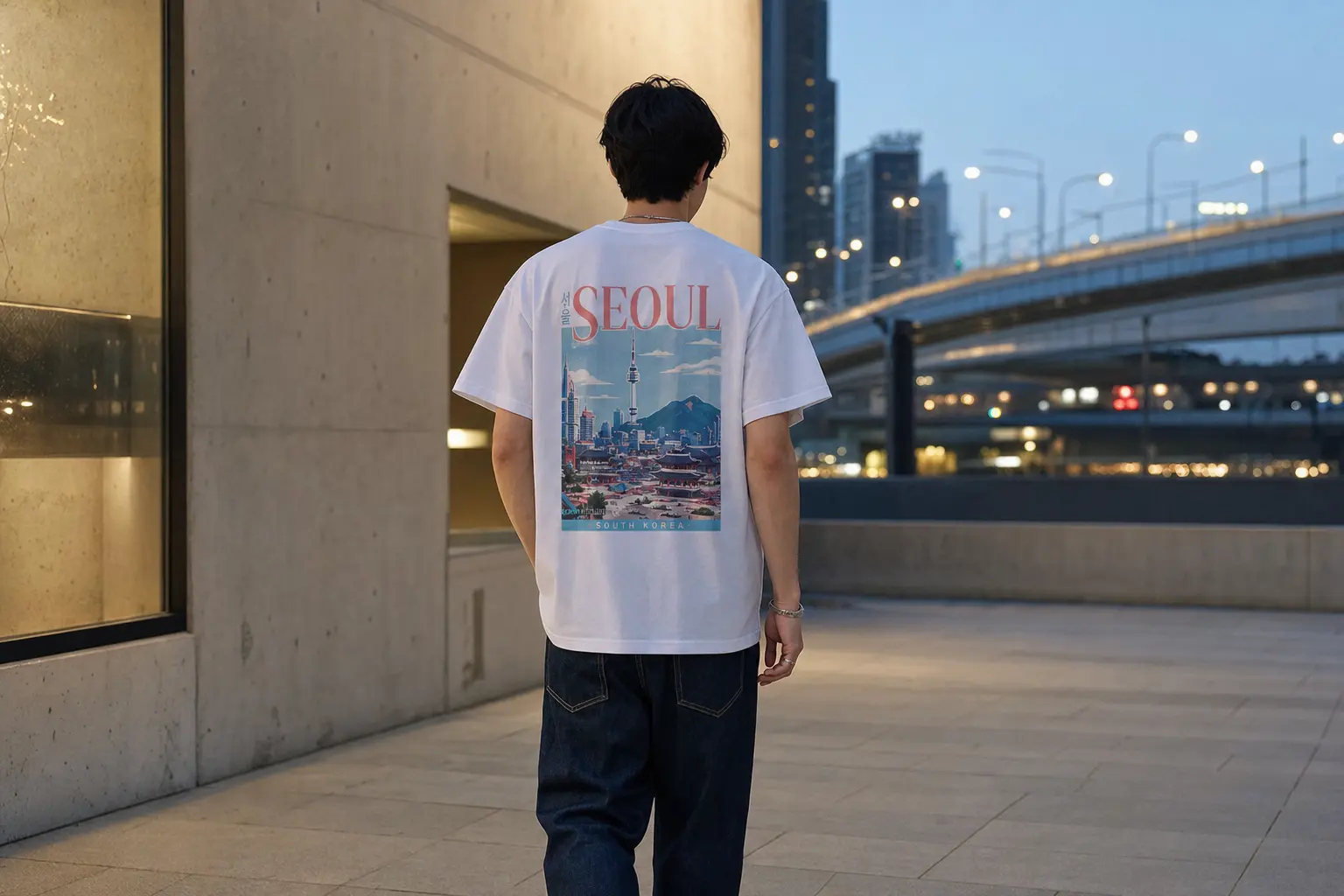
Build this outfit around a back-print tee in a neutral or lightly tinted color, then use dark straight denim to create a quiet base. The NIGHT WALKERS SEOUL design is especially suited to this formula: its illustration uses a rich palette including cream, teal, orange, green, yellow, brown, black, and red, while the heavyweight preshrunk cotton gives the shirt structure. Keep the denim dark enough that the city scene remains the focus.
Wear the shirt untucked when the tee has enough length to fall cleanly, or make a small front tuck only if the waistband needs definition. Let the back graphic appear as you walk. The styling should feel like an evening street scene, not a souvenir uniform.
The NIGHT WALKERS SEOUL tee gives a dark-denim outfit a specific Seoul reference through its illustrated street scene and urban nostalgia, while the available neutral and soft color options make the palette easier to control.
2. The red-moon focus look
For a quieter graphic outfit, choose a centered landscape print and keep the denim simple. Stand Firm places a red moon, mountains, winding road, and bird silhouettes on the chest, with a focused palette of red, white, deep grey, and black. Pair it with medium or dark straight denim and let the red act as the only strong accent.
Do not add a second slogan or competing bright color. A clean half tuck can work if the denim has a higher rise, but leave the graphic visible. This is a useful choice when you want the outfit to feel thoughtful rather than playful.
The Stand Firm tee suits readers who want a heavyweight cotton crewneck with a clean boxy drape, a broad size range from S through 5XL, and artwork that remains legible from the front.
Front prints, back prints, and the art of visual breathing room
Choose the viewing angle before choosing the denim
Print placement changes how an outfit behaves. A front graphic is read immediately, so it needs an uncluttered frame. Dark denim, a plain waistband, and a clean shirt hem help the artwork register. A back graphic is more dynamic. It becomes visible as you turn, walk, or remove an outer layer, which gives the outfit a more editorial rhythm.
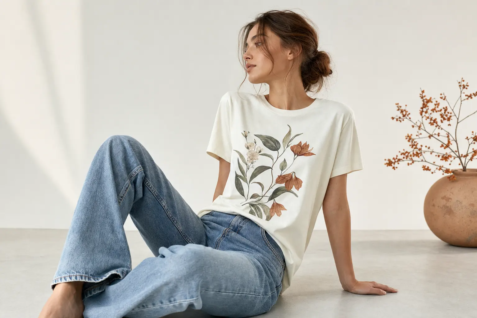
Front-only designs are often easier for everyday dressing because they remain visible in a seated position and under an open layer. Bloom Study, for example, uses a modern botanical composition on the front, with burnt orange, teal, mustard yellow, dark green, light grey, and subtle orange shapes. It works with washed denim when you want the colors to feel relaxed, but it also holds against charcoal or dark blue denim.
When a front print is colorful, avoid matching every color through the outfit. Pick one supporting shade, then return to a neutral. Denim can provide the blue family without requiring an exact match. A grey or dark tee base can make warm floral colors feel more considered, while pale denim keeps the overall effect lighter.
- Front print: choose a clear waistband and avoid a bulky tuck that cuts through the artwork.
- Large back print: select a simple front and allow the graphic to appear in motion.
- Small chest print: use denim texture or a more distinctive cut as the secondary point of interest.
- Multicolor artwork: echo one color only, then let denim do the grounding.
Do not confuse visual breathing room with minimalism for its own sake. The point is to make the image readable. A busy denim wash, decorative distressing, and a loud tee can flatten one another. If the graphic is detailed, keep the denim surface calmer; if the graphic is spare, a more characterful wash can supply balance.
Bloom Study is a strong option for a color-aware outfit because its botanical image stays on the front and its graphite heather or sport grey color choices keep the base controlled.
Tucking, untucking, and making oversized denim look deliberate
Three hem strategies
The right hem treatment depends on the rise of the denim and the size of the graphic. Start untucked. Look at where the shirt ends relative to the waistband and widest part of the hip. If the hem falls cleanly and does not obscure the main artwork, leave it alone. This is usually the most convincing choice for relaxed or heavyweight tees.
Use a small front tuck when you need to show the waistband or create a stronger vertical line. Tuck only enough fabric to suggest shape; do not compress a large print into a narrow fold. A full tuck works best with a compact tee, a structured waistband, and denim that is not too wide. It can look polished, but it demands more attention to bunching.
With wide denim, the half tuck provides useful contrast. The lower silhouette stays generous while the front gains a point of definition. If the tee is already very oversized, skip the tuck and let the shoulder-to-hem line create the proportion. Pulling the shirt tight at the waist can make a substantial blank look awkward.
- Put on the tee and denim without adjusting either piece.
- Check whether the graphic is visible while standing and sitting.
- Try a small front tuck, then release it and compare the shoulder-to-hem line.
- Choose the version that keeps the print flat and the waistband intentional.
Fit should also account for the blank itself. Some tees are medium and unisex in shape; others are described as relaxed, boxy, or heavyweight. Never assume that a larger size automatically creates a better oversized effect. It may simply add length and shoulder volume in the wrong places. Use the listed size chart and garment description, especially when buying across regions.
Genderless Korean streetwear has helped loosen old rules about who can wear a broad shoulder, a boxy tee, or a relaxed denim line. The useful lesson is freedom through proportion, not shapelessness. This look at genderless Korean fashion is a helpful reference when you are deciding whether to size up or work with the shape you already have.
Color combinations that make printed cotton look sharper
Let denim act as the quiet color field
Most successful graphic tee outfits use a restrained palette. That does not mean wearing only black and white. It means deciding which color carries the attention. Denim already contributes blue, grey, black, or a faded neutral, so the tee can add one major accent without becoming visually noisy.
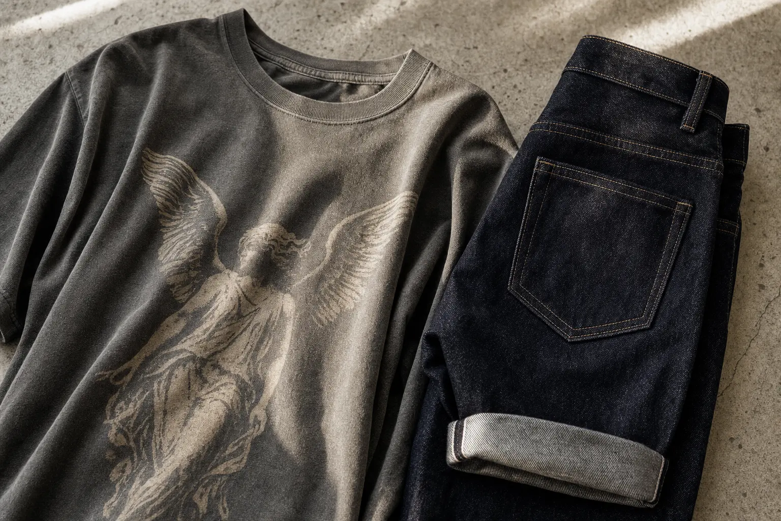
For warm graphics such as red moons, orange fruit, or golden flowers, dark blue and charcoal denim provide useful contrast. Light blue denim softens the same artwork and makes it feel more daytime-oriented. Black denim gives a graphic a sharper, more urban frame, but it can make saturated colors appear stronger, so keep the rest of the look quiet.
For cool graphics with teal, green, or blue, grey denim is a reliable bridge. White or cream details in the artwork will remain visible, while a black waistband keeps the outfit from feeling overly pale. If the tee itself is a light color, consider darker denim to create enough separation at the torso.
- Red or orange graphic: dark blue, charcoal, or black denim.
- Teal or green graphic: grey, washed blue, or black denim.
- Black-and-white print: almost any denim wash, with texture doing the work.
- Multicolor city scene: neutral denim and no competing bright layer.
Do not treat color matching as an exact exercise. A red detail in the graphic does not require a red garment elsewhere. Repeating one accent through a small styling detail is enough, but even that is optional. The most modern result often comes from allowing the artwork to stand alone.
Printed cotton also changes after care, so build your color decision around real use rather than a pristine product image. For direct-to-garment graphics, general guidance recommends washing inside out on a gentle cold cycle, using mild detergent, drying low or air-drying, and avoiding direct ironing over the print.[4] Follow the product label first. If you are concerned about dark denim transferring dye onto a light tee, wash the denim according to its care instructions before wearing the two together and avoid prolonged damp contact.
Care mistakes that shorten the life of a printed tee
Protect the artwork and the shape
Care is part of styling because a faded, warped, or cracked print changes the entire outfit. Direct-to-garment printing applies water-based ink directly to fabric and suits complex multicolor artwork and small on-demand runs.[4] That production method makes detailed graphics possible without conventional inventory pressure, but the finished tee still needs sensible washing.
Turn the shirt inside out before washing so the printed surface has less direct friction. Use a cold, gentle cycle and mild detergent, then choose low drying or air-drying where the label allows. Do not place an iron directly on the graphic. If pressing is necessary, protect the printed area according to the care instructions supplied with the garment.
Drying deserves special attention. High heat can affect cotton shape and may put unnecessary stress on the print. Air-drying also helps you preserve the deliberate drape that makes a heavyweight tee work with denim. Shape the garment while damp, then dry it away from harsh direct heat. Do not invent a care routine from the graphic alone; the garment label remains the controlling instruction.
- Wash printed tees inside out.
- Use cold water, a gentle cycle, and mild detergent unless the label says otherwise.
- Choose low heat or air-dry instead of aggressive high heat.
- Never iron directly over the printed artwork.
- Store the tee clean and fully dry before pairing it with dark denim.
It is also worth understanding the difference between print processes. DTG is generally associated with a softer, more breathable hand on cotton, while direct-to-film graphics sit on top of the fabric with a smoother, flexible finish and can work across more fiber types.[4] Neither label alone guarantees quality. Look at the actual product construction, print position, garment color, and care details.
Made-to-order production can be a practical advantage for original Korean design because the artwork is printed when ordered rather than held as broad inventory. Check the product page for the available sizes, colors, and production information before purchase, then care for the tee as a garment rather than treating it like a disposable graphic surface.
A practical buying checklist for your next denim outfit
Judge the whole outfit before you buy the tee
The best purchase is the tee that fills a gap in your wardrobe, not the one with the loudest artwork. Start by identifying the denim you actually wear. Is it rigid and straight, wide and faded, dark and narrow, or stretch with a closer fit? That answer determines whether you need a structured heavyweight top, a more compact silhouette, or a relaxed piece that adds balance.
Next, decide where you want the graphic to be seen. A front print is direct and easy to style under an open layer. A back print creates movement and works well when you want the outfit to reveal itself from behind. Consider the colors already present in your denim collection. A tee that works with dark and light washes will earn more wear than one that only makes sense with a single pair.
Read the catalog facts carefully. Confirm the blank, fabric composition, fit description, color options, size range, print placement, and whether the item is made to order. A heavyweight label can suggest structure, but the exact garment details matter more than the marketing phrase. Cotton is often a strong choice for crisp, vivid DTG graphics,[3] while blends may be selected for a softer or more faded visual effect.
- For a first purchase: choose a versatile base color and a clear graphic.
- For dark denim: consider cream, grey, muted color, or a high-contrast print.
- For wide denim: select a tee with controlled shoulder and hem proportions.
- For travel or frequent wear: prioritize a size range and care routine you can follow.
- For cultural graphics: style with restraint and read the design meaning before adding more references.
StyleMZ’s new arrivals are useful when you want current original artwork, while the broader clothing category helps you compare formats beyond a single graphic. Keep the decision narrow: one artwork, one denim shape, one clear reason the combination belongs in your wardrobe.
The strongest outfit is rarely the most complicated one. Choose the print for its point of view, choose denim for its line, and let the space between them make the styling feel deliberate. That formula works for a Seoul night illustration, a botanical study, a red-moon landscape, or a cultural graphic with a contemporary treatment.
Shop the collection: Korean graphic tees, Korean long sleeve shirts, Korean sweatshirts, Korean hoodies and Korean tank tops – original graphics designed in Korea, made to order.
Frequently Asked Questions
What tee weight works best with rigid denim?
A midweight or heavyweight cotton tee usually works best with rigid denim because it matches the firmer structure and keeps the upper half from collapsing at the waistband. A relaxed or boxy shape can balance straight denim without requiring a tight tuck. Check the listed garment details rather than relying on the word heavyweight alone.
Should a graphic tee be oversized or tucked with denim?
Leave a relaxed or heavyweight tee untucked when its hem falls cleanly and the graphic remains visible. Use a small front tuck with wide denim when you need more waist definition, but avoid folding through a large print. A full tuck works best with a more compact tee and a structured waistband.
Does direct-to-garment printing fade?
Any printed garment can change with repeated friction, heat, and unsuitable washing. For DTG graphics, turn the tee inside out, wash cold on a gentle cycle with mild detergent, use low drying or air-drying, and do not iron directly over the print unless the label gives different instructions. Care quality matters more than assuming the print process alone determines longevity.
Is 100% cotton better than a blend for a graphic tee?
Choose 100% cotton when you want a crisp, vivid graphic and a natural cotton garment feel; cotton is commonly favored for strong DTG results.[3] A blend can be useful when you prefer a softer or intentionally faded visual effect. The better choice depends on the artwork, fit, and care information listed for the specific tee.
Can dark denim transfer dye onto a light graphic tee?
Dark denim can release excess dye, particularly when new or damp, so wash it according to its care label before pairing it with a light tee. Avoid leaving the garments pressed together while wet. If the tee is pale and the denim is very dark, begin with shorter wears until you know how the denim behaves.