 OBJECT
Premium heavyweight tee vs standard tee sounds like a simple quality contest, but it is really a choice between two different visual tools. A standard jersey can feel refined because its yarn preparation and lighter construction support an easy drape; a heavyweight blank can look more deliberate because it creates a broader, more architectural shape.
For Korean graphic fashion, that distinction matters. A compact crest, a distressed floral panel and a large futuristic illustration do not ask the same thing of a garment. The sound decision is to choose by silhouette first, fabric mass second and artwork scale third.
Premium heavyweight tee vs standard tee: what the labels mean
The word premium is not a fabric weight. It can refer to fiber preparation, surface feel, construction, fit or the execution of the print. Heavyweight is more specific: it primarily describes how much fabric is used, usually expressed in ounces per square yard or grams per square metre. Those terms can overlap, but they cannot be treated as synonyms.
The 3001 format is a useful example of the distinction. Its manufacturer specifies 100% Airlume combed and ring-spun cotton, 32 singles and 4.2 oz fabric, with side-seamed construction [1]. That is a lighter-to-midweight jersey format, even when a catalog calls a 3001-based design premium for its cotton and overall feel.
Combing and ring-spinning describe yarn preparation, while ounces and GSM describe fabric mass. They answer different questions. The first can help explain why a surface is presented as smooth or suitable for printing; the second tells you more about body, opacity and the way the cloth may hold a shape. Neither measurement alone establishes comfort, longevity or a universal quality ranking.
By contrast, the Shaka Wear blank used for Robot and Wild and wounded is listed at 7.5 oz, or approximately 245–255 GSM, in 100% USA cotton, with a 16-singles yarn and a Lycra rib collar [3]. That is a meaningful increase in fabric mass, but it does not prove that the garment will feel softer, fit better or produce a sharper print than every lighter tee.
Separate the four questions
- How does it feel? Yarn preparation and finishing influence surface feel; weight alone does not settle softness.
- How does it hang? Fabric mass and pattern dimensions work together to create drape, structure or volume.
- How does the artwork read? Print scale and placement must suit the available front or back canvas.
- How much care will it need? Cotton garments can change in length or shape, especially when the cut depends on a specific proportion.
That is why “premium” should be read as a claim to investigate, not a shortcut to a purchase. If your priority is a relaxed streetwear silhouette, weight can be decisive. If your priority is a versatile graphic basic that sits neatly under existing layers, the lighter option may be the more considered choice.
A useful mental test is to remove the design name from the listing. Ask what remains: the blank, the stated fiber, the fabric weight, the construction, the fit and the care information. Those details let you compare products without allowing a polished adjective to do all the selling.
Heavyweight T-shirt comparison: weight, fit and construction
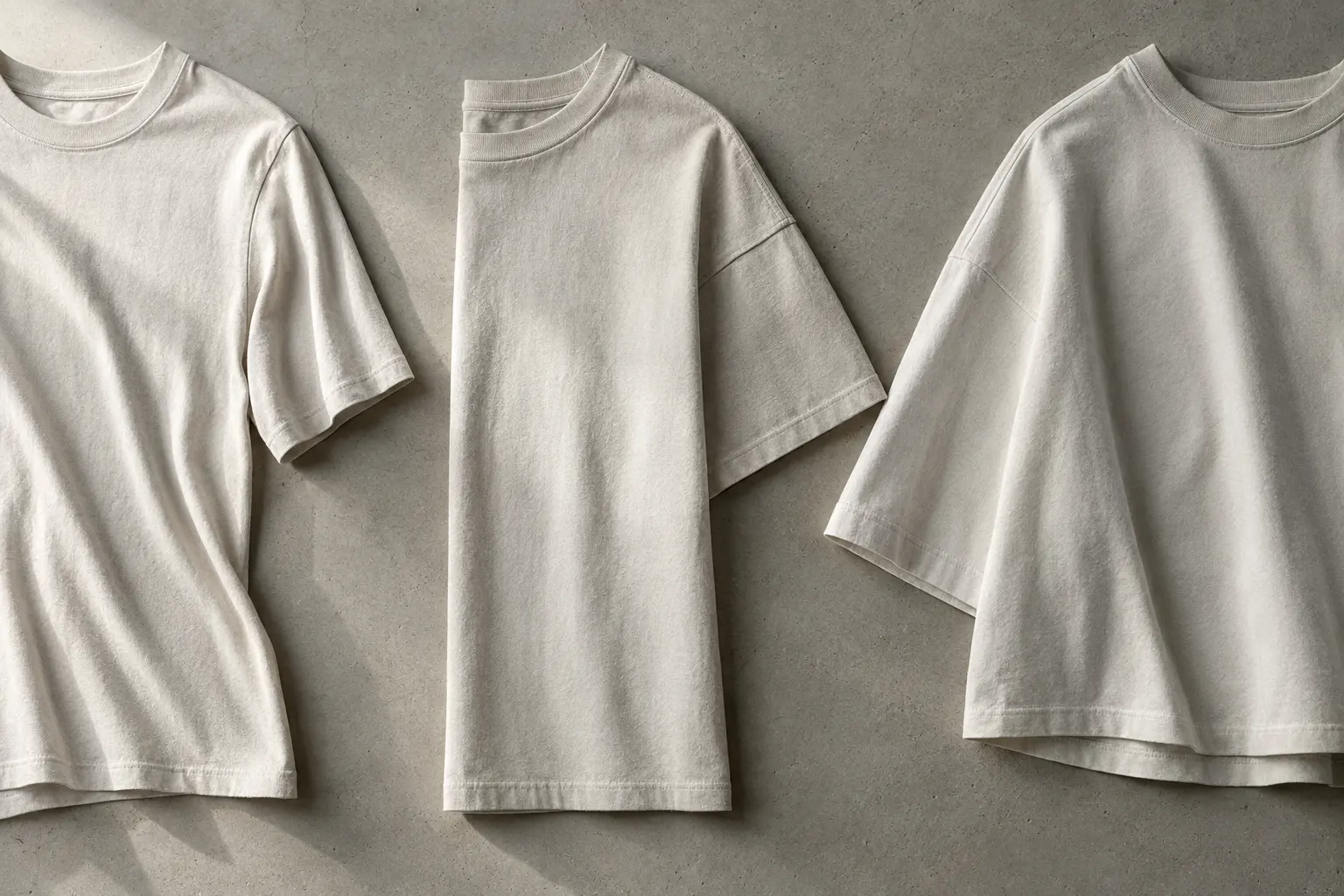
Fabric weight gives you a useful starting point, but the cut determines what you actually see in the mirror. A 5.3 oz tee can look relaxed without being dramatically oversized. A 6 oz tee can look more fashion-forward because dropped shoulders and a boxy body add width. A 7.5 oz tee can feel visually imposing, yet its oversized pattern may also have a slightly shorter length than a conventional body.
The table below compares the documented formats represented in the StyleMZ selection. It is not a universal ranking. It shows why the blank and the pattern should be considered together.
| Format | Documented weight | Construction or fit cue | Best visual use |
|---|---|---|---|
| 3001 format | 4.2 oz | Side-seamed, combed and ring-spun cotton jersey | Everyday graphic tee and lighter layering |
| Gildan 5000 format | 5.3 oz | Catalog-described relaxed boxy fit, taped neck and shoulders, double-needle stitching | Substantial casual basic without extreme volume |
| 3010 format | 6 oz or 203 GSM | Relaxed boxy fit with dropped shoulders and side seams | Structured K-street graphic statement |
| SHMHSS format | 7.5 oz or 245–255 GSM | Oversized shoulders and sleeves, slightly shorter length, Lycra rib collar | Pronounced oversized streetwear silhouette |
The Find peace tee occupies the middle of this range. Its catalog description specifies 100% preshrunk cotton, a 5.3 oz fabric, a relaxed boxy fit, taped neck and shoulders and double-needle stitching. It makes sense when you want more body than a standard jersey but do not want the deliberate scale of an oversized blank.
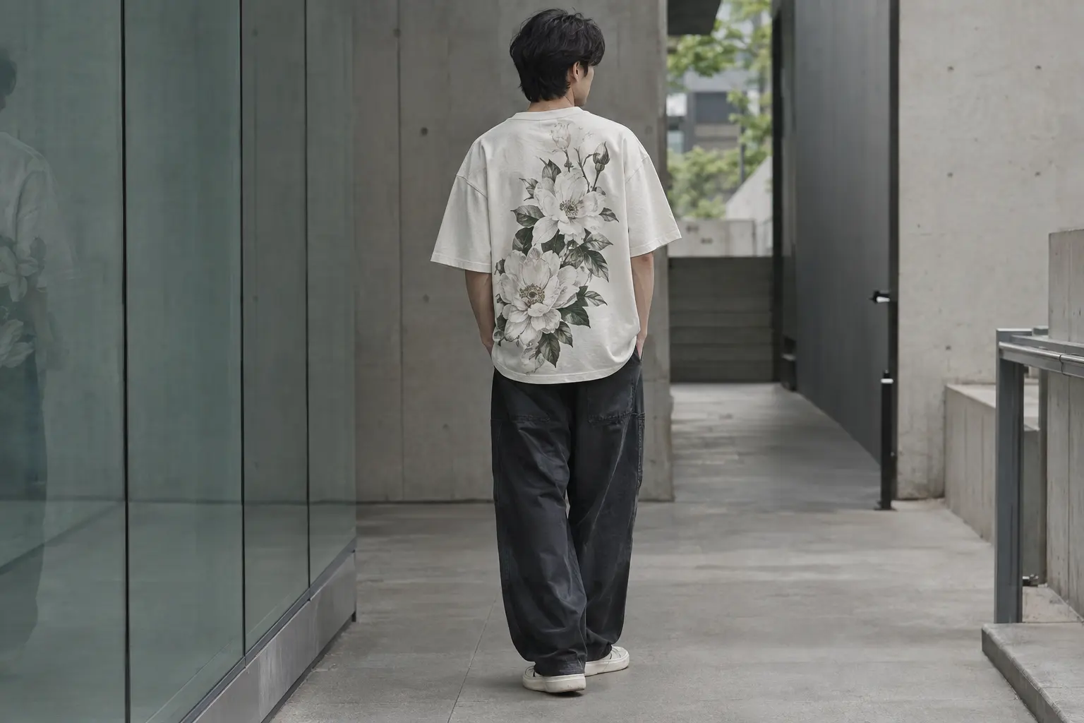
At the next level, Bloom Rose Flowers uses the 3010 format: 203 GSM cotton, dropped shoulders and a relaxed boxy shape. Its proportions give the rose artwork a larger, calmer field, so the garment reads as a designed silhouette rather than a basic tee with decoration applied afterward.
The difference between these two middle options is subtle but useful. The 5.3 oz body is a practical choice when the graphic should remain easy and familiar. The 6 oz body is more useful when shoulder width and controlled volume should be visible from a distance. Neither needs to be treated as a replacement for the other.
Use the 3001 direction when you want the graphic to remain the most assertive element. Choose the 3010 or SHMHSS formats when the garment’s width, shoulder line and body structure are part of the statement. If you are between sizes, compare the finished garment measurements rather than relying on the category name alone.
Korean streetwear fit: let the silhouette edit the graphic
Korean streetwear is not one fixed uniform, and no single blank is uniquely Korean. The useful connection is visual: Korean street-fashion documentation describes a hybrid street language in which contrasting eras, surfaces and identities are remixed rather than kept in separate boxes [4]. That makes proportion especially important. The same artwork can appear collegiate, grunge, minimalist or futuristic depending on the amount of space around it.
The 3001 format gives a graphic tee a familiar unisex jersey starting point. The front crest on Gangnam Style benefits from that restraint: the oval, laurel details and city reference can sit as a compact emblem instead of taking over the entire outfit. Its white and silver color choices and broad size range from S through 4XL make it a practical starting point for a clean graphic-tee wardrobe.
Soft Riot uses a different visual strategy. Its back panel combines distressed lettering, a wrapped bouquet, small graphic details and vintage-style text boxes. On a lighter standard blank, the art retains the feeling of a wearable poster: noticeable from behind, but not dependent on an exaggerated shoulder line.
Choose by the amount of visual volume you want
- Low volume: use a standard tee when the graphic is compact, emblematic or intended to work with a neat everyday proportion.
- Medium volume: use a relaxed boxy 5.3 oz or 6 oz tee when you want the artwork and garment shape to carry equal weight.
- High volume: use a 7.5 oz oversized tee when broad shoulders, larger sleeves and a shorter body are central to the styling.
If you already wear roomy silhouettes or prefer deliberately layered streetwear, the oversized option can create a stronger visual line. If your wardrobe depends on easy tucking, narrow layering or a closer shoulder fit, the standard direction is less likely to dominate. A shorter oversized body can also change how the shirt sits relative to the rest of the outfit, so length deserves as much attention as chest width.
For more outfit proportion ideas, the minimalist Korean graphic tee outfit edits are a useful companion. The principle is simple: a dramatic tee needs surrounding restraint, while a quiet tee can support more texture elsewhere in the look.
Do not confuse a Seoul reference in the artwork with a required styling uniform. A crest can work in a restrained outfit; a rose or robot can be softened by keeping the surrounding pieces simple. The Korean design connection is strongest when the graphic, proportion and editing feel intentional together.
Does a heavier tee make a better print canvas?
Not automatically. The catalog describes these designs as printed on demand, but the supplied product information does not establish the printing method or guarantee detail, color or durability. A heavier blank can provide more physical presence, yet fabric weight alone cannot guarantee sharper artwork.
A standard jersey can be a sensible choice for fine graphic detail because it offers a familiar surface and an easy drape. That logic suits the crest on Gangnam Style and the layered back artwork on Soft Riot. Their visual interest comes from linework, typography and illustration, so the image does not need an exaggerated shoulder line to communicate its mood.
Heavier cotton brings a different advantage: physical presence. The broad back graphic on Robot can feel like a stronger streetwear statement when the shoulders and sleeves create a larger frame around it. The steampunk bear on Wild and wounded uses the same basic idea, pairing intricate mechanical imagery with a substantial oversized body.
There is a tradeoff. Provider, artwork, garment color and production settings can all affect the final print. Treat the listing image as evidence of the intended placement and artwork, not as a promise that every color or future wash will look identical. A dark detailed design may also read differently on a light blank than on a dark one, so the product color is part of the decision rather than a minor afterthought.
Read the artwork before choosing the blank
- Fine linework and small type: favor a surface and fit that do not make the artwork feel crowded.
- Large back-panel illustration: consider a boxy or oversized body that gives the image room to breathe.
- Distressed or vintage treatment: decide whether a softer, less imposing garment supports the intended visual language.
- Dark, detailed artwork: treat color accuracy as provider-dependent rather than guaranteed by weight.
For made-to-order shopping, a product photograph can show placement but cannot establish every future wash result or color shift. The strongest decision is specific: choose the blank whose documented fit supports the artwork, then treat the print as its own production variable.
A common mistake is to choose the heaviest option because the shopper assumes it will make every design look more expensive. That can work for a large illustration, but it can overwhelm a small crest or make a delicate floral panel feel disconnected from the body. Print scale and garment scale should have a conversation.
If your interest is primarily the graphic rather than garment architecture, browse the wider StyleMZ T-shirt selection by design and cut instead of filtering only for the word heavyweight.
Which tee works for your actual wardrobe?
The right answer changes with the situation. Imagine three different wardrobes rather than one abstract shopper. The useful question is not simply which tee has more fabric, but which garment will solve the proportion problem you face most often.
If you want one versatile graphic basic
Choose the standard 3001 direction. A familiar unisex jersey proportion is easier to wear under an open shirt, with a simple layered outfit or as a standalone graphic. Gangnam Style is the clearest example: its front crest communicates the Seoul-street concept without requiring an oversized silhouette to make the point.
This is the practical choice for someone who changes styling frequently. The tee can be the graphic layer in one outfit and a quieter foundation in another. Its lighter construction also avoids making every surrounding layer compete with the shirt’s body.
If you want a visible K-street proportion
Choose the 6 oz 3010 direction. Bloom Rose Flowers has the relaxed boxy shape and dropped shoulders that make the garment itself part of the styling. The rose artwork then reads as an intentional front statement rather than a small decoration on a conventional body.
This is the middle ground for someone who wants shape but does not want maximum volume. It can support a simple outfit built around the tee while still offering enough structure to make the silhouette feel deliberate. The dropped shoulder also gives the graphic a wider visual field without requiring the shorter body associated with the oversized format.
If you want the tee to create the outfit
Choose the SHMHSS direction. The Robot and Wild and wounded designs use 7.5 oz oversized blanks with enlarged shoulders and sleeves. That is the strongest direction for a futuristic or rugged graphic that needs visual authority from both the image and the body.
Choose it when structure and graphic scale matter more than easy layering. If you prefer a closer, quieter outfit, the 3001 or 3010 directions will be more coherent. A heavyweight oversized tee can become the dominant shape, which is useful when that is intentional and awkward when the rest of the wardrobe was built around compact proportions.
One caution: oversized does not mean universally easy. The Shaka Wear fit guide describes oversized width, a slightly shorter length and sizing down for a normal fit; it also states that the tee will shrink to a shorter length after washing [3]. If you like the intended oversized effect, follow the product measurements rather than automatically sizing up.
- For a compact wardrobe: start with the standard tee.
- For a balanced statement: choose the 6 oz boxy tee.
- For maximum streetwear presence: choose the 7.5 oz oversized tee.
To keep a graphic outfit intentional, the styling question is not “What else can I add?” but “What can remain quiet?” The graphic tee and denim styling notes follow that same editing principle without requiring a matching head-to-toe look.
Cotton tee care, shrinkage and made-to-order reality
Care is part of the fit decision, especially when the garment relies on a boxy or oversized proportion. The SHMHSS 7.5 oz product page explicitly warns that the tee will shrink to a shorter length after washing [3]. A change in length can matter more on a shorter oversized body than on a conventional tee, so do not treat every cotton T-shirt as interchangeable.
The care instruction supplied with the actual garment takes priority. U.S. textile care rules require regular care instructions to be provided with covered apparel and require manufacturers or importers to have a reasonable basis for those instructions [7]. That is more useful than applying a generic heavyweight-cotton routine to every product.
Build your decision around three care questions
- Is the intended length important? If yes, pay close attention to the listed shrinkage warning and the product’s care information.
- Is the graphic the priority? Follow the print and garment instructions rather than assuming a familiar wash setting is harmless.
- Will the tee be worn often? Select a construction and fit you will realistically maintain, not merely the heaviest fabric available.
The catalog describes several products as printed on demand near you or as made-to-order designs. That model is useful for original artwork because it avoids treating every graphic as a mass-produced basic, but a catalog page should not be read as proof of identical print results across every color, provider or production run.
Care should also shape the purchase timing. If the shirt is intended to retain a precise oversized proportion, compare the size chart, note the product’s shrinkage language and allow the garment’s instructions to determine washing and drying. If you cannot accommodate that level of attention, a standard proportion may be the lower-friction choice.
Do not mistake “preshrunk” for “immune to change,” either. It describes a production treatment or catalog claim, not a promise that the garment’s dimensions cannot shift under every care condition. The safest buying rule is specific product information over category assumptions.
Made-to-order also changes what a careful shopper should expect from product photography. The image communicates the design concept, placement and intended mood, but it cannot replace the size chart or care information. When fit is the reason you are paying more attention to a heavyweight tee, measurements matter more than a dramatic studio pose.
Best StyleMZ picks by silhouette, not by marketing language
Once the terms are separated, the selection becomes clear. There is no single best tee for every reader; there is a best match for the proportion and graphic intensity you want to wear.
A standard graphic option: Gangnam Style
Gangnam Style is a sensible choice when you want a Korean designer graphic with a standard everyday body. The 3001 base is documented as 4.2 oz, 100% Airlume combed and ring-spun cotton, and side-seamed [1]. Its front crest offers a compact visual language, while the listed S–4XL range gives the shopper room to choose a personal fit rather than forcing one streetwear proportion.
Choose it if you want the artwork to function like a refined emblem. Do not choose it merely because the catalog uses the word premium and expect heavyweight structure; the blank is a standard jersey format. Its white and silver options keep the design focused on the crest, making it easier to build a restrained graphic wardrobe around it.
A balanced heavyweight: Bloom Rose Flowers
Bloom Rose Flowers is the strongest middle option. Its 3010 base is listed at 203 GSM, with a relaxed boxy fit and dropped shoulders. That gives the rose graphic more physical space and makes the silhouette feel intentional without reaching the maximum width and weight of the SHMHSS format.
Choose it if you want a K-street direction that still feels adaptable. The white, soft pink and natural color choices also keep the visual language softer than a highly contrasting graphic tee. This is the option for a shopper who wants the garment to have visible shape but does not want the shirt to dictate every other proportion.
Maximum streetwear presence: Robot
Robot is for the reader who wants the blank and the artwork to arrive as one large statement. Its catalog description specifies a 7.5 oz heavyweight 100% USA cotton SHMHSS base, oversized fit and detailed back-panel robot artwork. The documented blank uses oversized shoulders and sleeves, making it the strongest choice here for a futuristic, broad-shouldered silhouette.
Choose it when structure and graphic scale matter more than easy layering. If you prefer a closer, quieter outfit, the 3001 or 3010 directions will be more coherent. The back placement also rewards styling that leaves the artwork visible rather than covering it with another substantial layer.
The important distinction is not that one product is inherently superior. It is that each one solves a different styling problem: compact emblem, balanced boxy statement or full oversized graphic presence. Find peace remains a useful alternative if you want the middle-weight category with a relaxed boxy direction, while Wild and wounded suits the same substantial oversized family with a more rugged graphic mood.
The final buying rule for a premium graphic tee
Start with the outfit proportion you already wear, not the product adjective. If your wardrobe is built around clean layers and repeatable basics, a standard 3001 tee is likely to earn more wear. If you want the shirt to establish the shape of the outfit, move toward the 3010 or 7.5 oz SHMHSS formats.
Then inspect the graphic’s scale. A compact crest can look purposeful on a standard body. A large back panel may need a broader canvas. A distressed floral design may suit a less imposing garment, while a robot or steampunk illustration can support the visual force of an oversized heavyweight blank.
A practical five-step check
- Confirm the blank: identify whether the listing uses a 3001, 3010, Gildan 5000 or SHMHSS format.
- Read the weight: treat 4.2 oz, 5.3 oz, 6 oz and 7.5 oz as different levels of physical presence, not automatic quality grades.
- Study the cut: standard, relaxed boxy and oversized proportions will style differently even when the fabric is cotton.
- Check the artwork: match print scale and mood to the amount of body and shoulder volume.
- Review care and sizing: pay special attention to shrinkage language when the tee’s appeal depends on its length.
For a first purchase, choose the silhouette you can explain in one sentence: “I want a lighter everyday graphic,” “I want a structured boxy tee,” or “I want an oversized streetwear statement.” That sentence is more reliable than the word premium by itself.
When the choice is close, favor the product whose fit matches your existing wardrobe. A theoretically impressive blank that stays in the drawer is not a better purchase than a standard tee whose graphic and proportion you can wear repeatedly. If you are buying for a specific event or season, also consider whether the shirt needs to sit under another layer; that single requirement can move the decision away from the heaviest option.
Continue with the Seoul streetwear graphic tee edit if you want to compare the visual language of the designs before deciding. The next sensible move is not to chase the largest fabric weight. It is to select the lightest blank that gives your chosen artwork the shape and presence you actually want.
Shop the collection: Korean graphic tees, Korean long sleeve shirts, Korean sweatshirts, Korean hoodies and Korean tank tops – original graphics designed in Korea, made to order.
Frequently Asked Questions
Is a heavyweight T-shirt always better than a standard tee?
No. Heavyweight fabric is useful when you want structure, opacity and a pronounced streetwear silhouette, but it does not automatically mean softer fabric or a better print. A standard tee can be the better choice for lighter drape, simple layering and fine graphic detail. Choose according to the garment shape you want to wear and the amount of visual volume your wardrobe can support.
Is the Gildan 5000 a premium heavyweight tee?
The Gildan 5000 is a heavyweight-labeled cotton tee in the StyleMZ selection, and the catalog describes it as 5.3 oz with a relaxed boxy fit. “Premium” is an editorial quality judgment rather than a technical category, so the documented facts should carry more weight than the label. Choose the Find peace design when you want a substantial everyday body without the maximum volume of a 7.5 oz oversized tee.
Which StyleMZ tee is best for an oversized Korean streetwear look?
The Robot and Wild and wounded designs use the documented SHMHSS 7.5 oz oversized format, making them the strongest choices for broad shoulders, larger sleeves and a substantial streetwear profile. Bloom Rose Flowers is a more moderate alternative with a 6 oz 3010 blank, relaxed boxy proportions and dropped shoulders. Select by how much volume you want, not simply by the word heavyweight.
Does a heavier tee make a graphic print sharper?
Not necessarily. The supplied product information does not establish a universal relationship between fabric weight and print sharpness. A standard jersey may be a practical choice for fine detail, while a heavyweight blank can give a large back graphic more physical presence. Fabric weight alone cannot guarantee sharper color or better durability, so treat the blank, artwork scale and production details as separate decisions.
Will a heavyweight cotton tee shrink?
It can change in dimensions, and the product-specific care information matters. The SHMHSS 7.5 oz oversized tee is explicitly described as shrinking to a shorter length after washing, which is significant for its proportions. Read the individual care instruction and size information rather than applying one rule to every cotton tee. If length is central to the look, account for the stated warning before choosing a size.