 OBJECT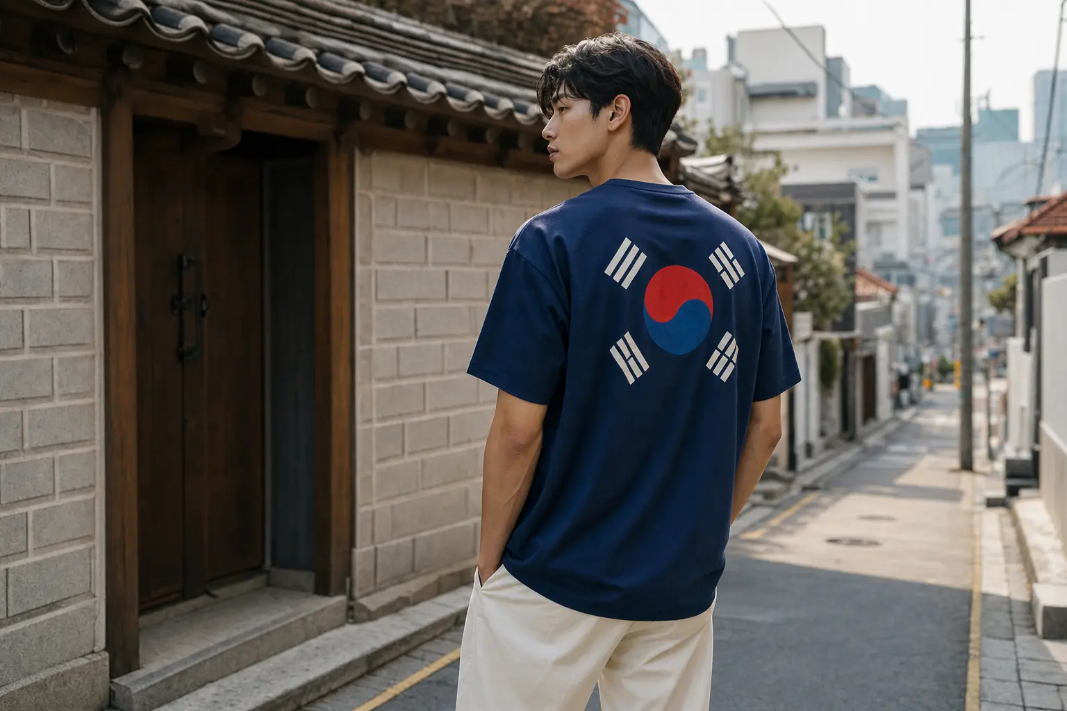
The phrase Korean flag Taegeukgi tee styling appears here because that exact search reflects what shoppers want: how to wear, make, and care for a tee that uses the Taegeukgi motif without crossing legal or visual lines. This piece gives clear choices — fabrics, print methods, styling formulas that actually work in Seoul, and the cultural rules you must respect.
Short, actionable, and design-aware: you’ll leave with a decision path for buyers and creators — whether you want a soft cotton DTG shirt for everyday wear, a polyester all‑over print for vivid fidelity, or a minimal placement that reads contemporary rather than costume-y.
What the law and design specs mean for your Taegeukgi tee
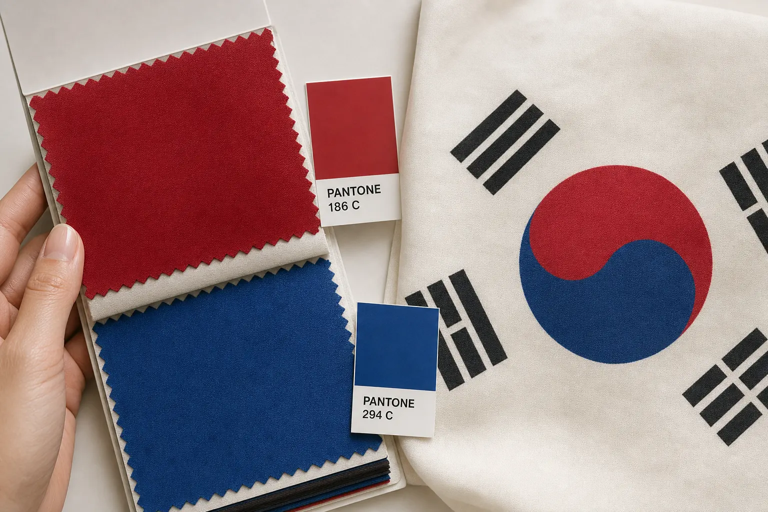
Start with the basics: the Taegeukgi is regulated. The flag’s official red and blue are specified as Pantone 186 C and Pantone 294 C in government guidance, which designers use as color anchors when preparing artwork [1]. The National Flag Law and its enforcement rules handle flag production, placement and respectful usage; they also explicitly allow the taegeuk and the four trigrams to be used “together or separately” on objects, but they codify dignity and handling standards you should not ignore [2].
Practical takeaway for creators: you can print the Taegeukgi elements, but don’t treat the flag as an arbitrary logo. Korean unfair competition and trademark rules restrict using national symbols as a registered trademark; attempting to register a national flag image as your brand mark will fail without authorization and risks a legal fight [3]. That matters if you plan limited-edition merchandise or a brand capsule — avoid trademark-style lockups that pretend the flag is a proprietary logo.
Design rules that affect placement
- Reserve official proportions for a true-flag reproduction. If you aim for an exact flag replica (for commemorative items), match proportions; otherwise, treat the taegeuk and trigrams as motifs rather than a full legal flag.
- Avoid deliberate desecration or treatments that could be read as disrespectful (ripped, scorched, or inverted in contexts meant to mock); sellers and designers are held to standards of dignity under the law [2].
- Labeling matters: be transparent in product descriptions that items are inspired by or reinterpretations of the Taegeukgi — that clarifies intent and reduces complaints.
In Seoul’s streetwear scene, respectful reinterpretation — a cropped taegeuk print, an abstract back panel, or tonal trigrams on a sleeve — reads modern and intentional. Use the official Pantone anchors during artwork prep to keep hues on target, and plan a physical sample approval step with your POD provider to confirm color shifts in RGB/CMYK conversions [7].
Sources: government specification and law references inform both color and handling rules; designers who ignore them risk consumer backlash or legal friction. Keep documentation of approvals and avoid any intent to brand the flag as a commercial trademark [1][2][3].
Which fabric and print method gives the best color and longevity
Choosing fabric and print method is the single most practical decision for both makers and buyers. Industry-standard options align like this: DTG on combed/ring-spun cotton for soft hand and short runs; dye-sublimation on 100% polyester for all-over, edge-to-edge fidelity; screen-print and DTF/heat-transfer for volume or special inks. These trends are standard among POD providers through 2025–2026 [4].
Below is a quick comparison to clarify tradeoffs between blank and print process. Use this when you brief a POD supplier or select a listing format.
| Blank fabric | Print method | Color fidelity | Durability/use case |
|---|---|---|---|
| 100% combed/ring-spun cotton (midweight) | DTG | Good for saturated solids; limited on very bright spot Pantone matches | Soft hand, best for short runs and photoreal designs; follow gentle care |
| 100% polyester | Dye-sublimation | Excellent for vivid Pantone-like saturation and all-over prints | Best for full-bleed Taegeukgi or continuous patterns; requires polyester blank |
| Cotton or blends | Screen print | High fidelity for spot colors; great for bulk orders | Durable, economical at volume; limited color gradients |
| Various blends | DTF / Heat-transfer | Flexible color reproduction; depends on transfer quality | Works for variable runs and complex artwork; watch for hand-feel on light fabrics |
How to choose between DTG and dye‑sublimation
- DTG: pick this for 100% cotton tees with soft hand and photographic back graphics. It’s the go-to for POD short runs and on-demand production; color conversion from Pantone will need proofing [4][6].
- Dye‑sublimation: required when you want a full-bleed Taegeukgi across seams or an all-over back panel on polyester garments. Sublimation bonds with the polyester fiber, offering exceptional color saturation and wash durability for bright red and blue tones [4].
Color management note: Pantone spot references (186 C and 294 C) are a design starting point. Textile workflows require conversion to appropriate textile color systems and physical approval samples to check ΔE tolerances; don’t expect perfect Pantone → RGB matches without a sample pass [7].
Finally, match your sales pitch to the method: if you advertise a “vibrant, long-lasting Taegeukgi back print,” prefer polyester/sublimation; if you sell “soft, wearable cotton with a distressed Taegeukki motif,” DTG on combed cotton is the right promise. Following POD best practices (and confirming wash-care instructions) keeps returns low and color complaints down [4][5].
Seoul streetwear ways to wear a Taegeukgi tee — effortless formulas
Seoul streetwear blends minimalism with bold graphic focal points. A Taegeukgi tee works best when it’s the visual anchor, not the entire outfit. Think balance: pared-down silhouettes, considered layers, and one statement print. That approach reads modern and avoids the costume effect.
Start with a short list of reliable formulas that perform in Seoul: a relaxed tee with a mid-weight denim bottom and clean sneakers for daytime; a slightly oversized crewneck layered over a long-sleeve tee for fall; monochrome bottoms that let the Taegeukgi pop; and clean accessories like a canvas tote or low-profile cap. Seoul streetwear favors neutral palettes paired with a single color punch — so the flag’s red or blue becomes the accent rather than the whole look.
Three easy outfits that work
- Minimal Seoul Casual: Navy relaxed Taegeukgi tee, cropped black trousers, white low-top sneakers. Keep jewelry minimal; tuck the front slightly to keep proportions modern.
- Layered Fall Streetwear: Tee under an open overshirt or a light zip-up; add a long-sleeve base layer when temperatures drop. See our long-sleeve recommendations for pairing options Fall Long Sleeve Graphic Shirts.
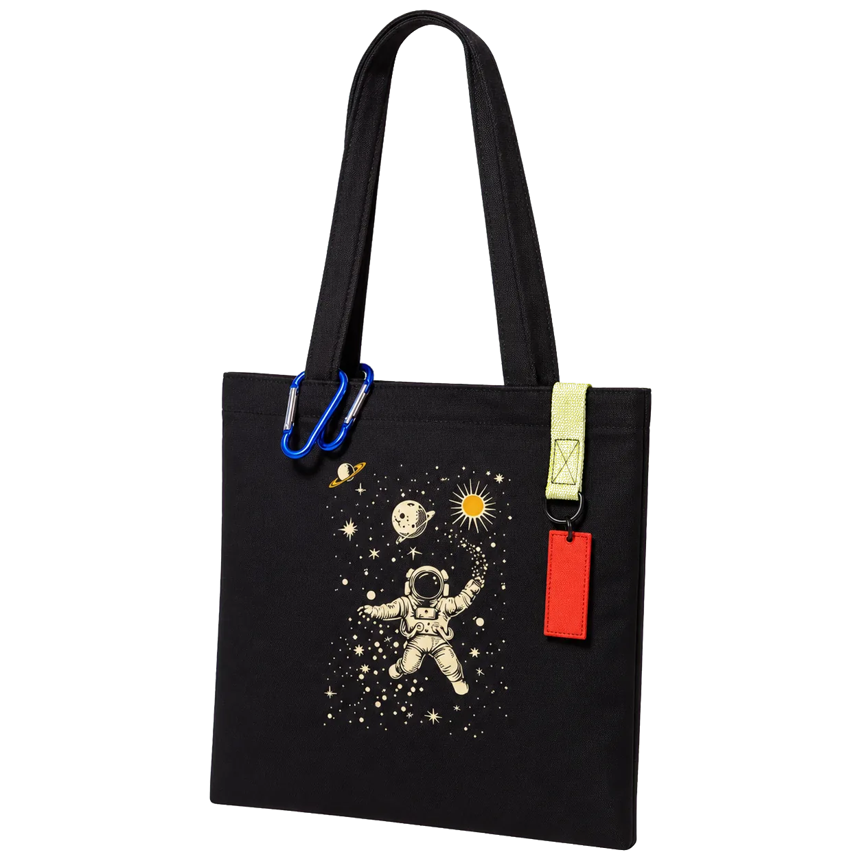
- Art-focused Back Graphic Look: Let a bold back panel be the centerpiece — pair the tee with tonal bottoms and a neutral tote to balance the visual weight.
Why the relaxed, artistic tee works: the “Korean Taegeukgi Flag” Women’s Relaxed T-Shirt is printed on Airlume combed and ring-spun cotton with an abstract back panel and paint-splatter graphics — it reads as contemporary and wearable rather than patriotic costume. Use it when you want an artistic nod to heritage that functions as everyday streetwear.
This product suits shoppers who prefer a looser fit and expressive back graphics: the relaxed cut and material make it comfortable for layering or single-piece statement looks. If you want to anchor a look around a single graphic, choose neutral, tailored bottoms and minimal accessories — the tee stays the hero.
In Seoul, shoppers time these statements around holidays but wear them year-round; a considered outfit that uses the tee as an accent reads intentional. For more on what Seoul actually wears, read our feature on graphic tees and local style choices Seoul Streetwear Graphic Tees.
Genderless and unisex styling: how the crewneck reads on everyone
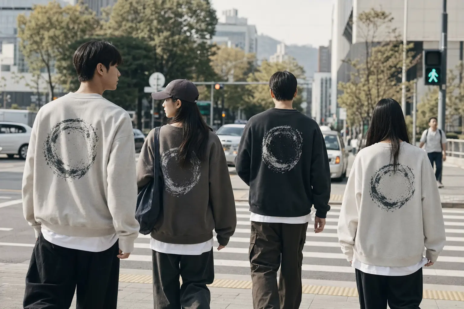
Gender-neutral dressing is central to contemporary Seoul streetwear; a Taegeukgi motif can sit cleanly in that space if you pick the right silhouette. Unisex crewnecks and boxy cuts are culturally current and versatile — they translate the design into shared visual language rather than coded gender apparel. The Spirit of Korean Premium Unisex Crewneck is an intentional example: it’s a Bella + Canvas 3001 unisex crewneck that pairs a stoic soldier artwork with a Taegeukgi motif, printed on demand and available in extended sizes, so it’s designed to be worn across body types.
Why this product suits a genderless approach: the unisex crewneck has a neutral silhouette and robust graphic that reads as a statement of heritage and resilience rather than gendered ornament. It’s available in Heather Forest and Black Heather, which are tonal choices that integrate into wardrobes without overtly feminine or masculine styling cues.
How to style unisex pieces so they don’t read costume-y
- Scale: avoid mini-skirts or ultra-tailored trousers that clash with the crewneck’s boxy proportions; instead, choose straight-cut pants or relaxed mid-rise bottoms.
- Layering: keep underlayers lightweight (thin tees or mock-necks) so the crewneck remains the focal point without overwhelming the silhouette.
- Color play: pick one tonal accent from the tee (a blue or red in the print) and echo it in a shoe or accessory to create cohesion without matching head-to-toe.
Practical fits: unisex sizing often runs more generous. If you want a slimmer look, size down; if you want an oversized streetwear stance, size up. Because the crewneck is a heavier knit than soft cotton tees, it performs well as a transitional-layer piece in spring and fall. The made-to-order print-on-demand model also helps reduce overproduction — order a sample to verify fit before committing to multiples.
Styling note from Seoul: layering a unisex crewneck under a lightweight jacket or over a collared shirt is common. Keep other graphics minimal; the crewneck’s detailed artwork is already a visual focal point. This is how you make the Taegeukgi motif feel current and wearable across genders without resorting to parade or costume aesthetics.
When to launch and how national rhythms affect demand
Timing merchandise matters. Demand for Taegeukgi-themed apparel spikes around national holidays and flag-related observances such as Gwangbokjeol (Liberation Day), Samiljeol (Independence Movement Day), and other commemorative dates. Brands and sellers frequently plan capsule drops and marketing pushes to align with these calendar peaks; that planning reduces overstock while matching consumer interest [8].
Practical schedule: create product timelines that include design finalization, sample approval, production, and shipping cushions. For POD work, production lead times can be short, but you still need the buffer for color proofs and size samples. If you aim for a holiday window, start approvals at least 3–4 weeks before the sales date, and allow another 5–10 days for shipping depending on fulfillment locations.
Marketing and inventory tips
- Limited drops: offer a small run or made-to-order window around a holiday to keep inventory manageable and the design desirable.
- Sample-first: always order a physical sample with Pantone callouts (see section on color) so you can confirm hue and print placement before listing.
- Communications: be explicit in product copy that the item is an inspired or artistic interpretation of the Taegeukgi where applicable; clarity reduces consumer confusion.
Design rhythm in Seoul: many independent designers schedule patriotic reinterpretations ahead of key holidays but keep seasonal staples available year-round. A back-panel artistic interpretation works well as a perennial piece; a commemorative capsule with official proportions is better suited for holiday-only runs.
Logistics: POD lets you scale quickly, but do not confuse speed with quality. Use the time saved on inventory to focus on sample approvals and care instructions that preserve color fidelity — shoppers notice when the red fades or prints crack after a few washes, and that harms brand perception more than a slightly longer delivery window.
Care and longevity: how to keep the Taegeukgi colors vivid
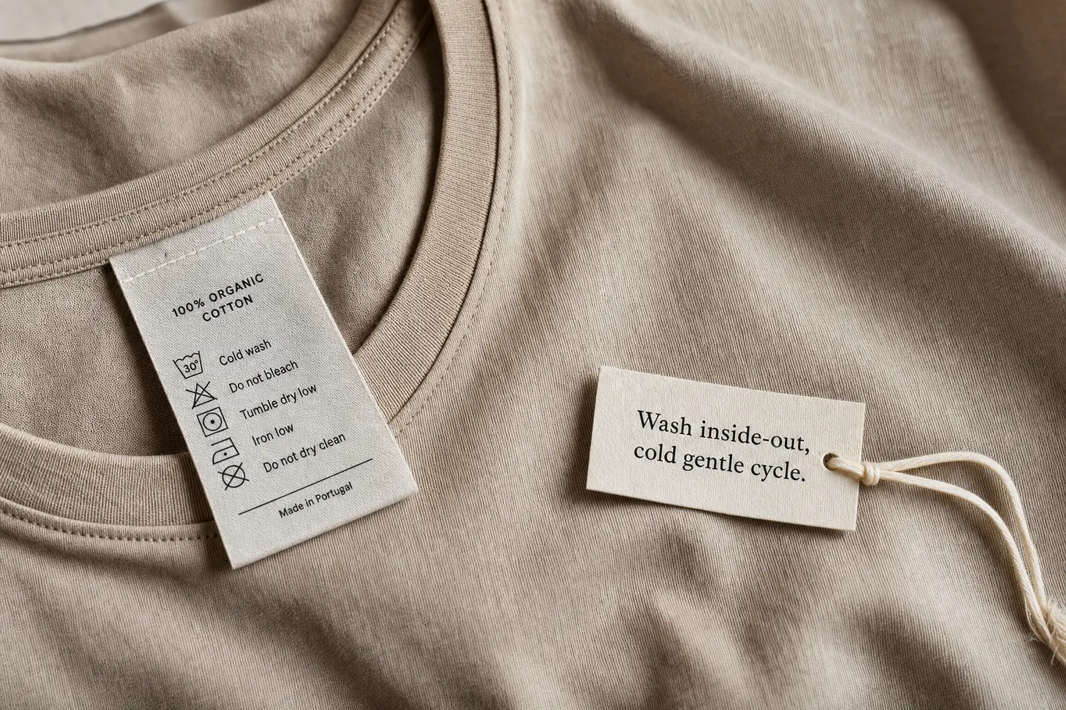
Print longevity is heavily dependent on fabric, print method and the end-user’s care routine. POD care guidance for DTG and printed tees is consistent: wash inside‑out, cold/gentle cycle, no bleach, tumble‑dry low or air‑dry, and avoid ironing directly on prints to extend life [5]. Follow and publish those instructions clearly on product pages and labels.
For vivid reds and blues that reference Pantone 186 C and 294 C, a couple of practical moves matter: first, choose the right print method for the blank (dye‑sublimation on polyester for all-over brilliance; DTG on combed cotton for soft hand but subject to more color shift). Second, include a care label and a short paragraph in the product description that repeats the wash instructions — shoppers tend to trust and follow explicit care copy.
Day-to-day care checklist
- Turn the garment inside out before washing to protect the printed surface.
- Use cold water and a gentle cycle; avoid bleach and harsh detergents.
- Prefer line drying or tumble-dry low to minimize heat stress on the print.
- Do not iron directly on the graphic; use a cloth barrier or iron around the print.
Durability expectations: screen-print and dye-sublimation prints generally outperform DTG for colorfastness in high-wear scenarios, but DTG can be excellent when paired with high-quality inks and correct post-print curing. Document expected life in the product copy — for example, state recommended wash settings and the expected behavior (e.g., slight softening over many washes rather than cracking) based on the chosen print method.
Finally, create a small care card or label for higher-end pieces. It’s a small touch that lowers returns and increases perceived value. The clearer you are about the exact care steps (repeat them in the order you recommend), the longer the Taegeukgi motif will look deliberate and fresh on the garment.
Sources: POD care norms and provider recommendations are consistent across platforms and industry writing [4][5].
File prep, color management and a short checklist for designers
Designers working with national motifs need a precise production brief. Color and placement are the most sensitive variables. Start by preparing artwork at high resolution (300 dpi minimum for raster images or vector for logo elements), include Pantone references (186 C / 294 C) in your notes, and plan a physical sample approval step — textile color conversions will shift when Pantone becomes RGB/CMYK or textile TCX values [7].
Designer checklist
- Art files: provide layered PSDs or vectors with clearly named objects (taegeuk, trigrams) and a separate flattened mock for preview.
- Color: include Pantone spot notes and expected textile conversion tolerance; ask for a physical sample before approving a live listing [7].
- Placement: define safe zones and seam margins. If you want a true-flag proportion, supply exact pixel or mm dimensions that match ratio rules; if you’re using motifs, document size and offset on the garment template.
- Print method: specify DTG for cotton or dye‑sublimation for polyester all-over prints. For DTF/transfers or specialty inks, confirm hand-feel expectations.
- Proofing: always request a pre-production sample and photograph it under neutral lighting; approve only when color and placement match your brief.
Practical file settings: export an additional flattened proof in sRGB for online preview while providing CMYK or textile-specific files for print houses that request them. Don’t assume Pantone will be exact in digital previews; require a physical check for the final pass. If you need balanced gray or black trigrams, supply pure black (K=100) vectors rather than converting from RGB black to avoid muddy prints.
Negotiating with POD: be explicit about ink types and wash testing. If you expect repeat orders, get the provider’s wash test results or commission a 5–10 wash test to observe fading. For all‑over patterns specify seam allowances and the exact garment blank, since dye‑sublimation requires 100% polyester blanks and will not bond to cottons [4].
Following this checklist reduces surprises: colorproof early, sample early, and document everything in your sales copy so customers know what to expect from hue and care.
Common mistakes to avoid and buyer decision rules
There are recurring mistakes sellers and buyers make with flag-inspired tees. Most lead to poor presentation or legal friction. Avoid these five errors and you’ll keep both customers and the law on your side.
Top mistakes and fixes
- Using the flag as a logo: don’t try to trademark the Taegeukgi or present it as a proprietary brand lockup — national emblems are not registrable in the same way and doing so risks rejection and reputational risk [3].
- Poor color management: advertising “Pantone-perfect” without a sample is risky. Textile conversions need physical approval; include that step and don’t oversell exactness [7].
- Cheap care copy: omitting care instructions leads to returns. Publish the wash routine prominently and remind customers at checkout [5].
- Full-bleed on wrong blank: trying an all-over print on cotton will fail. Choose dye‑sublimation with 100% polyester for continuous prints [4].
- Design disrespect: distressed or deliberately damaged flag imagery can be read as disrespectful; avoid treatments that appear intentionally degrading when your goal is cultural homage [2].
Buyer decision rules: if you want comfort and soft hand — choose a combed cotton DTG tee; if you want saturated, edge-to-edge color — choose polyester and dye‑sublimation. For limited retail runs, DTG on combed cotton offers better margins and less technical setup. For vivid commemorative pieces that cover seams, plan for polyester and run dye-sublimation.
Where to check fit and category: browse curated categories to match silhouette and weight expectations — our T-Shirts shop and Most Viewed picks can point you to construction and fit norms T-Shirts (shop category) and Most Viewed. If you carry a large graphic, balance it with simple bottoms and avoid competing graphics in the same outfit.
Final note: creative reinterpretation is welcome and part of Seoul’s design language, but do your homework. Respect legal boundaries, be transparent about intent, and communicate technical choices to customers — those steps protect you and make the product feel authentic rather than performative.
Shop the collection: Korean graphic tees, Korean long sleeve shirts, Korean sweatshirts, Korean hoodies and Korean tank tops – original graphics designed in Korea, made to order.
Frequently Asked Questions
Is it legal to print the Taegeukgi on T‑shirts for sale?
Yes, you can print Taegeukgi elements on apparel, but the National Flag Law sets dignity and handling expectations, and national emblems cannot be registered as a trademark without authorization [2][3]. Avoid designs that intentionally disrespect the flag and be clear in product descriptions whether your piece is an artistic interpretation or an official reproduction.
Which fabric and print method gives the most accurate red and blue?
For the most saturated, all‑over red and blue, polyester with dye‑sublimation is best because the ink bonds to the fibers and produces vivid color. For soft cotton tees with good photo-quality prints, DTG on combed/ring-spun cotton is the industry standard for short-run POD [4][6].
How should I wash a Taegeukgi print to avoid fading?
Wash the garment inside-out on a cold, gentle cycle, avoid bleach, and tumble-dry low or air-dry. Do not iron directly on the print; use a cloth barrier if ironing is necessary. These steps follow standard POD care guidance and will extend print life [5].
Can I place the flag graphic across seams or use an all-over print?
You can, but only if you choose the right blank and print method: all-over, edge-to-edge prints require 100% polyester and dye-sublimation. For cotton blanks and DTG, keep major elements away from heavy seams and zippers to prevent distortion during printing and wear [4].
Will POD providers match Pantone 186 C and 294 C exactly?
POD providers convert Pantone to textile color systems, which can shift when moving between spot color and RGB/CMYK workflows. Always request physical samples and set acceptable ΔE tolerances during approval to verify the final hue on fabric [7].