 OBJECT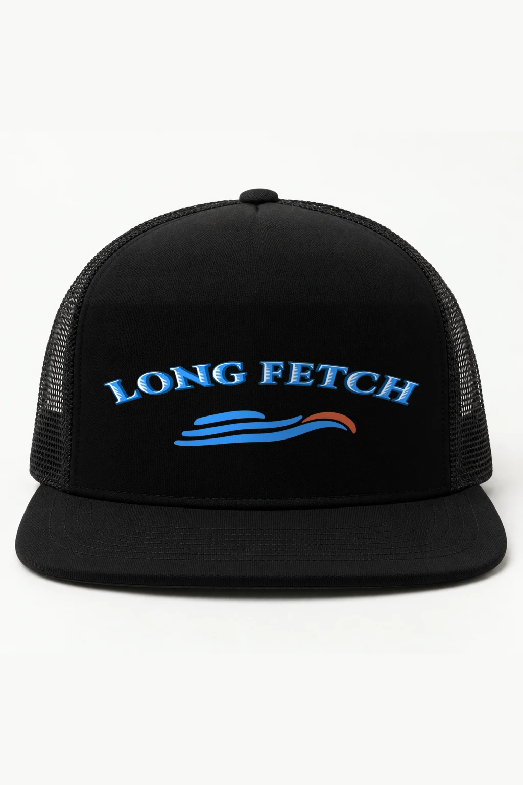


Description
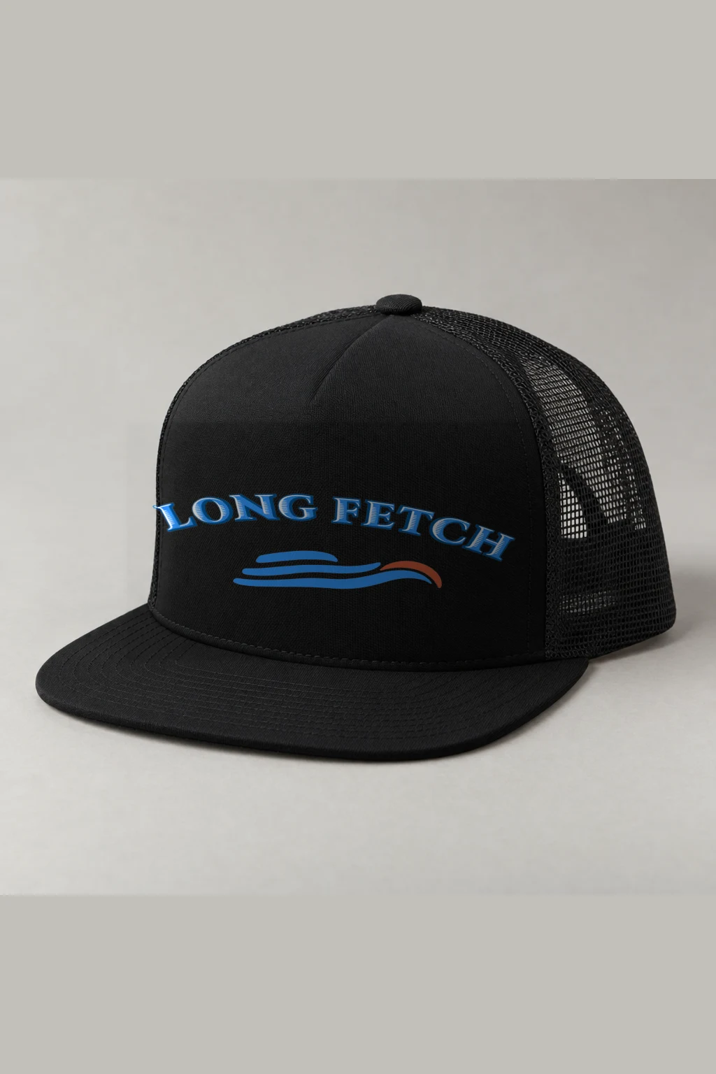
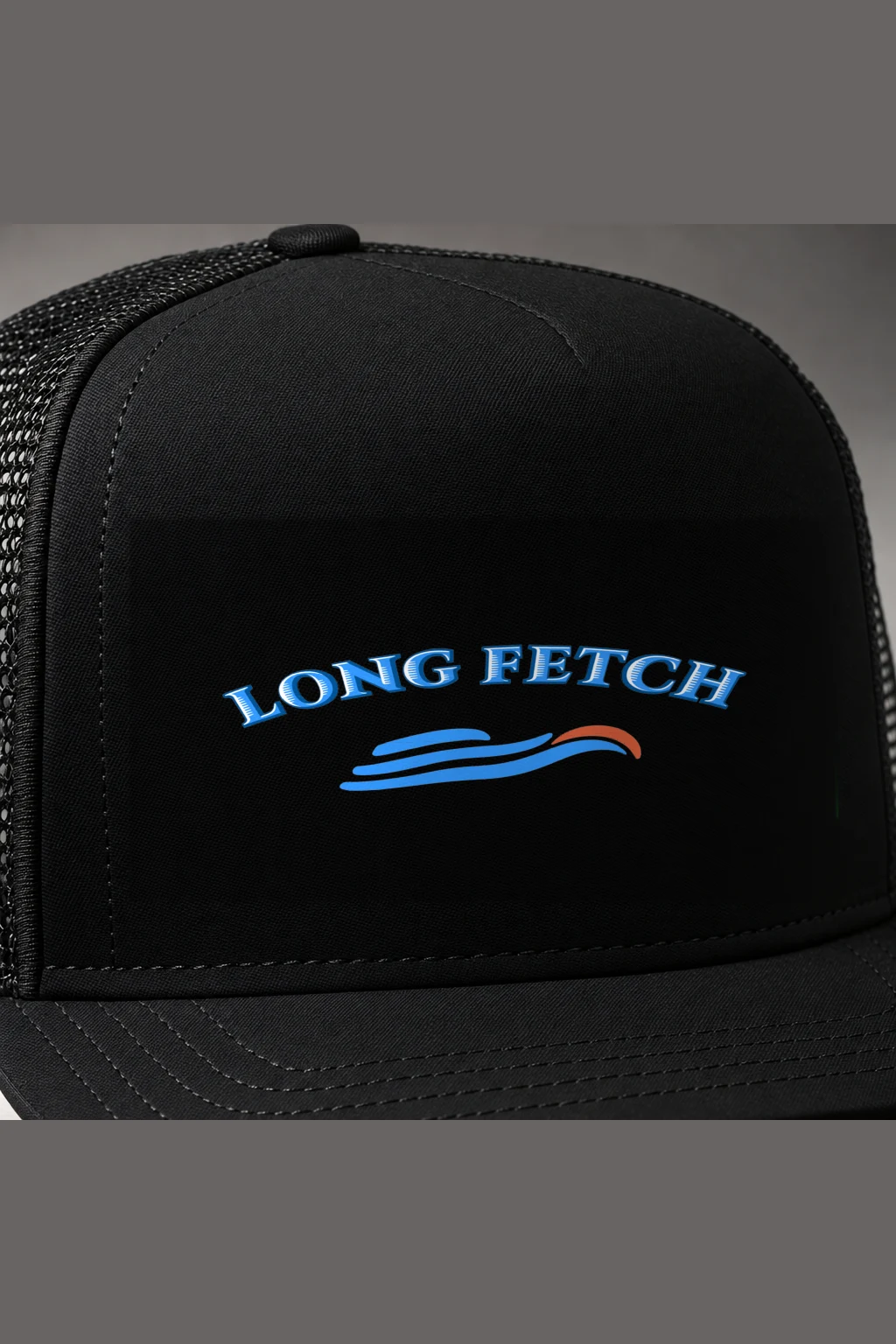
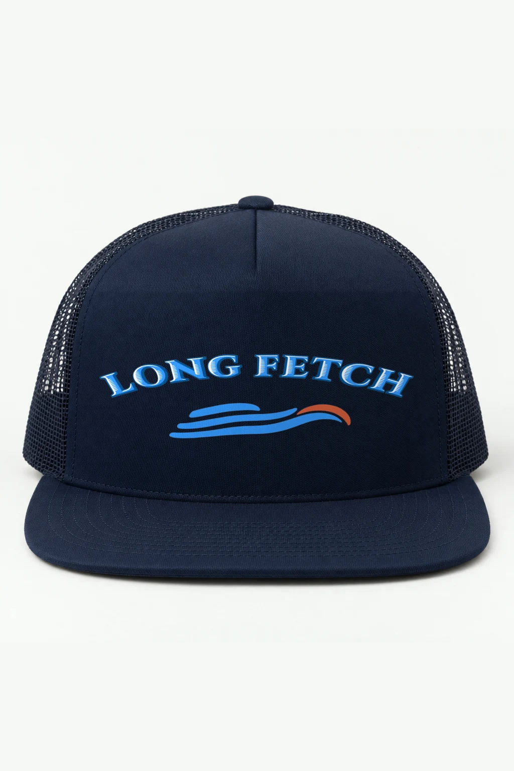
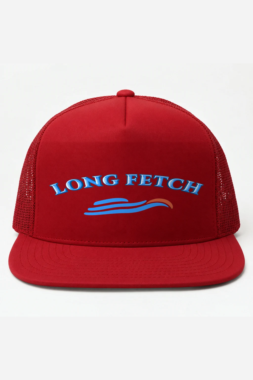
Open space at either side leaves the lower mark room to move, while “LONG FETCH” takes nearly the full width in a broad rising arc. On the Retro Trucker Cap, the embroidered lettering is built from bright blue interiors, thick dark blue contours and fine white inset lines, giving the serif forms a layered, sign-like edge. The letters at the ends lean with the curve; around the middle, they settle into a more upright stance. Small white hatch marks appear only on selected straight and rounded sections, a restrained detail that breaks the blue without changing the words.
- “LONG FETCH” is rendered in large uppercase serif letters, with the arch becoming most apparent at the outer characters.
- Three elongated bright blue forms below are divided by white channels, beginning with a short rounded rising stroke.
- The two longer forms extend sideways before narrowing into upward right-hand curves, ending beneath an orange-red crescent and its white curved gap.
The lower symbol stays narrower than the lettering, so its open margins remain part of the composition. That difference in scale gives the arc its sweep and lets the blue strokes read as a separate, compact sign below it.